Search the Community
Showing results for tags 'design'.
-
I have been avoiding developing this section of our website for a day now as it looks horrendous in my opinion. The general layout of the section is to have our 4 main services with their titles on the left hand side. When you click on one, an entire blocks swings in from the top (animate.css) with the title, brief snippet, cta, and a youtube video "explaining" the service with plenty of buzz words. The entire section is quite tall and the video sticks out like a sore thumb. I have been racking my brain on perhaps a "better solution", but I am all out of ideas. I was tasked to revamp the site (was on processwire, now in gridsome/graphcms just to try out something new), but the mockup is a bit out of date (just feels old tech for a marketing agency). Thankfully, I have a bit of wiggle room to make changes, as long as I can show something interesting. I was just wanting to hear some of your feedback/ideas on how you would go about tackling this section to make it feel a bit more interesting/clean. I have included a very basic "mockup" of the section in question (left = service titles | right = content regarding service => title, snippet, cta, video). The section is also the full width of the browser, so in my dev enviornment atm it is 1825px x 850px.
-
I just relaunched my portfolio website. It's my first ajax driven website using ProcessWire as a CMS. Its a showcase of some of my work as well as a digital playground to improve my coding skills. If you encounter any bugs or have feedback, feel free to share janploch.de
-
Hi, I'm trying to design a new User Survey functionality that allows a "User" to specify user surveys that pop up after a user clicks on an audio button after a user watched a video after visiting 5 pages on a site when users bounce etc etc So basically the potential to launch a User Survey from various places under various trigger conditions. I have already built User Survey capabilties where if the a particular User Survey field and certain trigger fields are filled in, it will trigger the user survey accordingly. I'm not really happy with the current design as it's highly coupled at the moment and I feel the design is too brittle to accommodate changes that are drastic (oh, like the one I have above for example) Has any one implemented any flexible User Survey functionality that has various triggering capabilities? I googled far and wide but I've not seen anything remotely close to what I'm looking for. All articles I've found seem to concentrate on designing the User Survey itself and not on the (smart) delivery of it.
-
Hi everyone! I haven't seen a thread yet to talk about this aspect of development in which I have been reading on lately and I am very interested in this community's opinion/experience. What are your perspectives/experiences on dealing with a UX/UI research process? Would you have resources/books/courses to recommend to learn about the topic?
-
Our agency website is not exactly new, because we relaunched it late 2014. At this time we have build it with the CMS Contao and Bootstrap as framework. Although I always liked our website, I was never quiet happy with it. Contao is a great CMS, but knowing ProcessWire it felt tedious managing content. Also it limited me as a developer. So the past months I have rebuild our website with ProcessWire and switched the framework to UIkit, because it made a good first impression on me and I wanted to learn it. Now I am happy with our website, because it is cleaner, faster, easier to manage and more optimized for search engines. www.designconcepts.de Modules used: ProFields ProCache Map Marker Pages2JSON Markup Sitemap XML Tracy Debugger Email Obfuscation Regards, Andreas
-
Hey guys! I just launched my new online portfolio. http://janploch.de/ This is my second site with PW and I really enjoyed working on it. Its in german, but I want to launch an english version soon (just have to figure it out). I would probably never have finished it without the help of this awesome community. Thanks for your support! Feedback appreciated. (The size of the Images are a bit heavy for mobile, I would like to improve that with "srcset" or the picture element, but Iam not sure how to do that with PW without multiple image uploads.)
- 4 replies
-
- 8
-

-
- portfolio
- responsive
-
(and 1 more)
Tagged with:
-
Hi, i work on a new start with my webpage on Processwire and have build a new Design with Bootstrap. Now i wonted to look it on my Phone and i saw that it looks like on Desktop. I can not find the problem! On my dummypage all works fine on Desktop and Phone. On processwire the Design works fine on Desktop, it scale perfekt but on my phone it doesn't work! Is there any what i must do in Processwire to scale on phones? http://dummy.mta-r.de http://processwire.mta-r.de What am I doing wrong?
-
I rebuilt my brothers website from it's WordPress theme/plugin into a ProcessWire designed theme. Mostly because it was build poorly, half the things didn't work and it kept getting attacked through 3rd party plugins, and not knowing much about WordPress other that omg I hate it - decided to look else where! Turned out nice I thought, easily modifiable pages/projects with tagging showcase etc, and using FormBuilder with bootstrap theme for contact form, also ProCache. Will look to try use ProcessWire for further projects, very nice to use as a dev. Cheers John
- 3 replies
-
- 4
-

-
- sustainable
- homes
-
(and 2 more)
Tagged with:
-
Hi, I am a mostly happy user of Contao which I have successfully used for many projects. What I like about Contao is the great flexibility when creating pages/articles - each article is pieced together with content elements (text, images, galleries, accordions, modules...) in any way I like. Typo3 works very similar I believe. Especially for marketing websites this is extremely useful because in that case pages tend to be styled and designed very individually. I have been "flirting" with PW now for some weeks but this is still my biggest question: can I achieve the same flexible design/layout approach for individual articles with PW as in Contao without having to create templates for each case? How can I p.e. have some text, then add an accordion, continue with text followed by a form and then add some images at the end - without pre-defining those elements in the template and frontend template? I understand I can do all this using plain HTML - but I can hardly expect that from clients. Maybe this is a very particular obstacle to overcome in my mind that only applies for users of Contao and Typo3 - other systems don't offer content elements either. I always wondered how those users get to individually designed pages...
-
Work process of my new website. 1.- Client area - Frontend login - View invoices - Submit a ticket - Change password - Domain Expiration - Hosting plan - Logout 2.- Frontend 3.- Backend
- 3 replies
-
- 7
-

-
- showcase
- development
-
(and 1 more)
Tagged with:
-
With all the past PW projects I have refrained from giving users the TinyMC html-editor and stuck to Markdown. This has proved to be a great decision. Most practical problems with past CMS:s has been with content formatting, users not knowing how or messing styles. Not giving them that possibility is just great. However, now I am looking at a project with tables (prices and specs). Anyone have wisdom to share here? Best way to allow users to create tables in their content without generating support request for table formatting, Office-copy-pas messes etc? Thanks!
- 3 replies
-
- content
- formatting
-
(and 1 more)
Tagged with:
-
Hi guys, recently, I'm reading Stephen Hay's "Responsive Design Workflow" and am fascinated by its idea of "Content reference workflows". In short: this approach does not use any software like OmniGraffle, MS Visio, etc. but plain HTML. This way the wireframes can be responsive (and be created quickly since one is at home in HTML anyway). The other thing is, that these type of wireframes are very minimalistic and, instead of a detailed graphic-design-like approach, it more or less uses two colors, borders and labels. So the danger of mistaking these wireframes as a design proposal is minimized. And since metaphors are always good I tried to tweak this philosophy with a well known instrument of the "analogue" world: blueprints. This way, at least thats the intention, it becomes even more clear for the customer that this is an abstraction. If you communicate it right, for example with a explainatory popup/modal, no customer ever should misunderstand it and ask: "What? My website is meant to be blue?" Find some screenshots below and a demo of what I'm aiming for here: http://demo.marcus-herrmann.com/blueprint-wireframes/ Before I confront any more customers of mine with this approach I would be very thankfully to hear any feedback on this from fellow developers. What is your (or your employer's) approach on this? Are there any obvious quirks with this one? As usual, you can find the code on GitHub: https://github.com/marcus-herrmann/blueprint-wireframes Have a nice weekend! Marcus
- 1 reply
-
- 3
-

-
- wireframes
- concept
-
(and 1 more)
Tagged with:
-
Hey guys! Our first PW project is online, finally: www.typneun.de So, please do not look into the code TOO close - we are designers, not coders, OK? We started to develop this little portfolio site about 2 years ago, but didn't find time to finish it. So it took nearly 1,5 years to get it done till oct 2012. That's why much stuff is not perfectly coded right now. The site was developed with static html-files - until tonight when I launched the PW-website. Modules we are using: procache multilanguage/german redirects formbuilder (not yet, will come soon) Actually this site was our second one on PW, but the first one is still in development and will go online in a few days. The experiences we made with this first site and the help I found in this forum made me switch to processwire for our own website. So, thanks to all of you guys! Any ideas or criticism to make the site better? Comments are welcome...
- 17 replies
-
- 10
-

-
Just launched a new Processwire site, http://luxcommunications.ca Comments? Feedback? As always, if you find any bugs or problems please let me know.
-
My younger brother runs a business for textile finishing and custom textiles in germany: http://meridian-gbr.de Based on foundation 5, which it really made easy to realise the layout. Modules used: Page Image Manipulator by Horst
-
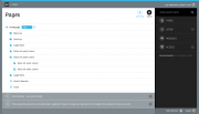
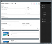
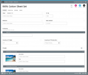
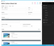
Hi Everyone, the last days i read a lot about the ongoing process of "modernizing" the admin theme, adding some features and getting some marketing buzz from people who aren't currently aware of processwires awesomeness due to the fact they didn't like the current admin theme. I must admit that at first was one of those "design oriented" guys and didn't dig deeper into the system because i didn't liked it's look & feel (or at least i thought it doesn't look "professional" enough to present it to our customers). Fortunately a colleague of mine finally managed to convice me giving pw a second try. After digging deeper i started to really like the concepts behind it. I tried different admin themes and git stuck with "ergo" which we currently are using on several pw instances. Although i weren't completely happy with it's look and feel on several details (but that's just me: i never heard one of our customers complaining ). The Idea of doing a theme by myself started to grow in my mind. After doing several layouts that "just beautified processwire to my taste" (i can post a "design evolution summary" if anyone is interested) i took a step back and started doing some more conceptual work and research. Specifically i thought about which "personas" are using processwire and for what reasons they are using it. Also i tried or looked at screenshots of some more "hyped" systems (ghost, anchor, craft...), asked out some (dev) co-workers and others who are content editors (which are the two main "groups" of personas imo) what parts of processwire could be done better or used in a more efficient way. The good (but not surprising) news is: There were almost no complaints about the current features. Long story short: With the "benchmark" in mind and some feedback i again started layouting. I rearranged some buttons, menus and tried to give processwire a more modern, clean and "up to date" look. But before i'm going to code all of this i wanted feedback from a broader audience so i can propably fix or correct things that you as everyday users aren't happy with. Here we go: I used the "w" of the processwire logo as a "picture mark" as it is pretty unique and can easily be recognized and remembered (You could also use this as a favicon). I kept using "processwire colors" for brand/product recognition (i know ryan stated people are complaing about them) but also tried to use them in a very minimalistic way so there is nothing that distracts editors from the content. I chose the menu to be positioned right for two reasons:1) Content first! The most part of work in processwire is editing and creating content. So why shouldn't content "rule" and be the first and most important thing (at least for LTR Readers)? 2) With the buttons and the menu both at the right side there is a "cluster of functionality" which makes it more efficient: Shorter ways for eye- and mouse movement, less things to "overlook" when actually editing content. The pages options within the tree are hidden (again: reduce visual complexity) into a dropdown with only the most commonly used one (edit) beeing shown (this should be configurable). The Font is the beautiful Fira from Mozilla <3 The messages are displayed "growl style" and can easily be closed by the user (or close themselves after a certain amount of time) I chose to use the content of ryans "new theme" example screenshots to make it easier comparing them in terms of visual hierachy. As you scroll, the buttons on the top will pin and scroll with you. This way it's always possible to save or view the page at any scroll position (the save/publish buttons are part of a module that's currently in devlopment here). The bar at the bottom will contain some shortcuts as well as less frequently used / system related stuff (i.e: user profile and logout). "Zen Mode" with closed menu. Just you and your content For those who like it bright: An example of an alternate version which is even more minimalistic.From my point of view there are some things still missing. I thought a lot about including a possibility to open the page tree from everywhere (as in Nico Knolls Dark Business and the ongoing Discussion in the Two column admin theme concept). I think this might be more effective to just test it from a ux perspective when actually coding the theme. My Idea is to build a static clickdummy and put it on github before actually releasing a "real" theme (with all the logic / js work to be done) to do some usability testing. Thanks for reading and i hope there will be some feedback! Best regards, Felix
- 33 replies
-
- 27
-


