Leaderboard
Popular Content
Showing content with the highest reputation on 11/06/2022 in all areas
-
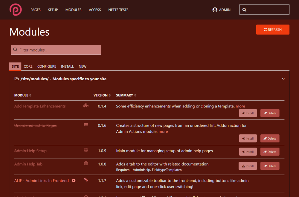
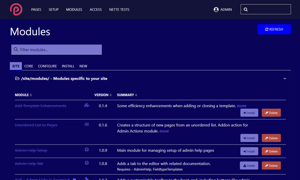
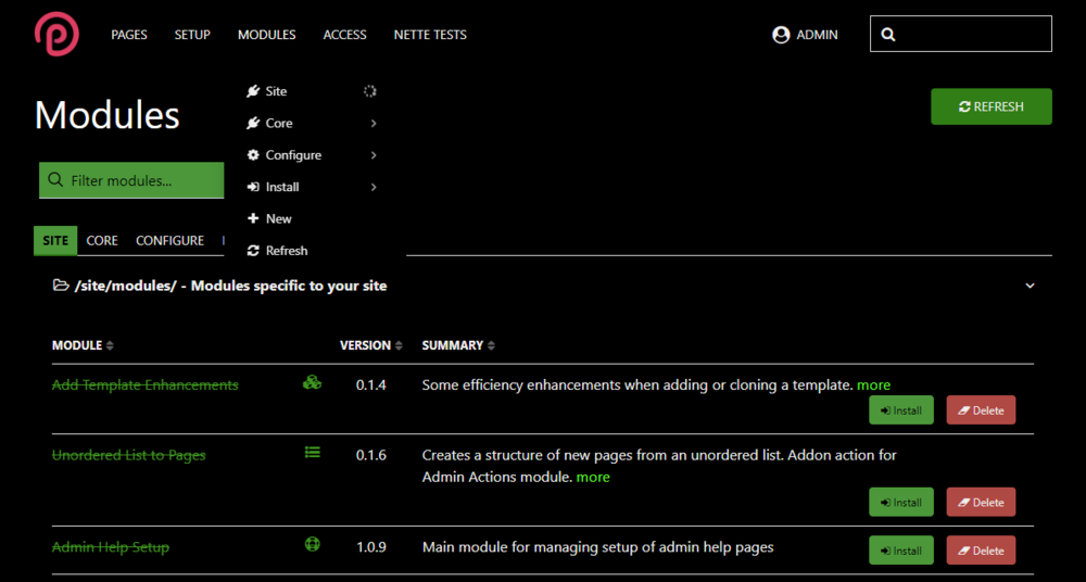
As I've been working through an admin theme structure that would allow me to add 1-3 colors and relationship types that would generate accent and different primary, secondary and muted colors for UIkit. There have been a number of interesting bumps along the way connected to color and contrast and this has led me through several rabbit holes that might save folks some time as they look to build their own admin theme and find themselves unsure about how to wrangler the color contrast issue. So I started with a basic color input and calculated a number of additional colors. I started with red. in LESS, I set up a few rules to calculate and arrange different colors: @base-dark-15-desat: darken(@base-color,15); @base-dark-30-desat: desaturate(darken(@base-color,30),20); @base-dark-35-desat: desaturate(darken(@base-color,35),50); @base-light-15-desat: desaturate(lighten(@base-color,15),50); @base-light-15: lighten(@base-color,25); @base-dark-15: darken(@base-color,25); @base-dark-35: darken(@base-color,35); Originally desaturated the first one, but changed my mind. All of these colors seemed to work fine for the base of #ff0000 although I needed to provide a little tweaking to get the link color usage right, because I found that when I chose other color, the contrast of the link text against the background didn't always work. It was fine for buttons and other navigation, but not link text on the main background. Blue and green, for example: The blue of the button, if applied to the link text above, would have been too dark of a contrast. In stead I brought the lightness up and it gets a sort of periwinkle tone. Green was dramatically dark: Now this piece took me down my first rabbit hole - what exactly was desaturation, lighten and darken doing to achieve their result. My assumption was that they were mixing with white or black - which LESS can certainly do. That's not what was happening here. LESS convert colors to HSL before running any color functions. And the percentage argument that comes with the lighten and darken commands does not actually brighten or darken the color by the percent you specify. Instead, it sets the absolute luminance value of the HSL value of the color to the value you state. Throw desaturation on top of that process The problem is that not all luminance values are equal. You can have two very different colors that appear to have different brightness levels, but their luminance levels are identical. If a luminance level is dark enough or light enough, using lighten will flatten the color to white, and darken will flatten the color to black. The percentage that merely dimmed the red color to a deeper brick red in combination with desaturate turned the base green color black. What can be done? It is possible to get the luminance value for a color through: lightness( color ); Then that value can be multiplied by a float between 0.01 and 1 to get an adjustment that can be added to the adjustment. This provides a percentage change from whatever the lightness level is that a color intrinsically has. But this feels a bit janky. Moving on to the next topic, and one that really captured by attention for a few days - complementary color calculation. The formulas here were similar to the single color variant - with the addition of a LESS complement calculation: @base-contrast: difference(@base-color, #ffffff); @base-dark-15-desat: darken(@base-color,15); @base-dark-30-desat: desaturate(darken(@base-contrast,30),20); @base-dark-35-desat: desaturate(darken(@base-contrast,35),50); @base-light-15-desat: desaturate(lighten(@base-color,15),50); @base-light-15: lighten(@base-color,25); @base-dark-15: darken(@base-contrast,25); @base-dark-35: darken(@base-contrast,35); This was strange to me. I was expecting violet as a complementary color. Not so, there is a rabbit hole (and a controversial one at that) connected to the legacy use of subtractive color spaces and additive color spaces. This article (and the connected libraries on github) explained it quite well: https://blog.daveeddy.com/2014/07/01/red-yellow-and-blue/ My expectation was connected to the RYB color wheel: not the RGB color wheel: So now, the thing about this situation is that even the CYMK color space - which developers and designers understand to be dull and muted when presented on monitors - is different still than RYB space, as it uses a more extensible primary color scheme that can cover gamut ranges that RYB can't touch. And yet, for some reason, RGB strikes me as having a lot of garish colors while RYB colors produce a warmer space. He's got a fun color picker for nostalgic folks like me: http://bahamas10.github.io/ryb/ Again, like the luminance cludge, trying to bounce around color space to get the effect I want led me to wonder - how are contemporary apps doing it? What color space are they using to work out all the accessibility and contrast issues? This led me to look into HCT - hue, chroma, tone - color space that is used by Material Design 3: https://m3.material.io/styles/color/dynamic-color/overview Really cool conceptually, the science behind the new color space is described in detail here: https://material.io/blog/science-of-color-design Regarding the issue we run into with LESS using lighten/darken - they give a great example of four colors that have the luminance but perceptually vary considerably in brightness: I haven't finished running calculations on how to best address color selections for contrast scores but these items gave me a lot to think about. There are Material 3 dev libraries available - I'll probably check them out this week. https://github.com/material-foundation/material-color-utilities My guess is that this sort of color comparison goes into Chrome's contrast scoring? Being able to use a library to automatically calculate appropriate contrast color sets will probably end up being a better alternative to using LESS functions in the future.3 points
-
Hello there! I recently updated my own website - I am a frontend developer living in the northern part of germany. https://www.thumann-media.de The old design has been online since five years (time flies...) and I thought that it was time to make things a bit flashier and include a better showcase of my web projects to give the user a more detailed description of the project features. It's a classic one pager design just for the sake of keeping things as short and simple as possible (I hope the image fits inside this thread). The new version of my site includes a "portolio section" where users get a sneak preview of each project I've been working on recently. It features nice fade-in-out animations powered by aos.js (animate on scroll). Also new is that every project gets a dedicated subpage where I describe some of the unique features that this website offers: I like to have some eye-catchers. I always used the animated wave theme on my website, so why not include a message in a bottle? The animation of the bottle is done via the awesome GSAP animation engine (https://greensock.com/gsap/). This is a super powerful library and I just started diving into the possibilities of this one. Tech Talk: Some of the things I used: - ProFields used for this one (repeater matrix, combo) - Frontend framework is Bootstrap 5. I had a hard time of deciding between Bootstrap and UIKit as my new go-to framework (I am bit biased though because I've been always using bootstrap since version 2). But the grid system alone makes bootstrap so flexible and powerful for me, so I will stick with it for another 10 years I think... - https://github.com/nbcommunication/PageimageSource for image srcsets with webp support - Ajax driven contact form with bootstraps frontend validation - AIOM+ for compressing the assets (CSS and JS) https://github.com/matjazpotocnik/ProcessWire-AIOM-All-In-One-Minify - SEO Maestro - WireMail SMTP AOS.js vs GSAP Which animation library you should use? I discovered the GSAP library a bit too late in the development process, tough. So I am still using aos.js for some animations. AOS has a super small footprint considering its filesize (14 kb, minified) and is super easy to use and super reliable. Whereas GSAP is quite large (71kb, minified) and if you want to make use of scroll triggers you have to include a second library which adds another 40kb. AOS has lots of nice animations which come out of the box. GSAP does not offer this, you have to program those transitions yourself. So you need to spent some time, reading the docs and looking for tutorials! GSAP can do all that AOS can and beyond. If you want to have full control over everything I would advice you to give it a try. So that's all for now. I wish all of you a great weekend!2 points
-
You could call $modules->getModuleInfo('all', ['minify' => false]) and iterate over the results. Each entry has a "core" property and an "installed" property you can check.2 points
-
Be sure to checkout the new grow feature ?1 point
-
Hi, Can you be a bit more specific? What is the exact wording of the message and what is its actual source? Do you have a backtrace or something else?1 point
-
On my last post in the thread of AdminStyleDark, when I said: I was refering to this one in particulary. I will send a github PR.1 point
-
1 point
-
Clip path is my preferred solution to obtain this effect but can be tricky if the clip path is a bit more complicated. As mentioned here the best way to achieve this is to make use of the mask-size property. -webkit-mask-image: url(path/to/svg); -webkit-mask-size: cover; If you chose "cover" for the mask size the SVG will fit to the image dimensions. I made a quick test and it seems to work really good. I didn't know this technique exists so thanks for the hint @3fingers!1 point
-
Is it trying to display thousands of pages and timing out? If so maybe an input type such as Page Auto Complete, which doesn't load all of the pages at once might work.1 point
-
I think I would go with - raster - image masks, like mentioned here: https://css-tricks.com/almanac/properties/m/mask-size/ Nowadays the support is very good and it covers the problems you are facing.1 point
-
Looking into it further, I believe it is being caused by a jquery ready() function call in \wire\modules\AdminTheme\AdminThemeUikit\config-field.js: $(document).ready(function() { $('#_adminTheme').find('input[type=radio],input[type=checkbox]').change(function() { updateAdminThemeUikitExample(); }); $('#_adminTheme, #_adminTheme > *').css('background-color', '#fff'); // <--- This seems to be the culprit. updateAdminThemeUikitExample(); initAdminThemeUikitColumnWidth(); }); @ryan Is there a reason for this rule being set? Commenting out this line resolves the behavior.1 point
-
@jploch - can you try the attached version please. Sounds strange, but it's actually a bit more complicated than expected just because there are a few ways that the bar can be enabled / disabled / hidden. I think I might have them all taken care of, but would be good if you could help test. Thanks. BTW, the class I added to body is: has-tracy-debugbar TracyDebugger.module.php1 point
-
Hi @horst, My ImageSizerEngineVips is based on your ImageSizerEngineIMagickCLI with code from other sizers. The module works fine, but at the moment only for my needs, because I optimized for speed and left some options like sharpening. But if I have the time and interest, I can polish it. Another thing: I only use WebP in pages with lazy loading and srcset. Because of that I have only variations as WebP, not the uploaded pageimage. Your change here checks not only variations, right? For me, it changes many variations that already exist.1 point
-
I'd say it's... GOOD! Today Microsoft isn't the Microsoft it was decades ago and Microsoft does a lot of things right nowadays. They listen. They deliver. They do better than Apple. Microsoft has the money to keep Github up and running. I'd be much more concerned if it was Facebook, Oracle, IBM, SAP, Adobe, Amazon, Apple, Alibaba (and similar) or several others. Who would have been better... Canonical, RedHat, any other free software foundation or company? I don't think so. Update: just saw that Nat Friedman will be part of the new team. This is awesome.1 point


