Leaderboard
Popular Content
Showing content with the highest reputation on 05/21/2025 in all areas
-
I'm clearly in a minority but I personally feel like the redesign is not very attractive.... To me, completely flat single colour panels with single relatively high contrast borders does not look clean and I don't enjoy the use of a mid grey as a base colour for light mode at all. The new font looks bold and blocky to me and again too intense in its contrast. I'm sorry to say this because I can tell a lot of work has gone into it, but I personally hope the Uikit theme doesn't go anywhere, if I put them side by side the Uikit one looks like the more modern and finished one to me. Also to add to the bug reports I'm getting white text on a white input when filling out the db details on a fresh install of the new dev version (dark mode/Chrome/Windows) which made installation quite difficult4 points
-
Hello, The collaborative efforts of @diogo and @jploch are truly commendable, and the new admin theme brings a fresh look to the ProcessWire interface. That said, it feels like some aspects weren’t fully addressed. The theme includes certain design choices that have sparked debate and a few bugs that slipped through. In my view, this isn’t a reflection of any lack of competence from @ryan, @diogo, or @jploch—far from it. Rather, it highlights how the project was managed, which, to me, mirrors how ProcessWire itself has historically been managed under Ryan’s leadership. A project like a new admin theme could really benefit from being more community-driven. A simple round of beta testing with some of the most active and experienced members of this forum could have prevented many of these issues before release. Keeping it under wraps usually doesn’t work as well as we hope, especially considering how diverse the use cases for ProcessWire are. And this does reflect on ProcessWire itself. I sometimes wonder whether Ryan truly wants PW to grow bigger, gain more visibility, and capture a larger market share. If he does, some of the actions we see don’t seem fully aligned with that goal. As for why Ryan continues to keep such tight control, I honestly don’t know—whether it’s a matter of personality, or perhaps he hasn’t yet found people he fully trusts on the technical side. That being said, none of this discussion would even be possible without Ryan’s incredible work on ProcessWire. Regardless of what the future holds, we’ll always be grateful for that. I’m simply sharing my thoughts with the hope of contributing to its improvement. That’s all.2 points
-
Just another note on toggles - this impacts even checkboxes that are added to process modules, but in some cases the css for it is broken so it's unusable. Also, in this case the checkbox is in a table and it takes up much more space. On another topic, I find it weird that the font color for the main menu is so black (mentioned above by someone), but also that for the dropdown items, the unselected items are black whereas for the top level items, the unselected are grey and the selected is black. I also think that dropdown menus should reflect the current page by being in the darker color, but again, definitely not #0002 points
-
I’ve been following this ping pong match for a few days. 😁. Gotta say, I loved it and @nbcommunication, you are awesome. Great developer. Thank you for your contributions to the PW community.2 points
-
Hi @Stefanowitsch, That's great, delighted to hear that! This is been a really useful exercise, I've pushed three bug fixes for the module so I'm happy 🙂 I'll update the README with a note that the module isn't compatible with DelayedImageVariations, and if I ever get around to it will try and figure out what the compatibility issue is. It isn't something I've used before. Cheers, Chris2 points
-
@nbcommunication I found my problem. 🥵 It wasn't your module at all but instead another module that I was using which interfered with the webp image creation for the srcset attributes: Delayed Image Variations I was using this Module because the image variant generation on image-heavy sites (using the size method) took very long and resulting in time out errors of the server. As described in the module thread: After uninstalling the module all the paths in the srcset attribute point towards the webp versions of the image and also the quality settings are applied as set in the module settings page! I am sorry for causing so much work for your tests! 😔2 points
-
@Sebi Is there a reason there is not a simple "API-key based authentication" auth-type, meaning to communicate with the API, you just need an API key (without having to deal with sessions or JWTs)? Would you allow a pull request to add this?1 point
-
Hi @Stefanowitsch, I've tested using gd and it is working as expected for me. Could you output phpinfo() and let me know what it says for gd? Here's what's on our dev server: Cheers, Chris1 point
-
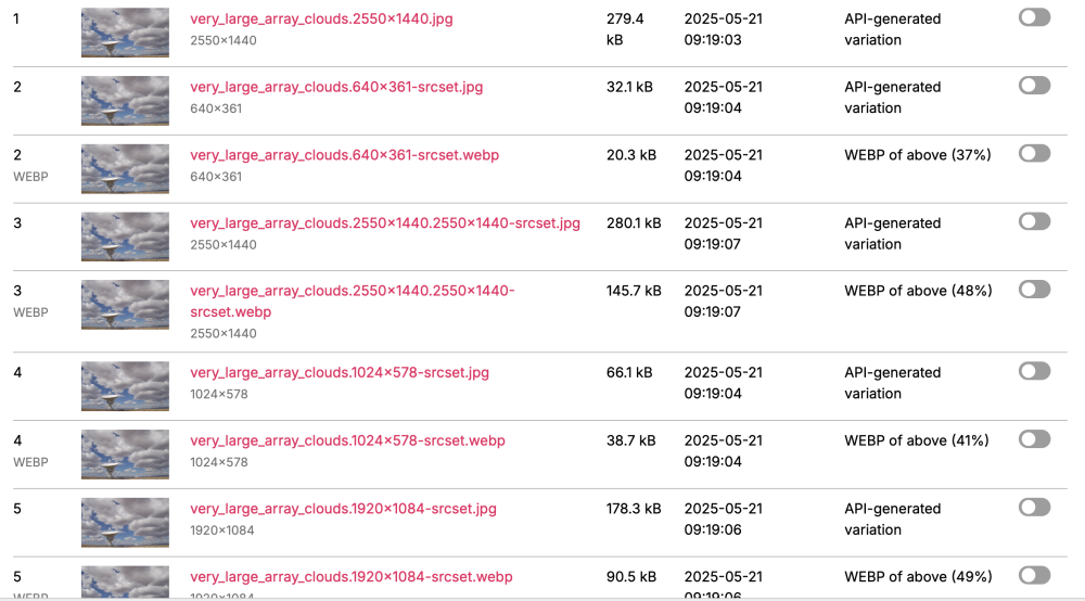
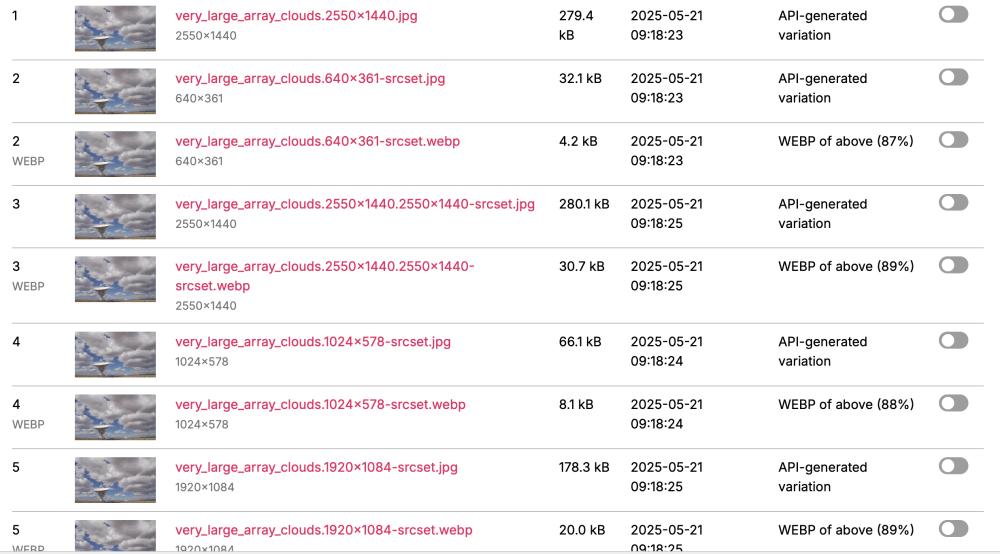
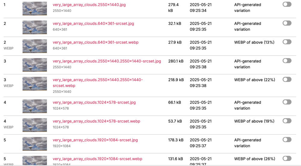
Hi @Stefanowitsch, I've tested based on the information you've provided and it isn't replicating: <?php // /site/config.php $config->imageSizes = [ 'title-img' => [ 'width' => 2550, 'height' => 1440 ] ]; // output, original pageimage is > 3000px wide echo print_r(explode(', ', $pageimage->size('title-img')->srcset([ 640, 1024, 1500, 1920, 2550, ])), 1); // result Array ( [0] => /site/assets/files/1031/very_large_array_clouds.640x361-srcset.webp 640w [1] => /site/assets/files/1031/very_large_array_clouds.1024x578-srcset.webp 1024w [2] => /site/assets/files/1031/very_large_array_clouds.1500x847-srcset.webp 1500w [3] => /site/assets/files/1031/very_large_array_clouds.1920x1084-srcset.webp 1920w [4] => /site/assets/files/1031/very_large_array_clouds.2550x1440.2550x1440-srcset.webp 2550w ) With module config webpQuality setting at 85 With module config setting at 10 With module config empty (defaults to 90 - there was a bug here, fix to be pushed shortly) The quality setting in the module config is definitely being used in this case. Reviewing the above, I'm quite surprised at the difference in file size between 85 and 90. There has to be something else going on here, maybe the image sizer engine (Imagick used here but that about as far as my knowledge goes on these things). Do you have access to any other server environments to try to replicate the test on? I've run this on a dev server and a production server which have different setups with the same result on both. Cheers, Chris1 point
-
Hello, After spending a week with the new admin theme, my feeling is that it is definitely a step in the right direction, making the admin feel more like an application, and many thanks to all who've worked to get it where it is. That said, there's quite a few issues I and the team here have picked up on. Most of these have been highlighted already. Here's some observations interspersed with some issues: Page Tree A number of colleagues have commented on the removal of the 'lines' on the page tree. I much prefer the new look, but it may be useful to have the option to toggle this on/off. I also like the 'text' style of the action buttons, but feel a more button-like style on hover would help. Colouring Something I'm not keen on is the lack of colour for the messages. Having the primary alert colour being the same as the background makes it hard to notice. We think the background colour (#eee) in light mode is too dark. #fafafa feels better. I also miss the colour of AsmSelect items. Having these in grey makes them blend in too much. Dark mode I prefer dark mode, but I've found myself switching to light mode on all the installs I've worked on. I can't pin down the problem though. It might be that the muted grey background makes the actual UI (fieldsets) too stark. It doesn't feel right. I agree with other comments that there needs to be an ability to customise the logo and colour for both modes. The installer needs to be tested in dark mode. All the input text is white on an input on a white background! (longest, most frustrating PW install ever!) Colour picker I think there should be at least two more fields beside the colour picker input, one for HEX value, and another for RGB. Editing one updates the others. On Safari, the native colour picker doesn't give you the option to input a value so I needed to login on Chrome to set the value I actually wanted. ... My main concern with this is the rollout when this reaches the master branch. We have a setup where we can update all PW sites on a server at once, and as it stands I think we'll need to go into each site to specify light mode. We want the rollout to be successful with our clients, and we'd prefer to adopt the new theme gradually, as and when we're working on a site. I think retaining the original UIkit theme as the default should be considered. Cheers, Chris1 point
-
Thank you for the huge amount of work put into the new AdminTheme style! After playing with it in different scenarios and PW installations we find ourselves always switching back to the „original“ style of the backend, wishing we could also have the fixed navigation here... is there a simpler way of doing this without rebuilding the original styles in the new theme? Please don´t get me wrong, we appreciate many of the design decisions made, but overall the typo and colors of the original theme are more suitable for all of us. ("we" --> a design agency in Vienna, Austria. We build client projects with PW since 2012)1 point
-
1 point
-
Hi Michael, I have not seen any fields like that, but as an alternative you could try using a "page" type field. It would create a new page for each tag, but has a nice friendly interface for the user to manage them. 1. Add a new page in your tree called "Tags Collection", and make it hidden. 2. Create a new field called Tags and make it a "page" type. 3. On the input field settings, make the "Parent of selectable page(s)" the Tags Collection page 4. For the "Input field type" try one of : Select Multiple, asmSelect or PageListSelectMultiple (I prefer the asmSelect) 5. Check the “Allow new pages to be created from field?” to allow the user to easily add new tags directly from the field1 point


