Leaderboard
Popular Content
Showing content with the highest reputation on 10/11/2013 in all areas
-
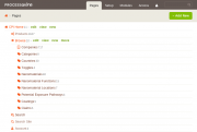
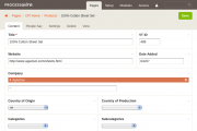
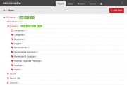
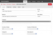
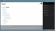
Just thought I'd share some work I've been doing on a "version" of this theme. I was recently inspired to make a theme that had a "killer" page tree and decided I would merge that code with some alterations to Ryan new 2.4 theme and port it to SASS (I usually use LESS). Anyway below are some screenshots. Dots indicated status, compatible with PageTemplateIcons though I will offer a version without if I finish this and release it as a theme. During drag and drop. Note: helpful arrow, I've used this on my Unify theme, clients seems to like it Fixed placeholderitem styling (not everything has been brought over yet)4 points
-
Ryan, the new theme was already growing on me while working with it, with these improvements I'm starting to love it!! (not sure about the gradients on the classic colors though ) edit: (Hm, to be honest I am sure. I don't like them at all)4 points
-
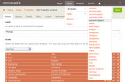
Here's the next iteration of updates which takes into account the comments above. The biggest changes are: Switch to Arimo for the font–thanks to Diogo for the suggestion. This font seems about perfect for our need here. It looks like the license for it wouldn't let us bundle it in the app, so we have to load from googlefonts... but I think that's okay. It'll continue to use Arial for people that are working offline. Got rid of the entire headline, per BartekG's comments above. The headline really doesn't seem necessary (regardless of how big or small it is), and his post made me realize that. The headline text is now just part of the breadcrumb trail. The drop down navigation now includes drilling down to individual fields and templates. ./colors=classic ./colors=modern ./colors=warm ./colors=futura Dropdown example: Not sure I understand–can you clarify which submenu items you are talking about (in the page list maybe)? Anyone else agree? What I was gathering from previous feedback was that folks wanted page list actions that were bigger and less subtle, so making them look a little more like buttons was the intent here. I just want to clarify that this is 1 theme, not 4. The color schemes are merely different SCSS variable files included at the top. Otherwise everything else is the same. There's no maintenance burden here. We are also in a spot where many like the classic color scheme, and it's kind of become our brand. But an equal number (or more) dislike the colors to the point where they see them as childish. So I think we have to answer that by having a variable palette / different options from the start. Good suggestion. I had started to think the title was more important than it was. I looked at several other CMSs to compare (Drupal, Joomla, Concrete5, EE, Craft) and noticed that this new admin theme started the content input before any of those–a good thing for sure. But then I got to WordPress, and noticed their content input is practically at the top of the screen! Granted WordPress uses sidebar navigation rather than header navigation, but it drove home your point for me. It's going to look like you've got a big footer if you have little content on the page and no scrollbar. That's because the <body> background color is the footer color. If you have a lot of content on the page, you will have a very small footer. The actual footer is actually very small / very little padding, but that may not be clear on some screenshots. I'm not sure I agree with this, but it doesn't matter now that the title is gone. Yes the forum may have a black title, but I believe that was a limitation of the IPBoard theming system. Notice the rest of the site (outside the forum) uses the pink titles. So the admin theme was trying to be consistent with that. I'm not against the idea, but since we already support custom icons there, I think it would be too much. Also, we already have visual cues that indicate whether an item is open, so additional icons/cues would be a form of double emphasis. Still, I think in the future, we will probably have default icons for when non are specified (like open and closed folder, triangles or something like that). Thanks–I will look into these. I don't think it should matter. Try hitting reload a couple times to make sure your cache is fresh. Also, your screenshots look to be the old admin theme rather than the one discussed in this thread? Though the icons should work in either, but just want to make sure I know which we're talking about.4 points
-
I learned to appreciate PHP via frameworks (mostly CodeIgniter, but also some time with Yii, Laravel, and Symfony). More recently, I've come to appreciate CakePHP. All of those frameworks provide great power for making complex apps. But the syntax can sometimes be a bit opaque. At the same time, I was also using Joomla (with a thing called Seblod, which promises to turn Joomla into an app builder). I could not wait to drop Joomla. Then I discovered ProcessWire last fall, and right away it seemed to me that it offered the same power as the PHP frameworks, but with crystal-clear syntax. At first, I thought for sure there had to be a lack of depth for ProcessWire to be that clear, but at every turn I've found that ProcessWire provides depth very close to what's needed for most apps, while maintaining clear syntax (or to borrow a word thrown around in Laravel circles, "expressive" syntax). To me, ProcessWire immediately felt like a framework, because it makes no assumptions about how "themes" need to be constructed, and because it has nicely defined API methods for doing everything in code. Having also come from the Joomla world, and having also spent a bit of time with Drupal and WordPress, I was curious about ProcessWire positioning itself as a "CMS." As I said, it seemed to be more comparable to frameworks. Back to your point: people who just want drag-and-drop site building won't use ProcessWire very much. ProcessWire is not equivalent to that kind of system. But ProcessWire can pull in people from Drupal, WordPress, and Joomla who want to customize those "big three" CMSs and are frustrated by assumptions those systems make. I know there are a good number of people in this position in all three big CMSs. They can use ProcessWire like a framework, and get the CMS capabilities they look for. I don't know exactly what segment of the big three is represented by this description, but I know from experience they are there. Thanks, Matthew4 points
-
what.cliente ask.4 drupal or wordprass ? cliente ask 2 be able do this.or that or other not what cms u use cliente.want to do some thing web devaloper is 1 to say.what to do with web devaloper is expert on.tool not cliente unloss yur client.is also web devaloper love -willyc4 points
-
Hi Everyone, the last days i read a lot about the ongoing process of "modernizing" the admin theme, adding some features and getting some marketing buzz from people who aren't currently aware of processwires awesomeness due to the fact they didn't like the current admin theme. I must admit that at first was one of those "design oriented" guys and didn't dig deeper into the system because i didn't liked it's look & feel (or at least i thought it doesn't look "professional" enough to present it to our customers). Fortunately a colleague of mine finally managed to convice me giving pw a second try. After digging deeper i started to really like the concepts behind it. I tried different admin themes and git stuck with "ergo" which we currently are using on several pw instances. Although i weren't completely happy with it's look and feel on several details (but that's just me: i never heard one of our customers complaining ). The Idea of doing a theme by myself started to grow in my mind. After doing several layouts that "just beautified processwire to my taste" (i can post a "design evolution summary" if anyone is interested) i took a step back and started doing some more conceptual work and research. Specifically i thought about which "personas" are using processwire and for what reasons they are using it. Also i tried or looked at screenshots of some more "hyped" systems (ghost, anchor, craft...), asked out some (dev) co-workers and others who are content editors (which are the two main "groups" of personas imo) what parts of processwire could be done better or used in a more efficient way. The good (but not surprising) news is: There were almost no complaints about the current features. Long story short: With the "benchmark" in mind and some feedback i again started layouting. I rearranged some buttons, menus and tried to give processwire a more modern, clean and "up to date" look. But before i'm going to code all of this i wanted feedback from a broader audience so i can propably fix or correct things that you as everyday users aren't happy with. Here we go: I used the "w" of the processwire logo as a "picture mark" as it is pretty unique and can easily be recognized and remembered (You could also use this as a favicon). I kept using "processwire colors" for brand/product recognition (i know ryan stated people are complaing about them) but also tried to use them in a very minimalistic way so there is nothing that distracts editors from the content. I chose the menu to be positioned right for two reasons:1) Content first! The most part of work in processwire is editing and creating content. So why shouldn't content "rule" and be the first and most important thing (at least for LTR Readers)? 2) With the buttons and the menu both at the right side there is a "cluster of functionality" which makes it more efficient: Shorter ways for eye- and mouse movement, less things to "overlook" when actually editing content. The pages options within the tree are hidden (again: reduce visual complexity) into a dropdown with only the most commonly used one (edit) beeing shown (this should be configurable). The Font is the beautiful Fira from Mozilla <3 The messages are displayed "growl style" and can easily be closed by the user (or close themselves after a certain amount of time) I chose to use the content of ryans "new theme" example screenshots to make it easier comparing them in terms of visual hierachy. As you scroll, the buttons on the top will pin and scroll with you. This way it's always possible to save or view the page at any scroll position (the save/publish buttons are part of a module that's currently in devlopment here). The bar at the bottom will contain some shortcuts as well as less frequently used / system related stuff (i.e: user profile and logout). "Zen Mode" with closed menu. Just you and your content For those who like it bright: An example of an alternate version which is even more minimalistic.From my point of view there are some things still missing. I thought a lot about including a possibility to open the page tree from everywhere (as in Nico Knolls Dark Business and the ongoing Discussion in the Two column admin theme concept). I think this might be more effective to just test it from a ux perspective when actually coding the theme. My Idea is to build a static clickdummy and put it on github before actually releasing a "real" theme (with all the logic / js work to be done) to do some usability testing. Thanks for reading and i hope there will be some feedback! Best regards, Felix3 points
-
A quick tutorial how to create file downloads using pages You will be able to create a new page using template "PDF" (or any you setup), upload a pdf file. You then can select this page using page fields, or links in Wysiwyg. The url will be to the page and NOT the file itself. This will allow to keep a readable permanent unique url (as you define it), unlike /site/assets/files/1239/download-1.pdf, and you'll be able to update/replace the uploaded file without worring about its filename. Further more the file will also have an id, the one of the page where it lives. Clicking those links will download or open the file (when target="_blank") like it would be a real file on server with a path like /downloads/project/yourfile.pdf. You'll be also able to use the "view" action directly in the page list tree to view the file. Further more you'll be able to esaily track downloads simply by adding a counter integer field to the template and increase it every time the page is viewed. Since the file is basicly a page. This all works very well and requires only minimal setup, no modules and best of it it works in the same way for multi-language fields: Just create the language alternative fields like "pdf, pdf_de, pdf_es" and it will work without modifying any code! Still with me? ok PW setup Download folder: Create a template "folder" or "download-folder" with only a title needed. Create pages in the root like /downloads/project/ using this template. Setup the template for the pdf files 1. Create a new template in PW. Name it pdf 2. Goto template -> URLs tab and set the URL end with slash to no. (So we can have /path/myfile.pdf as the URL) 3. Create a new custom file field, name it pdf. Set its maximal count to 1 under -> Details tab. 4. Add the pdf field created to the pdf template. Easy. 5. Create a new "pdf" page using the pdf template under a download folder you created earlier. 6. Give it the title and in the name field add ".pdf" to the end (could also leave as is) Template PHP file for the pdf files 1. Create the template file pdf.php in your /site/templates folder 2. add the following code: <?php // pdf.php if($page->pdf){ wireSendFile($page->pdf->filename); } Done. To see the options you have with PW's wireSendFile() you can also overwrite defaults <?php // pdf.php if($page->pdf){ $options = array( // boolean: halt program execution after file send 'exit' => true, // boolean|null: whether file should force download (null=let content-type header decide) 'forceDownload' => false, // string: filename you want the download to show on the user's computer, or blank to use existing. 'downloadFilename' => '', ); wireSendFile($page->pdf->filename, $options); } Simple and powerful isn't it? Try it out. Some thoughts advanced Create as many file types as you like. It might also be possible to use one "filedownload" template that isn't restricted to one field type but evaluate it when being output using $page->file->ext, or save the file extension to the page name after uploading using a hook. One last thing. You can add other meta fields or preview images to the template and use those to create lists or detail pages. It's all open to goodness. Again all without "coding" and third-party modules. Further more you can use the excellent TemplateDecorator to add icons per template and have a nice pdf icon for those pages. This as a base one could also easily create a simple admin page for mass uploading files in a simple manner, and create the pages for the files automaticly. ImagesManager work in the same way. Cheers2 points
-
Made a compromise that I'm happy with. Same technique might be a happy medium for Ryan's theme as well. The more I look at it the more I like it. Awesome!2 points
-
Keen is an understatement for me, no CMS comes even close, PW is a quantum leap in CMS's. I like many others here have a hard time bothering with anything else anymore. I looked for soooo long for something with the logic of PW. And while I still look because I just find software and CMSs fascinating, nothing has yet to even give PW any competition in my mind. I believe with the right design and marketing PW can be "the next big thing". Oh and thanks for the complement!2 points
-
Parsimony, SiteCake and ImpressPages are good for drag & drop, however PW could be a drag and drop system. Sign up for a squarespace demo. You can build something as robust as that using PW. They have three edit modes... admin w/ a page tree like PW, style editor, and layout editor. PW only needs the layout editor. The style editor could be built with existing fields. There's a great realtime css editor that works like the squarespace css editor, and it's free, if only I could remember what it was called. The squarespace layout editor is pretty nice and it would be awesome to have something like it for PW. Eventually I'll build one, but that's such a low priority it may never get done. I agree with your post, but I think what I was after was something more personal, basically I want to get to know you, as a person, "what makes Matthew tick?". That's what helps build trust and an emotional bond. Through our dialog I'm getting to know you better, but when you are interacting with new clients, you don't have as much time to create a bond with them. If you don't make the connection what's to stop them from finding someone else they bond with to do the work? PW is freely available to everyone, so you have no competitive advantage there... and PW is only as great as the developer using it. You smell what i'm steppin' in? The value to the client is YOU, your skills, your intelligence, your appreciation for quality and your concern for the needs of your clients. Any schmuck can build a website, whether it's built in PW, WP, Drupal, etc. What makes YOU different? I think if you addressed this, you'd be more successful with the type of clients that recently chose other platforms. Maybe even ask the other two if they chose the developer or if they chose the platform. Probably a little of both, but the feedback would be invaluable to you. Better than any feedback a long winded blowhard like myself could give you.2 points
-
Really looking great - minimalistic, but without removing functionality - such a rare thing these days, I am impressed! Two comments for the moment - the field and template drilldowns are great but I wonder how functional they will be on a site with a lot of fields - it might be become to unwieldy to be useful - not sure if it should be configurable so it can be turned off or not. I also wonder whether there needs to be the ability to scroll within the div that contains the fields, rather than scrolling the entire page to get to the bottom of the list - maybe that will be messier? I think you actually just fixed the rounded corners issue, although I do think the css for the menu could still be tweaked a little - being very pedantic, the grey border that appears around the fields and templates items when you are viewing the sub items looks a little clunky - I think just keeping the background grey would be better. Also note that go from a fields/templates submenu back to its parent doesn't return the parent to the grey background. Also, maybe just a personal preference, but I'd rather see the submenus slightly offset, rather than slightly overlapping the main dropdown - just a little breathing space. A couple more minor things - I love the futura colors, but worry about the use of that much red - seems to me that it diminishes the use of red in error messages. I will also iterate one of Soma's earlier comments about too many colors - buttons in particular seem too colorful with many changes between states, including a red border when active but the mouse is no longer hovering. BTW, removing the title really is a great improvement - it's looking so clean now PS: Even though I said less colors, I would like to see a warning color (orange i guess) for appropriate messages like this one: ProcessTemplate: Pages using this template are not viewable because the template file - I see that there are different shades of green, so maybe that is ok? PPS: Any thoughts on making the "Add New" link a config option - I think on some sites this will be great, and on others perhaps confusing to certain users.2 points
-
Two days ago, an idea about a new admin theme came to my mind. Some hours later, I've crafted a first concept in Adobe Fireworks.... The look and feel of the admin is important Two months ago, I've introduced some teachers into ProcessWire. They were none-technically people. At the end, they knew how to use the admin panel to create content or update a gallery on their new page. However at some points, they got confused with parts of the admin theme -beside the problems with our concept on how to use fields and templates for creating content. I think one factor why Wordpress became so large, was the great Adminpanel. It works well and easy (as long as you have a blog and not a twenty-plugins-for-text-pages-site). Editing content on a daily basis is the main task of my customer. I've to take this aspect serious. Problems I wanted to solve Have the page tree always visible. If I do not click the right link, it will be closed after I've finished editing my site More visuals like icons. Simplify some workflows. Creating 3 or 4 pages can result in multiple unnecessary clicks. More focus on important links like the tabs. Guide my customer through some action. Help them to repeat simple tasks. The concept First: Nothing is perfect and its not possible to find one single solution for everything. This was just done in a couple of hours and it's only the first iteration. Quick action button Next to the ProcessWire logo is the quick "Quick Actions" button. It should be possible, to configure it like: "Create a new Page with Template X with page Y as a parent". Use it for skyscrapers, news or galleries. (Yes i know, the arrow is pointing upwards. This is wrong) Two column layout The page tree is always visible (as long as we are in the pages view). It can be navigated as the normal page-tree. If you click "edit" it will become highlighted. Every action that would take you to a new page, would be displayed in the other half of the monitor. Speaking of a "half monitor" - I think that most people use a screen resolution of atleast 1300px. The sidebar should take up to 1/3 of this. On smaller screens, it will become hidden by default or we just simply step back to single pages for each view. If the content is to long, the sidebar becomes scrollable. Page tree I like the Template Decorator made by mindplay.dk. It fits the concept well with black outline icons for every type of template. The same icons could be used in the Quick action menu. I'm note sure what to do with the "move" action. To Do list Think more about the behavior of the elements. Design the modules view. Rework the search and the top menu. Options to "brand" the panel for agencies while keeping the ProcessWire logos. What happens if we are on mobile (small screen) devices? Listen to your feedback.1 point
-
Lately there have been lots of people that are not enjoying the default admin theme, so we've been working on making something new. Not trying to solve all issues or add every new feature we'd like, but just trying to come up with something to have as an interim replacement for the default admin theme until we can afford the time to do something broader in scope (like Phillip Reiner's great admin theme design for example). So this theme doesn't necessarily break a lot of new ground, but hopefully has some of the improvements that people are looking for. Visually, the goal here was to find a lighter, more modern look and reduce the boxes-in-boxes feel of the current admin theme. I've opted to commit it to the dev branch because it requires the latest version of ProcessWire on the dev branch, and likely will continue to with updates. Meaning, I can't distribute this one as a 3rd party theme very easily. This is because I'm making core updates related to the admin theme at the same time. So if you want to help test this new theme, you'll need to grab the dev branch of ProcessWire. The new admin theme is in /site-default/templates-admin/. That means you'll see it as the default theme if you are installing a new copy of PW. But if upgrading an existing copy, you'll continue to get the old theme. If you want the new theme, then just copy the /site-default/templates-admin/ directory to your /site/templates-admin/ directory on your existing PW install. This would be in addition to replacing your /wire/ directory with the latest one from dev, as usual for PW upgrades. The existing default admin theme also remains in place in /wire/templates-admin/. So if you want to stick with the existing/stable admin theme, then just make sure you don't have a /site/templates-admin/ dir in place (unless you are using a 3rd party admin theme). This admin theme is probably not production ready, as it's not been tested in many browsers yet. I personally haven't yet tested it in anything but Chrome and Firefox in OS X. Please let me know if you experience issues in other browsers. I fully expect things won't be pretty in IE... but they never are. To start, this comes with 3 color schemes (though we'll be adding more too): Warm: Modern (similar to processwire.com site colors): Classic (similar to existing admin theme colors): To switch to one color theme or the other, specify a GET variable of 'colors' in any URL you are accessing in the admin: /processwire/?colors=warm /processwire/?colors=modern /processwire/?colors=classic To specify a default, edit your /site/config.php and set to one of the following: $config->adminThemeColors = 'warm'; $config->adminThemeColors = 'modern'; $config->adminThemeColors = 'classic'; We'll probably make this switchable in the user profile at some point, but that comes later. This theme also comes with some new features (most of which have been copied/inspired from the work of others here, whether in other admin themes, modules or designs): It now uses Font-Awesome icons rather than jQuery UI icons. We now only use jQuery UI icons for actual jQuery UI widgets. Note that asmSelect and our file/image inputfields are built as jQuery UI widgets, but I don't think anything else is. Basically, the majority of icons in the system are now Font-Awesome icons. You can associate Font Awesome icons with templates. When associated with a template, the icons will appear in the page list, in front of the page title. To use this, edit any template and go to the Advanced tab. In the "List of fields to show in admin page list", you can type in any Font Awesome icon name (in addition to the field names you could before). For example, in the Page List screenshots above, I have my "search" template configured with the value: "icon-search title". You can associate Font Awesome icons with fields. When associated with a field, the icon will appear at the beginning of the input. For example, I associated a coffee icon with my "title" field in the screenshot below. To do this, edit the field, click on the Advanced tab, and enter the icon name in the new field provided for it. The top navigation now supports simple dropdowns. A new "user" dropdown has also been added that contains profile and logout links. The main Pages screen contains an "add new..." button, that is itself a dropdown to a list of templates that are configured adequately for us to know where they would be added. To use this, you have to configure your template "family" settings. The search box is now ajax powered, though this was introduced a couple weeks ago in the existing admin theme too. The theme is responsive too, of course. This is all kind of preliminary and open to changes. I'm trying to keep the scope of the project fairly small since I don't have much time to work on it. But just wanted something to quiet the haters a bit for a little while, so that we can take our time on the bigger admin theme project for longer term. We'd appreciate your feedback if anyone has time to help test.1 point
-
As some of you might have noticed recently there has been a large "Frontend Performance Talks Offensive" (not only) by Google Engineers. Here are some high quality (regarding content) Videos which i enjoyed very much and thought you also might be interested in. A Rendering Performance Guide for Developers by Paul Lewis: Performance Tooling by Paul Irish Your browser is talking behind your back by Jake Archibald Gone In 60fps – Making A Site Jank-Free by Addy Osmani http://addyosmani.com/blog/making-a-site-jank-free/ Any suggestions for more interesting performance related stuff are welcome!1 point
-
Hi folks! Despite of ProcessWire being one hell of a cms, we and our clients' editors stumbled upon one issue that is at least annoying and sometimes a major drawback that could lead to customers favoring another software for their projects: In ProcessWire you cannot update an already public pages without simultanously modifing the page's public appearance. In short, we cannot save drafts, use editing copies ore any similar form of manipluating content that should not be published immediatly. This is quite a common use case if you like to - preview your changes before publishing (already addressed by the preview module]) - edit content in teams. - want to schedule publishing of updated content for a future date. - have to apply some kind of approval chain before publishing updates. - just want to quit working for today and continue tomorrow. Personally I think, this should possible a feature request for a future core release instead of a plugin module discussion. But plugin modules are all we have at hand for the time being. ### Reqirements ### So let's start collecting a list of requirements: - New logic is only needed when editing already public pages. No need to mess with the process of editing non-public pages. - Opening a public page for editing: - Instead of presenting the current public state of the page some kind of draft state has to be used to initialize the editing form. - A draft state euqlas the page's state at the time of the last publishing - potentially modifed by preceeding save-as-draft actions of an editor. - The draft state covers the sum of the field values of the page (existing of database content, files of image fields and maybe other forms of serialized data in case of more exotic custom field types being used). - Additionally pages consist of a set of "direct" properties, such as templates_id, parent_id, status, and sort being the most important. Whether this kind of data should or must be part of a draft state is still to be discussed. - Instead of one rather two different saving options must be offered to the editor: save changes and publish changes. - Save changes - When saving changes the public state of a page has to left untouched. - The contents of the editing form must be serialized in a different way updating or replacing any existing draft state or creating a new one if necessary. - Publish changes - This option equals the normal publishing action on public pages as it is implemented right now (due to the editing form being initialized with the current draft state instead of the page's public state). - Delete pages - When deleting a page (entirely) any existing draft state has to be discarded as well. - Preview pages - We need to provide a new preview option (in contrast to the view option) that allows rendering the page's draft state instead of the public page. - This function should be accessible from the editing view as well as from the page tree. There might and probably will be more requirements, but I think this list covers the most common aspects of a save-as-draft feature. As I'm writing this post, I already invested some time trying to implement a plugin module. Unsurprisingly I stumbled upon a bunch of obstacles leading to a halt and seeking help and opinions from the comunity. I'll try to describe the general strategies I came up with for implementing the draft state feature: ### Cloning the page ### My first attempt was to implement a cloning mechanism that duplcates a public page storing it in a hidden folder. The I tried hooking into ProcessPageEdit::execute() trying to replace the originl page object handdles by the module with my draft copy. This approach came to a halt due to the following problems: - The page object within ProcessPageEdit is stored within a protected property ($this->page) and referenced by all the methods of the module. Their is no direct way to manipualte that via a hook. I came up with some kind of dirty hack to circumvent that but this was far from a satisfying solution. - Some parts of the editing form still had to show details of the original page (e.g. the breadcrumps, the children, the state), so the page object used to initialize the editing form had to be some kind of mix of the public and the draft state of the page. - Most of this mixing state issues could be solved for the initializing. But when it comes to saving the draft state (not publishing changes) the need to divide the editing form's content in draft data and public data could not be solved (at least by me). ### Cloning field values ### The second approach was to not clone the entire page but all the page's fields to represent the draft state. This would solve the issues with special treatments for form values for status and template and therefor should be more elegant and "light-weight" in our efforts to mess with ProcessWire's default behaviour as less as possible. I tried hooking into Fieldtype::savePageField() and FieldtypeMulti::savePageField() providing special logic for storing field values in case of a public page being saved as draft. Additional the former mentioned hooking into ProcessPageEdit::execute() used to unserialize this draft field values and overwrite the page's public field contents. The main problem I encountered was that there are more than this two types of FieldtypeXYC::savePageField() implementations (Repeater, I'm looking at you!). Every custom Fieldtype module can and often will come up with its own implementation of serializing values which would have to all be hooked into seperatly (correct my if I'm wrong on this one) and handled accordingly rendering a generic Save-as-draft module useless. ### Cloning the form state ### So I tried a more direct approach, ignoring the existance of pages and fields completly, just looking at the editing form alone. A page's draft state can be represented by the pure form state (meaning the list of form elements and their values). So save-as-draft action could possibly be implemented by intercepting the svaing process of the ProcessPageEdit module, grabbing the form state and serializing it instead of the normal routine. Unfortunatly ProcessPageEdit::processSave() is a protected and therefor unhookable method. But even if that wwasn't the case, you still had to face a mix of the same problems that we encountered in the first two approaches (separating draft form values from public state values and the need of implementing different ways of serializing the form state for a multitude and mostly unknown list of different field types. Additionally you would have to duplicate a lot of code e.g. form validation and handling file uploads that has been covered deep in the guts of the ProcessPageEdit module. ### Starting the discussion ### So, this was a looong intro. And I already thank you if you're still with me. If you have any thoughts regarding - the core feature vs. module question - the list of requirements I came up with so far - my efforts in conecpting and implementing a plugin module - or the need of this kind feature in general drop me line (or two). Regards, Marco1 point
-
Totally agree, I usually do that and added it to my version.1 point
-
Is it just me, or is the "View" tab a little strange. I feel like this has been discussed before but couldn't easily find it. I just wonder if maybe it should be moved from its location next to the other options, and/or made to not look like a tab. At a minimum, I think it should open the page in a new browser tab so the user doesn't potentially lose their edits if they haven't saved yet. Maybe it's just me1 point
-
That theme looks absolutely fantastic Adam! I love the traffic lights idea! Reaction and activity to take PW admin to next level tells something about how keen people are for PW. Can't wait to start testing this one Adam.1 point
-
Oh, also this is the scss I used to style my dropdowns, this ill kill the ugly borders .dropdown-menu{ display: none; border-radius: 0 !important; border: 0 !important; .ui-menu-item{ min-width: 10px; border: 0 !important; a{ border-radius: 0 !important; } } } Pretty simple, though I think you already got rid of the border-radius I left mine in there. EDIT: Also, while it seems I'll be in the minority on this one, I believe removing the traditional title element from the page is a bad idea. A proper title is a strong visual cue to a user as to the current location/function of what they are doing, and the breadcrumbs just doesn't command enough attention to serve this purpose. This seems to be once again slipping towards a feature that is more in the interest of developer than clients/users. I guarantee the majority of my clients will find this confusing, and plenty of them think they are rather "tech savvy". Mind you I know I can go ahead and make a theme to fix this if I want, but I just think it might not be a great idea for a default theme.1 point
-
Glad you guys like it. Making a little progress with every update. They disable themselves if you get above 100 fields (or 100 templates, but that's less likely). So if you are dealing with that many fields, then you'll not have the drop-down menu option... it would just be too much. It might be that the limit should be lowered to 50 or something, I'm not sure. IMO the fewer scrollbars the better... I'd rather scroll the whole page than something within the page. But I haven't tried the alternative either. These are jQuery UI menus, and I'm not sure yet how to change that (I was trying to earlier). It may be that I just need to come back to it when I've got more time to explore it. But if you see any specific CSS tweaks I can make let me know and I will. Not positive I understand–might need a screenshot that points to exactly what you are talking about. At least, I'm not recognizing where the overlap is here. Theoretically I'm not sure they can be separated (space between them) and still maintain the mouseover state to keep the menus active. I'm not too worried about this, as the error message appear right under the masthead. Also, error messages in this environment are not life-threatening if they somehow miss it. I'll play with it though, as I'm not sure I've even seen the error message in Futura. jQuery UI is adding these button colors when active/click, and I'm not exactly sure how to get around it (I've been pressed for time this week, so haven't pursued these rabbit holes). If you manage to figure it out before I do, please let me know. I get the impression this is coming in from the JS side, since there seems to be a fade-on-click going on here. The yellows and blues that show up in there are not part of the color scheme and I don't know where they are coming from, yet. We probably will expand the scope of this button, but going to keep it simple for the first version. I'd love to see screenshots of these, as I can't see that here (Firefox 24 in OS X). I think the screenshots you attempted to post were probably not JPG/PNG/GIF, given the error message the forum gave you. Please convert them to one of those formats and post. Or if you don't want to convert, just email to me ryan at processwire dot com. Could I see a screenshot? I'm not seeing the jaggies here. Maybe there is something I need to adjust with this particular typeface. Based on what you are saying, I'm guessing the browser is fake-bolding the typeface rather than using the actual bold version of the typeface. Maybe there's something I can do from the CSS side to fix that, but I'd like to get a look at it first. I was trying to find something in-between the old theme's colored field headers and the new theme's non-colored headers... a gradient. But I think those gradients are a failed experiment.1 point
-
1 point
-
Great improvements Ryan. Surprised how big difference there is by removing the header. Also lots of little new improvements here and there! I like the new fonts, but some of the sizes are jaggy, at least on chrome / win7. I would say all bolds are messy (like page tree actions and button labels on warm theme).1 point
-
The border radius is now gone from the sub menus in the new version The new font looks a little "jagged" here on firefox, as if it's not being displayed at it's recommended size. Also I found a strange visual behavior on select elements when hovered on. I tried to post screenshots but it wouldn't let me? I get a message that says: "You are not allowed to use that image extension on this community." Anyway, I'm really happy with the new theme.1 point
-
Ah, you're right! All of my links are root-relative, and most of time I stay in https, EXCEPT when I go back to the home page (which is also root-relative, i.e. href="/"). For some reason that takes me out of https. Any idea why this would be?? Edit: This may be an issue with an Apache directive on our end... Looking into it. Edit 2: Yep, that was it. The only issue now would be if the client opens another window to view the site front end and doesn't go to https. But I'm not too concerned about that. Thanks for helping me get to the bottom of this, apeisa.1 point
-
1 point
-
I feel like something like this should really just be an ultra minimal module. I don't generally believe its a good idea for software to give users superfluous ways of doing the same task. There should be one standard, clear, natural way of doing the task. Double click to edit is not an inherent thing. I recently handed off a site to a new client and while teaching her to edit the site I cringed as I saw that she was a "double clicker" (those people who think they need to double click weblinks to make them work), I forgot about this feature and throughout the teaching session had to tell her not to double click when she just wanted to open the pagetree and not edit that specific page. It was embarrassing and frustrating for both of us, if I were to give my honest opinion, it's a terrible feature and one that doesn't put the client first. You may have plenty of clients who wont make the mistake, but surely you will have some that do, and the default behavior of any piece of software needs to serve the lowest common denominator and be configured and tweaked from there for the power user.1 point
-
Thanks a lot ryan! I can't wait to hear more details. It's 2013. What do you think? Sure it will be responsive! For a "normal" (consumer) website i most certanly would have done a "mobile first" design. But for me processwire is a software that is used by "professionals" as part of their work (either developing or creating content). So i created it with "desktop first" usage in mind as most people are using some sort of desktop computer for their daily work. "Mobile optimization" will be done while actually coding the theme (though i did think of several things performance wise while designing... if you're interested in some really cool videos and links i'll open up a topic in "Dev Talk" as this is a little bit off topic). Thanks!1 point
-
Or maybe just make it require faster clicks. It is way more "slower" than usual double click on windows.1 point
-
Well said, this resonates with me and I suspect if you told me why these things are important to you I may share some of your values. I think this statement could be further developed into a very effective personal branding statement. Your branding statement will help connect to the types of clients you are looking for. http://www.entrepreneur.com/article/228631#ixzz2hNV6MBNo Haha, yep, I've done that.1 point
-
Greetings, Well, one of the ideas of using ProcessWire (in my mind) is to try and talk to people about the benefits of this system over "the big three." I actually think that's important, because ProcessWire is a terrific system and deserves to be used in place of the big three as much as possible. As we all know, there are many different categories of clients. There are clients who essentially ask us to develop their plan and use whatever system we want. They don't even care or know anything about different systems. They just know results. In those cases, ProcessWire is the easy path. There are clients who are already tied into another system (like Drupal or WordPress) but they let us know up front they are open to moving to a new and more flexible platform. These are also easy ProcessWire projects. Then there are those clients who are sort of "fishing around" and don't quite know what they want. They talk to us, and get pretty far in the discussion, then make decisions about a system. This is the category I was referring to earlier. To summarize: these are clients who are sort of learning in the process of discussing things with you. My problem is, I get excited about a project too early. Now, I totally agree with one of sshaw's comments above that I should streamline my early discussions so I don't invest too much time with these sorts of clients. Thanks, Matthew1 point
-
[quitamos]WillyC has a great point. [/quotamos] this what.all ladies say aboute me when they.got close1 point
-
1 point
-
Beautiful work! I'm currently over my head on client work, but just wanted to quickly drop in and thank you for your great work and thinking here. I'll come back with a better reply (and catch up with the rest of the forums) once I get through this marathon work week. I've been working on admin theme stuff a lot lately (before this week at least), so it's very fresh on the mind and I'd be happy to collaborate on the back-end side too.1 point
-
PW is defintely more a CMF than a CMS. As a marketing strategy it is difficult to say which way is better. For technical people I have explained that PW is Django of PHP world.1 point
-
Say, I need a special content which can only be viewed by people who know a password but don't have to be registered with the site? And only on this special content type the users knowing the password are allowed to answer comments of other users? This is probably easy enough to do with a cookie or session, but it's not supported out of the box. You would create a login page, which is just a basic page. Then you do most of the work in the template file using traditional php. You can add a password input field and set the cooke if the user logs in successfully. Then on your templates for the protected content, you can check to see if the cookie exists and allow comments if it does. You can also make this into a module, but initially you won't know how to do so. 1) What literature is to be had on Processwire which can bring me up to speed in a very short time? Limited documentation compared to Drupal. It will take 2-3 months for you to get a handle on PW if you understand oop programming, typical patterns/paradigms and frameworks. Compared to Drupal which is really a three year learning curve, that's not bad. If you come from Drupal or WP though, those will help you a little. If you use php frameworks and/or jquery, PW is as easy as it gets. 2) How big and friendly is the community. (The German Drupal community is rude and and acting aloof, the English-speaking community is very polite and helpful especially the maintainer of the superfish module)? Small, but friendly. 3) Are there responsive Processwire themes and which ones are the most modification-friendly? there are no themes for PW, however I'll be releasing a theme framework soon. All of my themes are responsive html5. Super modification friendly. So much easier than WP even. 4) What is the nearest equivalent to the Drupal module "Views"? templates. much easier and faster. 5) Is there a module like "Webform" for Drupal? yes, it's $40 USD I think. 6) And: within the European Union ("EU") - bavaria is unfortunately part of the EU (and Germany for that matter) - there is an "EU Cookie Guideline". When this guideline raised its ugly head there were about four Drupal modules I could choose from which addressed said EU red tape. How are things handled with Processwire if this or other bureaucratic obstacles crop up suddenly? This is specific to your needs, so I don't think PW is going to address this. You have full control to do what you want with PW though. It doesn't get in your way. 7) This WYSIWYG editor I'm using right now is CKEditor or am I wrong? I think this is tinymce, however there's a module for cke and it works quite nicely with some advantages over tiny in my opinion. 8) How about internationalization and translations with Processwire? As good as any. Translations work nicely, but many third party modules aren't translatable (you can fix this easily inside the module and submit your work back to the owner).1 point
-
Greetings, This is a sore topic because -- for some crazy reason -- two potential jobs in the past week slipped away from me: one to Drupal and one to WordPress. In both cases, the client was ready to move forward and I had the scheme for the sites laid out. Then they got ideas about the "other" CMSs and just did not believe that sites could be created more rapidly and better in ProcessWire, with more design and administrative customization now and in the future, and with better security. The sheer bulk of Drupal and WordPress became their overpowering argument. It hurts... I think this question becomes easier for those of us in the following two scenarios: 1. You already have a successful independent career as a developer and your portfolio convinces clients to use your system of choice 2. You work for an agency and have successfully convinced your bosses to use ProcessWire instead of one of the "other" CMSs For those of us who are in the middle (you're an independent, still building your clientele) it can be very frustrating to lose jobs to systems that you just know are inferior. I'm not going back to Joomla/Drupal/WordPress. But I'm not sure what the solution is for this dilemma. As a side-note: the more I use ProcessWire, the more I am convinced that the comparison we should promote is NOT ProcessWire vs "The Big Three." I think the comparison we need to make is ProcessWire vs PHP frameworks like CodeIgniter, Cake, and Yii. Of course, this would mean re-structuring the messages from the site and what gets presented first (API or admin back end). This is probably a separate discussion, which I would really like to have! Thanks, Matthew1 point
-
I've pushed several updates consistent with the feedback above. This includes going a little more minimal on some things, converting absolutes to floats, making the lines more visible, and numerous other updates. I also added another color theme "futura", which is based on Nikola's Futura Remixed. With regard to typography, I'm going against my own preferences and making the type bigger, bolder (in Classic and Modern), and increasing the line height. These changes make it less usable to me personally, but my conclusion from previous feedback was that others may prefer bigger/bolder, more height, more room, etc... so just trying to find a balance. After all, the point here is to have a theme that appears to a broader group, rather than one that maximizes usability at scale. Or at least to find a balance. Regarding there being some redundancy or things that need cleaning in the CSS–I'm leaving a lot of extra stuff in there since I change my mind a lot. I'm not going to fully clean and remove redundancies until it's final. So please don't look for perfection here, this is a work in progress. I'm not going to vacuum this place until the work is done. Regarding use of Arial as the typeface: I tried switching to OpenSans, but there was just too much personality to it that I thought it was influencing the tone too much, and ultimately too distracting. If you guys can think of any other free, fairly neutral webfont typefaces worth trying, please let me know. I would love to find a better alternative to Arial. Edit: Almost forgot, here's the screenshots of the updates. ./?colors=classic ./?colors=modern ./?colors=futura ./?colors=warm1 point
-
2.4 will be released once the dev branch source has sat for a week or so without any necessary fixes or major additions (meaning, it's reached a stable state). I think that's probably soon, but don't want to promise any dates since I'm actively working on the code almost every day.1 point
-
Put this in your config.php: setlocale(LC_ALL, 'Polish_Poland'); You could try changing this: "<div class='date'>{$e->date}</div>". to: "<div class='date'>" . strftime("%e %B %Y", $e->getUnformatted("date")) . "</div>". I'm not a programmer so this could be totally wrong.1 point
-
1 point
-
They shouldn't be compressed. Regarding the 1-line issue, we can correct this on PHP 5.4 and newer as json_encode() now has a JSON_PRETTY_PRINT option, which makes it output the JSON in a human readable way (and I'm assuming a much easier-to-version way). I'm going to add a check for PHP 5.4 so that we can start taking advantage of this now.1 point
-
At least in ProcessWire, the tree is far more scalable than a linear bucket system like in EE. If it helps to conceptualize, think of ProcessWire as having a tree of buckets. This is the natural way the web works. If a single-level linear bucket system suits your needs, then you can do this in ProcessWire. But there's a good chance you can do much better. So I would argue that your statement about buckets vs. trees is backwards. In terms of scalability, a tree will take you much farther. But it does require that each branch in that tree have the ability to function as an unlimited bucket. This is exactly what ProcessWire does. Also consider that websites have hierarchy by nature, need and design. That hierarchy is extremely useful and powerful, and should be embraced. Websites lacking hierarchy would be limited, for obvious reasons. When working with a linear bucket system, you are always mapping a hierarchal system to buckets. This has always struck me as completely unnecessary, complicated and unfortunate. This mapping and conversion is ultimately a side effect of having to reduce a powerful system of tree hierarchy (upon which the web is based) to a less powerful bucket system. But if the system embraces the natural hierarchy of the web, then no mapping or conversion is necessary. You are working with the tree either way. The question is whether the system is embracing and using it (like ProcessWire), or mapping it to a more limited system of linear buckets. I don't have enough experience with MODX to know what the "resource tree shortcoming is", but am guessing it's something to do with pagination that others have mentioned before? I know that MODX has a reputation for being quite scalable, so would guess that they just have a different approach to managing that scale. But once you have worked with trees, and really experienced the benefits, it's very difficult to go back to buckets, IMO. The words "tree" and "shortcoming" simply do not go together. As for keeping more than one CMS in your toolbox, I think that's always a good idea. It sounds like MODX and ProcessWire have common ground in terms of philosophy, and these two would be good to have in your toolbox. I don't think I would bother with keeping a bucket-based system in your toolbox, except for perhaps WordPress, which can be handy in the right situations (like one-off blogs when client has very limited budget). ProcessWire is pretty much infinitely scalable, within the boundaries of a server, SQL database and file system. As scale increases, you do have to practice care in how you use the API. ProcessWire gives you a lot of power, and will fill up your memory if you tell it to. So you have to use common sense when using the API at the large scale. For example, an API call like $page->children(); might be referring to a million pages. Do you really want to load and display links to a million pages at once? (probably not). Does the server have enough RAM to keep a million pages in memory at once? (not likely). So you accommodate scale by specifying limits and using pagination, like $page->children("limit=50"); This is something you don't necessarily have to consider at the smaller scale. But I think it's a good practice to design and develop every site as if it could grow infinitely. Do you need to learn PHP? Not any more than you would need to learn the {tags} from another system, like EE. The time investment and scope of what you'd have to learn would be about the same, maybe even less with ProcessWire. In fact, you can do almost anything in ProcessWire by simply learning how to use just two API variables: $page and $pages, and knowing what a PageArray is. There are a few bonuses you get from learning PHP vs. a tag system though: Whatever you learn about PHP is something you can take with you, beyond ProcessWire. The more you learn about PHP, the more you can do, both inside and outside ProcessWire. Meaning, the environment can grow with you, when and if you want it to. Whereas, at some point, you'll start hitting your head on the ceiling in a {tag} environment. ProcessWire's API is identical regardless of context. You can be in a template file, command line script, plugin/module, etc., and everything works the same. In a {tag} environment, if you want to grow and learn plugin/module development, you'll be starting from scratch. In ProcessWire, everything you learn applies throughout the system in any context. It's only a small step to go from building templates to building modules. In {tag} systems, it's a canyon. In fairness, while you don't need to know much about PHP to effectively use ProcessWire, you may indeed need to learn more PHP to accomplish some of the things you've set out to do: paid membership and access, member signup forms, etc. ProcessWire is a tool more than a turn-key solution for these particular needs. While they aren't difficult to accomplish, you might find yourself doing more on the code side than you would with a system that has turn-key solutions for membership sites. If your project budget/timeline doesn't give you the room to learn and build these things, you would want to investigate more ready-to-use solutions for these. But I think you would do well to make friends with and use ProcessWire either way.1 point
-
I would actually separate out each Vendor and each invidivual Product to be under their own tree like: /vendors/vendorname/ /products/product-1/ You then just use a Page fieldtype to link products to relevant vendors: http://processwire.com/videos/page-fieldtype/ and then use code on the product name something like this to pull the vendor into the product page: <?php $productvendors = $pages->find("template=vendors, id=$page->vendors"); // Assuming you could have more than one vendor per product $productvendor = $pages->find("template=vendors, id=" . $page->vendors->first()); // Or just one vendor You can also do it the other way to view a vendor page and list all products they sell: <?php $vendorproducts = $pages->find("template=products, vendor=$page"); // Assumes your Page field is called vendor1 point


