-
Posts
385 -
Joined
-
Last visited
-
Days Won
5
Everything posted by gornycreative
-

AdminThemeUIkit admin styles from multiple less files
gornycreative replied to gornycreative's topic in General Support
There's blue and black in the primary and secondary, but we can't discount default (white) and muted (gray) in UIKit specs. Particularly if there is a desire to be able to engage light or dark options. Haven't installed it yet - I'll add it to the checklist though as I plan on using it. -
Yup I get that. Just a suggestion that if a link is going to be included in a tutorial 'Next Steps' a step should actually exist, or perhaps suggesting that a person look at the source code in core for documentation is in order. The documentation in the source is very helpful - I think that's a feature that gets buried often and isn't brought up to new users. It was awhile before I realized how much extra information was in there for devs.
-

AdminThemeUIkit admin styles from multiple less files
gornycreative replied to gornycreative's topic in General Support
I am working through several color calculation options that will be part of my style module. I will let folks know when it is ready. Yes, UIKit's use of default, primary, secondary, muted provides a lot of color options. My interest is in being able to offer option for selecting up to three colors and having caluclations to provide adequate palettes for each, including UI contrast concerns. And yes, those highlights are part of the issue, as well as highlights/focus color changes on certain inputfields, and yes, there are buttons that appear in different places with either reno coloring or default coloring (like the delete button in certain areas). Likewise, the alert color schemes don't always necessarily fit well with different color schemes. That's what I am experimenting with at the moment. -

Using config data for the module elsewhere
gornycreative replied to gornycreative's topic in Module/Plugin Development
No that was just really quick pseudo. I just wanted to make sure I wasn't putting things in the wrong place generally. I was able to get the information reliably. -
ConfigurableModules class link from those pages leads nowhere helpful... a dead end. https://processwire.com/api/ref/configurable-module/
-

Using config data for the module elsewhere
gornycreative posted a topic in Module/Plugin Development
Hi, I'm trying to wrap my head around configurable modules. The issue I am running into is that I'm not sure when or how to get the configured values to be used for other backend processes. At first, the config saved but nothing on the backend in terms of methods was using those value. Now when values change, the backend methods pick up the changed values to the config and uses those in my method calls, but if a value didn't change it doesn't get brought in to my public vars. The structure I have in place (roughly) is:\ class ClassName extends WireData implements Module, ConfigurableModule { getModuleInfo() { } public var declarations public function ready() { $mod_config = modules()->getConfig('ClassName') //I have code here that assigns values from the $mod_config array to my public vars if values exist } public function getModuleConfigImputfields() { //Here I've got my fields set up properly and the config saves fine and values load fine from the DB. } } Is there something else I need to do to utilize those values? -

AdminThemeUIkit admin styles from multiple less files
gornycreative replied to gornycreative's topic in General Support
I wish I could live and program in a world of "shoulds" but years of working in the WordPress ecosystem has cured me of holding free module developers to high expectations. I do agree that the module format should have either its own css and/or less asset folder, but I also take into consideration that adding LESS and AdminStyleUIKit features to PW is a very recent endeavor. It's one I support and would have certainly argued for, but in working with many old and new modules in the directory, there are a lot of abandoned modules that are still in production which don't necessarily conform to what has been built recently. It's worth discussing how modules should handle their assets - including scripts and styles - on the admin side. Maybe a new thread? -

AdminThemeUIkit admin styles from multiple less files
gornycreative replied to gornycreative's topic in General Support
Because there are modules that other people have created which add inline styles and colors and all sorts of other things that are not covered by the default pw and rock LESS styles. They aren't my modules! ? For example, AdminOnSteroids - the admin config interface there has all kinds of crazy styling going on. Left to its own device it looks pretty bad with a dark theme. I have a file that contains override that use the main color variables. Will probably be useful for other folks trying to style their admin and aren't sure what is going on with some crazy config screen. But not every site uses AoS, I don't always deploy it. So why include those style rules for sites that don't have the module installed? There's stuff in core as well that was put together before the UIkit days that have static css - I guess some of these could be resolved by "inherit" maybe? I haven't felt confident enough with the changes I've made myself to suggest pull requests but I can dig into it later. There are a few others. Look at the modules support @flydev has added to his theme to correct/adjust the look of admin configuration interface for some of these modules. For now I'll just load them all and see how bad the bloat is. If it ends up being negligible then great. -
I've had to mod my UIkit to include more subdivisions for the grid. UIkit 3 also doesn't have push pull and a few other source ordering features. They sortof expect you to order and filter based on content but sometimes it is nice to be able to have content semantically and visually ordered differently. Not sure why Yootheme made this choice, as the feature existed in UIkit 2. You can do a lot of similar things with flexbox, but if folks aren't as familiar or comfortable with flexbox, it's way more complicated than how Bootstrap does it. I think UIKit decided to really enhance the flexbox usage. There isn't really an easy UIkit variation for things like .offset and .order
-

How do you handle responsive font sizes, paddings etc?
gornycreative replied to bernhard's topic in Dev Talk
I am late to this party, just watched the video and I think it is great that a css based solution is possible. I started looking into this process to replace what I have used for many years to achieve this - not so much because of the issue of mobile versus desktop, but for the sake of container readability, which was why this library was created so long ago. https://simplefocus.com/flowtype If you look at how old this github repo is (2013) and the update to the readme pointing to css-tricks, you may think it is not worth the review, but there are a few things to consider and tuning metrics that really will effect the factors you take into account. The things that you will want to be able to easily tweak at the design phase revolve around the aspect of the webfont you are working with. Definitely not a one size fits all solution and if in particular you are looking at handling text in columns. https://simplefocus.com/flowtype/demo Perhaps you might find their font ratio math interesting - or another cat to skin. I do think that legibility - 45 to 75 characters - is a valuable CX guideline: http://webtypography.net/2.1.2 I look forward to playing around with the rfGrow feature. -

AdminThemeUIkit admin styles from multiple less files
gornycreative replied to gornycreative's topic in General Support
Yes. It calls the loadStyle() function from the AdminStyle trait. There's a relative path to a single less file in the subdirectory that imports other files. I want to be able to conditionally call several less files that cover different module installation requirements. No point in bulking up css for modules that aren't installed. The Less module provides the ability to $object->addFile() in aggregate so that multiple .less files get included in the final getCss() call. I do this on the frontend for sites sometimes, and did it for the admin backend also using settings factory to allow colors and fonts to be set before the Admin Style stuff was released. With the new setup you folks have put together, I'm trying to pull that into a single style module so deployment is a little simpler using the AdminStyle setup as a base. There is no single .less file in my scenario, and I don't necessarily want to call every .less file in a folder either. It's not just a matter of including the uikit and including reno/rock.less and then just importing all the other less files I want in admin.less LESS isn't really designed to be elegant in its conditionals. I could use guards to make it work, I think, but I'd rather try to keep that programming logic on the PHP side. I don't know how many modules on the list of modules I generally choose from have weird style requirements. Maybe the bloat to always include them all is insignificant. I just don't like loading stuff on a site that isn't relevant for the site. Hope that makes sense. -
I'm not sure if there is currently a way to do this with the code as it is. I was looking at the modules and the trait that @bernhard got set up. Essentially I want to be able to set a LESS module object up with conditionally added files and then pass that into AdminThemeUIKit as a style - but from what I can see my options here are either declare reno or rock as the base style or else pass through a file path to a single existing .less file. I can get the LESS module to compile an admin.css file without going through the AdminTheme stuff, but then I lose the whole minify and compile on changes features unless I reinvent the wheel for my admin theme. I can do that if its the only way - as an alternative would it make sense to also have an option to detect a LESS module object passed through the style option?
-

Getting a list of installed modules?
gornycreative replied to gornycreative's topic in General Support
Awesome... I saw the list in the db in the cache table under modules.site but I was hoping it was easier to get. Duh the installed bool is sitting right there. I must have missed it. -
I liked the rendering idea for showing both desktop and mobile versions of projects. That's a really cool practical display for portfolio work. I need to think more about adding animation to sites more - the dynamics and mood it adds to sites really does make an emotional impact. Works very well in your case! GSAP is incredible. I've been playing with it in conjunction with lottie presentation and there's just a lot of cool control it offers for scrolling timeline effects. I still have folks ask about bootstrap and foundation along with uikit. I think all three have their benefits.
-
It's a fun topic. Look ma - no magenta exists. ? And a cool one I found in college somewhere between the bronze and iron age - creating colors that don't exist with Wendy Carlos: https://www.wendycarlos.com/colorvis/color.html Do you see color in this image? Funny, its just made up of red and grayscale pixels.
-
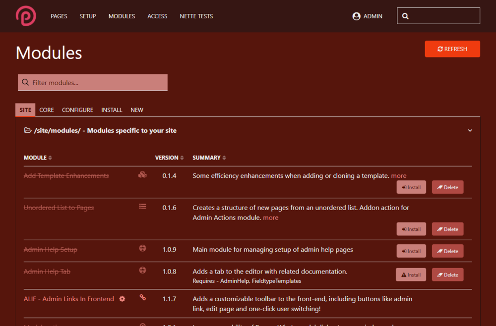
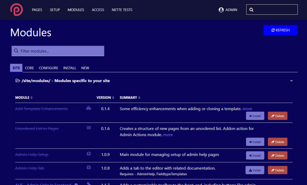
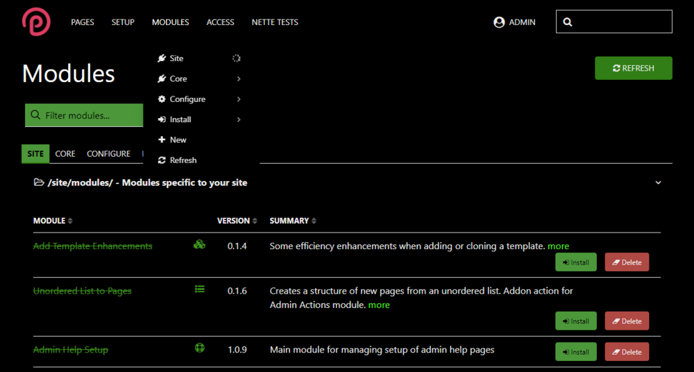
As I've been working through an admin theme structure that would allow me to add 1-3 colors and relationship types that would generate accent and different primary, secondary and muted colors for UIkit. There have been a number of interesting bumps along the way connected to color and contrast and this has led me through several rabbit holes that might save folks some time as they look to build their own admin theme and find themselves unsure about how to wrangler the color contrast issue. So I started with a basic color input and calculated a number of additional colors. I started with red. in LESS, I set up a few rules to calculate and arrange different colors: @base-dark-15-desat: darken(@base-color,15); @base-dark-30-desat: desaturate(darken(@base-color,30),20); @base-dark-35-desat: desaturate(darken(@base-color,35),50); @base-light-15-desat: desaturate(lighten(@base-color,15),50); @base-light-15: lighten(@base-color,25); @base-dark-15: darken(@base-color,25); @base-dark-35: darken(@base-color,35); Originally desaturated the first one, but changed my mind. All of these colors seemed to work fine for the base of #ff0000 although I needed to provide a little tweaking to get the link color usage right, because I found that when I chose other color, the contrast of the link text against the background didn't always work. It was fine for buttons and other navigation, but not link text on the main background. Blue and green, for example: The blue of the button, if applied to the link text above, would have been too dark of a contrast. In stead I brought the lightness up and it gets a sort of periwinkle tone. Green was dramatically dark: Now this piece took me down my first rabbit hole - what exactly was desaturation, lighten and darken doing to achieve their result. My assumption was that they were mixing with white or black - which LESS can certainly do. That's not what was happening here. LESS convert colors to HSL before running any color functions. And the percentage argument that comes with the lighten and darken commands does not actually brighten or darken the color by the percent you specify. Instead, it sets the absolute luminance value of the HSL value of the color to the value you state. Throw desaturation on top of that process The problem is that not all luminance values are equal. You can have two very different colors that appear to have different brightness levels, but their luminance levels are identical. If a luminance level is dark enough or light enough, using lighten will flatten the color to white, and darken will flatten the color to black. The percentage that merely dimmed the red color to a deeper brick red in combination with desaturate turned the base green color black. What can be done? It is possible to get the luminance value for a color through: lightness( color ); Then that value can be multiplied by a float between 0.01 and 1 to get an adjustment that can be added to the adjustment. This provides a percentage change from whatever the lightness level is that a color intrinsically has. But this feels a bit janky. Moving on to the next topic, and one that really captured by attention for a few days - complementary color calculation. The formulas here were similar to the single color variant - with the addition of a LESS complement calculation: @base-contrast: difference(@base-color, #ffffff); @base-dark-15-desat: darken(@base-color,15); @base-dark-30-desat: desaturate(darken(@base-contrast,30),20); @base-dark-35-desat: desaturate(darken(@base-contrast,35),50); @base-light-15-desat: desaturate(lighten(@base-color,15),50); @base-light-15: lighten(@base-color,25); @base-dark-15: darken(@base-contrast,25); @base-dark-35: darken(@base-contrast,35); This was strange to me. I was expecting violet as a complementary color. Not so, there is a rabbit hole (and a controversial one at that) connected to the legacy use of subtractive color spaces and additive color spaces. This article (and the connected libraries on github) explained it quite well: https://blog.daveeddy.com/2014/07/01/red-yellow-and-blue/ My expectation was connected to the RYB color wheel: not the RGB color wheel: So now, the thing about this situation is that even the CYMK color space - which developers and designers understand to be dull and muted when presented on monitors - is different still than RYB space, as it uses a more extensible primary color scheme that can cover gamut ranges that RYB can't touch. And yet, for some reason, RGB strikes me as having a lot of garish colors while RYB colors produce a warmer space. He's got a fun color picker for nostalgic folks like me: http://bahamas10.github.io/ryb/ Again, like the luminance cludge, trying to bounce around color space to get the effect I want led me to wonder - how are contemporary apps doing it? What color space are they using to work out all the accessibility and contrast issues? This led me to look into HCT - hue, chroma, tone - color space that is used by Material Design 3: https://m3.material.io/styles/color/dynamic-color/overview Really cool conceptually, the science behind the new color space is described in detail here: https://material.io/blog/science-of-color-design Regarding the issue we run into with LESS using lighten/darken - they give a great example of four colors that have the luminance but perceptually vary considerably in brightness: I haven't finished running calculations on how to best address color selections for contrast scores but these items gave me a lot to think about. There are Material 3 dev libraries available - I'll probably check them out this week. https://github.com/material-foundation/material-color-utilities My guess is that this sort of color comparison goes into Chrome's contrast scoring? Being able to use a library to automatically calculate appropriate contrast color sets will probably end up being a better alternative to using LESS functions in the future.
-
Hello, I'm working my admin.less into an admin style module and would like to break out .less files into a directory where the rule overrides required by the theme for any given module are only included when the module matching the name is selected. I figure there's no reason to include LESS definitions/overrides when a module is not being used on a site. I could pull a list of filenames that follow the convention /styles/modules/ModuleName.less and then run $modules->isInstalled() calls I guess, but I was wondering if there is a call that I am missing that returns an array of installed modules - either site or core that I can iterate on.
-
As an aside, I started using Settings Factory for this - it's an interesting alternative if you ever want a combo setting that isn't tied to a page, but it does require some scripting knowledge to configure. Not meaning to derail from the combo discussion.
-
It is something I have used a little bit when the alternative would be too many additional fields created in the list that are just taking up space. Say if I have a set of fields that I know are only going to be used in a single field group, it makes sense for me to store those in a combo field because I never plan on calling them independently. For example, if I have a product, odds are good I may pull the product title in a number of different contexts, and perhaps prices and variants - so I'll set up normal fields for those. But things like manufacturer, dimensions, weight, checkbox features, warranty length, UPN etc. are things it doesn't necessarily make sense to have a separate field for because outside of the context of recalling a particular item/page, those fields are never referred. I see it as the difference between having a sort of 'local' field group where everything is 1:1 and bound to view together, vs a 'global' field where I may want to include it of view in it context with other templates, other indices, other tags, etc. That being said, I have also run into situations where I have a value that originally is in a combo field, but then we discover that we want to actually build that piece of information out into a separate template entity - so it is most valuable when you plan ahead. Things like testimonial entries, product reviews, these each have multiple fields, but honestly, they could each be put on a card and stored away - there is no real value that any single field in the group has independent from the card - indeed, sometimes having the information in separate places can sometimes make the information more confusing and less valuable.
-
Not really. The difference being that wordpress assumes you are wanting to write a blog, and as such there are a reliable set of core fields and design expectations that are the bare minimum and take into account the minimal technical back-end file structure required to accommodate 'the loop'. The good news is, you don't have to use a template that is that sophisticated for Processwire. ANY HTML template will do - even from an old static website. And since every field is essentially a custom field (like ACF or pods) it takes very little effort to convert an existing static HTML design with slices into a template that Processwire can use. The simplest form for using regular HTML is probably the 'direct output' strategy: https://processwire.com/docs/front-end/output/direct/ To get that sort of simple construction methods for Wordpress quickly you often need to use a tool like Pinegrow that can take a static HTML template and split it up appropriately into the various default template files and structure that Wordpress can accommodate. But it you are already going that far, you may as well develop it yourself.
-
There are a number of older modules that still work just fine, generally speaking there is generally not a lot of compatibility breaking upgrade during the core upgrade cycle. It's also not necessary to upgrade to the latest and greatest dev version - there is always a stable release channel and a development channel - which channel you choose to put in production is ultimately up to you. Kongondo has stuff on his own site. https://processwireshop.pw/plugins/dynamic-selects/ When you view the fields list, it shows you how many pages use that field and clicking that number will give you a list. You can also get lister pro which allows you to create remembered custom lists based on any number of criteria, including selectors to check if a field is filled out or empty. For your purposes of analyzing field use, this is one I'd definitely recommend - it is also possible to edit value within a lister. https://processwire.com/store/lister-pro/ There is a version of Lister included in core but it doesn't have the ability to remember/save listers as pages or edit-in-place.
-

Weekly update – 28 October 2022 – TinyMCE Inputfield released
gornycreative replied to ryan's topic in News & Announcements
I always loved working with the Tinymce customization rather than CK, very excited to see how it has evolved! -

Strange admin theme settings inline style definition
gornycreative replied to gornycreative's topic in Themes and Profiles
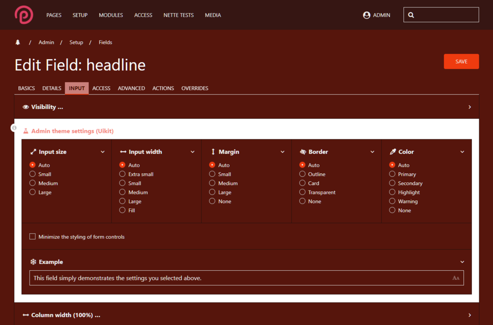
Looking into it further, I believe it is being caused by a jquery ready() function call in \wire\modules\AdminTheme\AdminThemeUikit\config-field.js: $(document).ready(function() { $('#_adminTheme').find('input[type=radio],input[type=checkbox]').change(function() { updateAdminThemeUikitExample(); }); $('#_adminTheme, #_adminTheme > *').css('background-color', '#fff'); // <--- This seems to be the culprit. updateAdminThemeUikitExample(); initAdminThemeUikitColumnWidth(); }); @ryan Is there a reason for this rule being set? Commenting out this line resolves the behavior. -
I'm trying to override an element inline style definition that seems to possibly be part of core? It appears on a minimal install but I'm having a hard time isolating where it is getting injected in order to disable/override it: This admin theme settings fieldset has an inline definition: style="background-color: rgb(255, 255, 255);" It appears on the input tab on fields across the board.
-
This is something I recently picked back up to try to finish, it's a bit tedious depending on how many modules/features you want to cover. I wrapped styles in a .dark style rule in my less so that I could get the added specificity I wanted rather than use !important to override. It doesn't work for all modules (as some create pretty specific rules themselves that need a slightly different approach - like AdminOnSteroids - that are higher in the DOM than your typical rules.) Sometimes I have to insert the .dark selector deeper than a style applied to html, for example in a given rule. I included the dark class in the body tag in my _main.php override. When I stopped I also recall there was quite a bit of !important css rules set in the image editing popups and image fields styles in core - I started making headway with it and then had to step away. I haven't gone back to see if that has improved. I'm doing a bit of refactoring now to try to consolidate rules and get the options that I want. The uk-inverse is not exactly what it appears to be. It gets used when you need light content in spaces where you otherwise get dark content by default - particularly in nested cards/sections/overlays and such. There are global inverse color rules that have a uk-inverse wrapper similar to the dark wrapper I described above, but it can be unpredictable in nested elements sometimes. In our case, though, with the content bring generally light, uk-inverse would provide dark text and assumes a lighter primary color IIRC. I really like the toggle idea. In theory you could then just include the .dark class wrapper conditionally in the template override. EDIT: Looking at different approaches, I guess I was approaching the toggle as more of a real-time DOM class change with jquery, but maybe it is better to have different variable sets that load for different color options. I'm going to play around some more with it.
