Leaderboard
Popular Content
Showing content with the highest reputation on 08/12/2025 in Posts
-
SSE (Server-Sent Events) would be a game-changer for ProcessWires core, and the trash functionality example perfectly illustrates why: The Current Problem: As you mentioned, the current trash system is painful - deleting hundreds of pages requires multiple confirmations, long waits, and often timeouts. Your clients shouldn't need API knowledge just to empty their trash efficiently. How SSE Solves This: One-click bulk operations: Start deleting 1000+ pages with a single confirmation Real-time progress: "Deleting page 234 of 1000..." instead of a frozen screen No more timeouts: SSE keeps the connection alive, bypassing PHP execution limits Graceful interruption: Users can safely stop/pause operations if needed Beyond Trash - Core Benefits: I have written several converter or importer modules for my clients, that import data and transform them into pages or a payment matcher module, which compares bank statements with invoice pages inside of ProcessWire. For all of these modules I wrote custom SSE Event handlers myself which is much boilerplate and duplicated code as Bernhard mentioned. Imagine every ProcessWire installation having this built-in: Import/export operations with live feedback Batch page operations (move, publish, unpublish) Asset processing (image optimization, file management) Search index rebuilding Module installations and updates Why Core Integration Matters: Standardized approach: All modules can use the same SSE implementation Better UX across the board: Every long-running operation becomes transparent Developer-friendly: No need to reinvent the wheel for each module Professional feel: Matches modern user expectations from enterprise CMS Addressing Adoption Concerns: I can't predict what percentage of users would use this feature - nobody can provide statistics for something that doesn't exist yet. But consider this: every ProcessWire user who has ever dealt with timeouts, batch operations, or large imports would benefit immediately. The feature would be invisible to those who don't need it, while being invaluable to those who do. Your modules already prove SSE works brilliantly with ProcessWire. Making it core functionality would elevate the entire ecosystem.3 points
-
Thanks @ryan - it's no longer blurry, which is great, but it's still got jagged edges due to that #pw-morph-threshold) filter. With the filter on: and with it off: Sorry, but it really looks unprofessional as is. I know it's intended, but it doesn't provide any good purpose to have it that big - it just hides the important stuff below the fold. And on bigger screens it's comically large (as noted by @psy).3 points
-
You're right of course! Contentful has been the leading commerical headless CMS for quite a long time, so they are doing something right. I was asked to build a site with it about 10 years ago - I declined because I loved working with PW and couldn't understand the reason to spend so much on a commercial service like Contentful, but they are definitely successful - there are some very big names on this list: https://trends.builtwith.com/websitelist/Contentful2 points
-
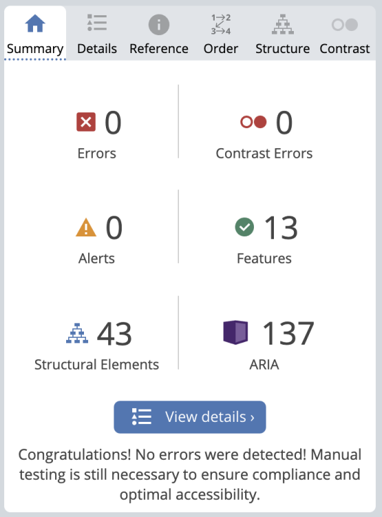
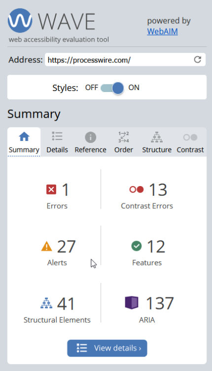
@DV-JF I was focused on making Lighthouse happy before, but I've put in some updates to make that Wave tool that you linked happy too. I can't duplicate the flickering you saw on mobile, what device and browser are you seeing it on? I'm testing with Chrome on Android 16 and an iPad with Safari on latest iOS.2 points
-
2 points
-
2 points
-
This week I’m thrilled to report that we have a new website online. The site was designed by @jploch and @diogo of KONKAT Studio in Hamburg Germany. Here's a short announcement post about it— https://processwire.com/blog/posts/processwire-website-redesign/1 point
-
@adrian To be fair both are very nice sites. I see so many sites, and I like to look through the lens of how memorable it is. Like whether there's anything strongly unique or surprising that makes me want to click further inside, and hooks into my memory so that I can recall it later. That's what I'm missing from the Contentful site, even if it is nicely designed. As a visual learner, I'm drawn in by bold visuals and anything that makes a site different from any others. That's also what I'd like to communicate about PW, as something different from the Contentfuls, Wordpressers, and Drupals of the world. On the PW site, the large headline is unexpected/surprising, and whether one likes it or not, it's memorable, bold and stands out from the crowd. Likewise with the abstract animations, they communicate the concepts (to me and I'm sure others) in a way that text just doesn't. There's plenty to read for the book learners too. So whether one subjectively likes some of these things or not, I think it will prove to be memorable and engaging, and good for gaining new users.1 point
-
Firefox Ver. 141.0.3 (Build #2016106991), null GV: 141.0.3-20250806102122 AS: 141.0.1 OS: Android 16 Device: Google Pixel 6a Thank you for having a look at accessibilty.1 point
-
Can I humbly make an overarching statement on my thoughts about website design. I think there are certain types of sites that should have artsy, flashy, animated content and large fonts - these can make the right impression and be part of the visual experience. But when it comes to technology, I think clean, simple, and free of distractions is needed. Take a look at how clean https://www.contentful.com/ is and compare with https://www.sanity.io/ which is mess of moving stuff that I just want to gloss over. I also think you might have missed a key marketing point - "headless"1 point
-
@Tiberium I have another way to attack this so I'll put together another commit on that branch and let you know. Unfortunately adding an ability to manually assign languages like the TranslatePage module would be a heavier lift than you might think since there are more features that Fluency uses. It would require rewriting the module config page for DeepL. The true solution is to make sure that the module performs correctly for everyone and preserve the UI that people are familiar with. It wouldn't be a good move to require some people who are having difficulty with API calls to forego features that are available to others who aren't. So I want to get this right for everyone 👍 Hold tight, I'll come back with another test. Please expect that via private message so we can more easily converse without adding too many more posts to this thread. When the issue is solved I'll come back and post a new release.1 point
-
@elabx you might want to use this approach and create a dynamic runtime superuser: https://github.com/baumrock/RockShell/blob/64a453a518e11dc445ae451bf1ca2d5e30126ef6/App/Command.php#L588-L590 $su = new User(); $su->addRole("superuser"); wire()->users->setCurrentUser($su);1 point
-
@ryan - my screen is the 16.2" Liquid Retina XDR display 3456 x 2234 native resolution at 254 ppi so I am definitely on a hi dpi screen. But your changes do fix the static text for me.1 point
-
@adrian Okay I think I figured it out. The jagged text is only visible on non-hidpi screens. My dev computer (iMac 27") has a hidpi/retina display, and there was no visible jagged text in any browser. But as soon as I tried it on a non-hidpi screen, I was able to see the jagged text. I've adjusted it so that the filter is completely removed except when it's transitioning between two words. So a few jaggies when animating, but otherwise not. It seems to improve it a lot on the 72 dpi screen I'm testing with here. How about there?1 point
-
I've built this over and over in several of my modules (RockDevTools for Livereload, RockCalendar for creating events). Always a lot of work. Always a lot of boilerplate code. Always a lot of issues to fix. I think it's time to bring SSE (Server Sent Events) to everybody. Simple example (Empty Trash): Client-Side: // create stream const stream = ProcessWire.Sse.stream( 'ssedemo-empty-trash', (event) => { const textarea = document.querySelector('textarea[name="empty-trash-status"]'); try { let json = JSON.parse(event.data); stream.prepend(textarea, json.message, 100); } catch (error) { stream.prepend(textarea, event.data); } } ); // update progress bar const progressBar = document.querySelector('#empty-trash-progress'); stream.onProgress((progress) => { progressBar.value = progress.percent; }); // click on start button document.querySelector('#empty-trash').addEventListener( 'click', (e) => { e.preventDefault(); stream.start(); }); // click on stop button document.querySelector('#stop-empty-trash').addEventListener( 'click', (e) => { e.preventDefault(); stream.stop(); }); Server-Side: public function __construct() { parent::__construct(); /** @var Sse $sse */ $sse = wire()->modules->get('Sse'); $sse->addStream('ssedemo-empty-trash', $this, 'emptyTrash'); } public function emptyTrash(Sse $sse, Iterator $iterator) { $user = wire()->user; if (!$user->isSuperuser()) die('no access'); $selector = [ 'parent' => wire()->config->trashPageID, 'include' => 'all', ]; // first run if ($iterator->num === 1) { $iterator->max = wire()->pages->count($selector); } // trash one page at a time $p = wire()->pages->get($selector); if ($p->id) $p->delete(true); else { $sse->send('No more pages to delete'); return $sse->stop(); } // send message and progress info $sse->send( $iterator->num . '/' . $iterator->max . ': deleted ' . $p->name, $iterator ); // no sleep to instantly run next iteration $sse->sleep = 0; } Code + Readme: https://github.com/baumrock/SSE/tree/dev What do you think? Would be nice if you could test it in your environments and let me know if you find any issues!1 point
-
@FireWire unfortunate, that doesn't solve it. I remove (+delete) the plugin, refresh the modules and then installed the apiDeleay branch. What is a difference, between TranslatePage and Fluency is, that you have to connect the locals manual, in the language page: The fluency "way" is more comfortable, but since that is the curlprint, would be a fallback option reliable? Like to deactivate the automatic calling for language options and set it manual? Or is that a "Correlation vs. Causation" observation from my side? ========== Thank you for taking the time and publish testing branches! I know it is very hard to debug something, that is not seeing on the own side.1 point
-
1 point
-
@taotoo Thanks, fixed the animation in Firefox. It turns out Firefox needs the SVG filter to be visible, so had to remove the "hidden" attribute and move it off screen with absolute position. I don't know what's up with the MS Edge appearance (I don't have that environment to test in) but if you find what it is, please let me know. @poljpocket I prefer to stick with the term CMS and guide folks into the CMF side of things, since the term isn't so widely known/used. Though I'll continue to use it, just not front and center. @adrian Blur issue should be fixed. The large text size on the homepage is intended. @Alexander That assertion is incorrect. The metrics say this redesign was long overdue. But you are right about a performance issue with the desktop version of Safari (only) related to not using the GPU, I'm working on it.1 point
-
1 point
-
@ryan - the demo site (still linked from the new site) is still showing that .htaccess needs updating error (has been for a very long time) and running an old version of PW and the old theme. All fields and templates need to either have an icon or no icon - it looks messy with the alignment in those dropdowns when there is a mix. Maybe minor, but these details are what makes a project look professional or sloppy.1 point
-
@monollonom It looks like that width:100%; on the uk-card-body is something I added last minute for some reason, I don't know why. I removed it and it seems to correct that issue that was appearing for "other modules by author" list. Hopefully I didn't break something else by removing it. 🙂 I tried the CSS trick you mentioned (very cool!), but I'll have to return to it when I've got more time. For whatever reason, it added an underline to the text and no amount of text-decoration: none !important; seemed to be able to cancel it. @adrian Thanks, code examples fixed. I'll return to the image thing, I may have to cancel that rule for images in the modules directory.1 point


