-
Posts
429 -
Joined
-
Last visited
-
Days Won
16
jploch last won the day on March 18
jploch had the most liked content!
About jploch
- Birthday 05/02/1985
Contact Methods
-
Website URL
http://janploch.de/
Profile Information
-
Gender
Male
-
Location
Hamburg, Germany
-
Interests
Graphic Design, Web Design, HTML/CSS, Javascript
jploch's Achievements

Sr. Member (5/6)
505
Reputation
-
The toughest challenge so far? Being our own client. Actually, the website we launched back then was just a placeholder, and the plan was to quickly replace it with a proper portfolio website. But as is often the case, it ended up taking a little longer than expected. A year later, we’ve finally done it: Our new website is live! https://konkat.studio/ The goal of the new website is to showcase our work and better communicate our services. The site is bilingual and was built using ProcessWire and PageGrid. More on that later. In addition to the website, we’ve also evolved our visual identity and logo. KONKAT (from concatenation) stands for linking individual elements into a functional whole. Our new branding makes this connection visible. In our case, we combine strategy, design, and technology into a unified process. The logo mark communicates this as well; as most of you probably know, the += operator in JavaScript joins elements and assigns the result. It took us some iterations to get the design right, but once the design was done, development was pretty straightforward. Most of the time was spent preparing the content for the projects, and that is also where PageGrid was super useful since it allowed us to design the layout and content of each project individually. Backend view: Managing project content and layouts with PageGrid. PageGrid also significantly sped up development, as we built all other pages using only its core blocks. For the projects overview, for instance, we used the datalist block to automatically generate the listing from our project pages, working perfectly out of the box without any custom logic. We also added some custom code where it made sense, e.g. the scroll animation on the homepage was just a bit easier to achieve with custom code (it uses native CSS sticky). Backend view: Using Pagegrid's inline editing to update some text on the english version auf our services page. Another great thing is that PageGrid takes care of lazy loading images and videos (using the famous lazysizes js plugin) and is caching its content automatically. As a result, we got a 100 on the Google Lighthouse test on desktop and 99 on mobile without any extra optimizations (we are not using Markup Cache or ProCache for this site). Backend view: Editing a thumbnail on the homepage If you have any further questions regarding our workflow or process, feel free to ask. I will do my best to answer them. Also, please let us know if you find any bugs, since the website is brand new, there are probably some we haven't caught yet! We also welcome any feedback you may have. Best, Jan & Diogo (KONKAT)
-
If you just want to sync the fields and templates you can also try the native fields/templates export/import. For most fields this works quite well. Thats how I usually do it. Sometimes I also do it the other way around and import all the pages that have changed from production to local with the native page export/import and than export the whole database (using ProcessDatabaseBackups module) from local and import that on the production site. RockMigrations is also great and I have used it for more complex stuff. One thing I did not find in RockMigrations is the option to migrate pages. Can that also be done?
-
Hi ausblick, I'm happy to answer your questions. Basically, these are topics that for the most part don't specifically concern PAGEGRID, but rather ProcessWire in general. In ProcessWire, site profiles are essentially preconfigured starting points for a new site. They define the structure, templates, fields, and sometimes demo content that get installed when you first set up ProcessWire. Unlike themes in WordPress, which can be changed later, site profiles are installed together with ProcessWire when you first setup the site and can't be changed later. PAGEGRID supports the creation of site profiles, and there are currently two smaller PAGEGRID profiles that can be installed (click the thumbnail to see the frontend). However, these are currently only available in PAGEGRID Cloud. If you want to try them quickly, you can create a free cloud account. Cloud sites can then also be exported as a site profile (with a self-hosting license). But I can also upload them here as ZIP archives if you prefere. For my projects I usually don't use site profiles. Since PAGEGRID allows you to install pre-built blocks (which create all the templates and fields for you), it's already a good starting point for a new website. All you have to do is add the blocks you want to your page and design them using the style panel (visually) or with CSS code. Since my websites usually look very different from each other, I prefer blocks that are largely unstyled by default. Yes. Procache works with PAGEGRID. But it is not really needed since PAGEGRID is already using markup cache for all it's output. If you build a site that is mostly rendered through PAGEGRID it will be very fast out of the box, without any additional customisation. E.g. page-grid.com which is build with PAGEGRID has a performance score of 100 (best score) in Google lighthouse speed test and is not using any additional caching. First you have to add a PAGEGRID field to your home template inside the admin. Then open the file home.php inside your site/templates folder and add the following lines: <div id="content"> <?= $pagegrid->styles($page); ?> <?= $pagegrid->renderGrid($page); ?> <?= $pagegrid->scripts($page); ?> </div> Note in this example I am using the blank site profile and markup regions are enabled. The #content div in this file will replace the #content div in _main.php See the Markup Regions documentation for more information.
-
PAGEGRID makes no assumptions about CSS or markup. This means that all CSS frameworks also work with PAGEGRID. I don't work with CSS frameworks myself, so I can't really recommend any (I prefer to use modern vanilla CSS like variables, grid, etc.). But I think it's totally fine to use them. I don't think it will have big impact on performance (depending on how large the CSS file for the framework is), just make sure to load your CSS fraemwork files inside the <head> tag so it's not blocking the rendering of your page. There are basically two approaches to working with PAGEGRID, but these can also be combined: No-code approach: You can create entire websites with PAGEGRID without writing any code yourself. To do this, you can use the “Ready-Made Blocks” and create CSS classes and styles with the Style Panel. This works similarly to Webflow or Figma and is particularly interesting for people who want to customize their website visually (which can be faster then doing it in code). Code only: If you prefer to work in code, you can disable the Style Panel in the PAGEGRID settings (Setup > PAGEGRID). You can then use any CSS framework with PAGEGRID. If you want to use your own CSS code or a framework, you can load it into your page template (take a look at the pagegrid-page.php template as an example). If you want to create your own blocks, you can copy the ready-made blocks from “site/modules/PageGridBlocks/blocks” to your “site/templates/blocks” folder and customize the markup there (e.g., add classes and markup for your CSS framework), or create your blocks from scratch. Learn more here: How do I create my own blocks? or here: how styles work in PAGEGRID. Here is an example of an accordion block using the UIkit framework as an example: <?php namespace ProcessWire; ?> <!-- UIkit accordion block using PAGEGRID's children option --> <ul uk-accordion pg-children="true" pg-children-label="Accordion Items" pg-children-tab="append" pg-autotitle="false" pg-wrapper> <?php foreach ($page->children() as $item) : ?> <li> <a class="uk-accordion-title" href><?= $item->title ?></a> <div class="uk-accordion-content"><?= $pagegrid->renderItem($item) ?></div> </li> <?php endforeach ?> </ul> In this example we use PAGEGRID's children option to render the accordion items (as child pages). Users can then add child items using the backend editor. You could also use repeaters to render the child items for PAGEGRID. The point here is that you can easily add whatever markup is neede for your CSS framework by creating your own custom blocks.
-
Unfortunately, only my PageGridBlocks are available so far. But it would be nice if the community created and shared their own blocks as well. My PageGridBlocks module makes it easy to install and uninstall block templates. It could be a good starting point for others. Another good option would be Bernhard's RockMigrations module to create the block templates. I think it would be best if those blocks would be installable as modules. It would be cool, for example, if someone created blocks for a specific CSS framework. Since I don't work with frameworks myself, this isn't particularly useful for me. However, there seem to be many people in the PW community who work with frameworks. If someone were willing to create and share their own block library, I would be happy to grant that person free access to PAGEGRID.
-
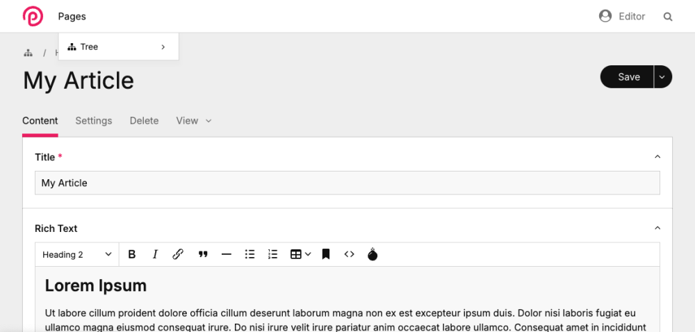
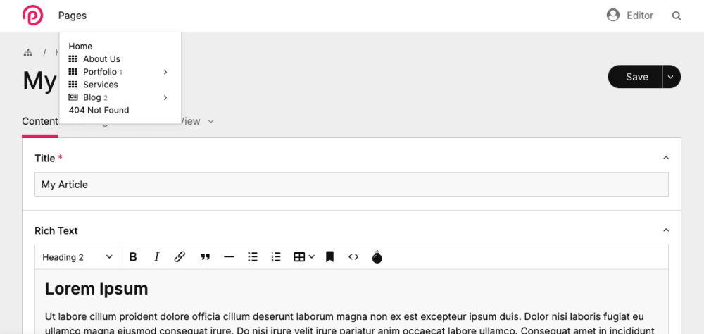
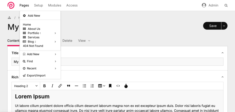
AdminQuickTree This module is great for productivity when editing many pages within the admin, as it gives you direct access to the page tree navigation without having to hover the tree icon first. Download from Github Donwload fom Module Directory For non-superusers the page dropdown currently looks like this (if no bookmarks are defined): With this module it looks like this: For super-users or users with all permissions set it looks like this: These changes are achieved width a small js file that triggers the ajax tree navigation after the dom has been loaded. While I have tested it already a bit, I release this for now as a beta version. I hope others find it useful as well.
-
- 11
-

-
- admin helper
- admin-ui
-
(and 1 more)
Tagged with:
-
I think we need both. Clients usually ask what CMS the developer uses and more often then not visits the website. So the website should also help the developer to convince the client.
-
We are still targeting developers. But we are trying to be more accessible. Many of us where not trained developers when we started to use PW. And programming can feel intimidating. For example Diogo and I where designers and then became developers when we discovered PW. The great thing about PW is that it’s relatively easy for beginners to get started. Even with little coding experience. I think it’s not a bad idea to make PW approachable for more users.
-
Thank you for your feedback! And thanks to @ryan for the technical implementation. I am currently on vacation and am only now able to respond here. I understand that it takes some time to get used to change, especially when you are attached to something. And there will always be different evaluations and opinions about design. However, it is important to me to say that there are reasons for our design decisions and that they were not made arbitrarily. Due to time constraints, I will only be able to address a few points here. The overarching theme of the design is “friendly flexibility.” All design decisions were made to emphasize this theme and find a consistent visual language. With the new design, we want to appear less technical and also include user groups other than developers, such as designers, marketers, and editors/content creators. At the same time, we want to differentiate ourselves from other comparable CMS products and highlight PW's uniqueness. The morphing animations are intended to communicate the versatility and flexibility of PW and engage users. For example, we used many adjectives on the old site (flexible, stable, secure, open, free, powerful, etc.) and our idea was to communicate this directly in the first headline. The font (“Apfel Grotesk”) we used has many curves and a friendly character, which is especially noticeable when used in larger headlines. The colors used have been part of PW's branding from the beginning, so we thought it would be good to continue using them. By mixing these colors, we want to communicate versatility again and move away from the rather technical and dominant blue of the old site. We also greatly reduced the amount of text per scroll on the homepage, because we felt the old site was lacking visual hierarchy and felt to crowded. We have a much more guided flow on the homepage now that makes users actually read the text and it's easier to scan the content. We have also improved the visibility of features and modules and adjusted the navigation structure. I can provide more details on this when I have more time. I hope it adds some context to our decisions.
-
Thank you all for testing and providing feedback! The latest dev version has many bug fixes and improvements for the new theme. Check out Ryans post for more details. If you find any issues please post them here.
-
Just adding this here as note for me and others. There is also an alternative way to append custom markup to an inputfield: $inputfield->appendMarkup('<div class="test">Hello</div>');
-
We did a skin on top on an existing theme, it was never the plan to add a lot of new features. Thats why we did not ask for feature ideas. It's mainly a design release.
-
@bernhard We value your input very much and I think you are a blessing to the PW project. But currently I am focusing on covering the general design concerns. Since Diogo is out of office I would like you to give us some time for a proper response. But let me quickly address one of your main concerns. I agree that we should make an effort to keep the CSS layers as low as possible, at the same time I see a lot of benefits of CSS vars (also for module development, e.g. for PAGEGRID in my case, we can get into that later). Initially Diogo had the idea to base the new theme/skin on the stripped down version (without the reno-less files) you are using. I'm not sure what impact that had at the time or why we didn't do it. And maybe there's something I'm not considering at the moment, but to me it makes perfect sense to remove all Reno styling from our theme and use the base UIKIT as a foundation.
-
Thanks for the feedback. We have a color for Delete/Error/Danger, that should be used in this case. I would consider it a bug if that is not the case. Adding the class "uk-button-danger" should do it, but that doesn't seem to work. We will fix it, I think we need to carefully go through the UIKIT docs and cover all the color based classes they are using. It should look like this: on a side note: To me the contrast of the secondary button of the original theme is way to low, I know that it is supposed to be muted, but it is barely readable. And the blue field title on light blue background is also to low in contrast.


