-
Posts
115 -
Joined
-
Last visited
-
Days Won
22
Everything posted by Mikel
-

GitSync – Keep your (private) modules in sync with GitHub
Mikel replied to Mikel's topic in Modules/Plugins
Update: Improved "Link Module" UX We had an internal discussion about the "Link Module" interface and optimized how the different states are handled: Match found – The repo is resolved and ready to link. The green link opens the repository on GitHub so you can verify it's the right one before linking. This appears instantly when the module declares its GitHub URL in getModuleInfo() or has been resolved before (cached), otherwise after a quick GitHub search. No repo found – ProModules like RepeaterMatrix have no public GitHub repo. GitSync shows a clear "No repositories found." instead of false matches. Multiple repos – When a module exists in several repos (forks, different maintainers), you get a list to pick from. Selected, with "change" – After picking one, a "change" link lets you switch. It only appears when there are actually alternatives. Other improvements: single results are now auto-selected (no unnecessary click), the GitHub search uses Code Search API for exact .module.php filename matching (works even when repo name ≠ class name), and results are cached client-side so re-selecting a module is instant. Cheers, Mike -
Hey folks, we at frameless Media often develop across multiple devices – laptop, tablet, sometimes even from a phone with an AI coding assistant. Git is our single source of truth, but getting those changes onto a staging or production server has always been annoying. Especially on shared hosting where there's no SSH, no git, and git-based FTP via YAML configs is more hassle than it's worth. We also frequently need to test new modules directly on shared hosting environments where the server setup differs from our local machines. Manually uploading files after every push? No thanks. So we built GitSync. 🎯 TL;DR: ✅ Link any installed module to its GitHub repo ✅ See all branches and their latest commits ✅ One-click sync – only changed files are downloaded ✅ GitHub Webhook support – auto-sync on every push ✅ Works on shared hosting – no git, no SSH, no cron ✅ Private repo support via GitHub Token What's the difference to ProcessUpgrade? ProcessUpgrade is great for updating published modules from the PW modules directory. But it tracks releases, not branches. During development, when you're pushing to `develop` or `feature/xyz` ten times a day, you need something different. That's where GitSync comes in. 🚀 How it works Install the module, add your GitHub Token (optional for public repos) Go to GitSync > Add Module, pick any installed module from the dropdown GitSync searches GitHub for matching repositories automatically Link the module to a repo + branch – done From now on, you can sync with one click. GitSync compares file hashes locally and remotely (using the same SHA1 blob hashing that git uses internally) and only downloads what actually changed. No full re-downloads, minimal API usage. Want it fully automatic? Set up a GitHub Webhook – enter a secret in the module config, point the webhook to `https://yoursite.com/gitsync-webhook/`, and every push triggers an automatic sync. The module overview shows a ⚡ webhook badge on auto-synced modules so you always know what's wired up. The real power: remote development with AI 📱 You're on the train, phone in hand, chatting with Claude via the Claude app. Claude writes code, commits to a feature branch on GitHub. GitSync picks up the webhook and syncs the module to your dev server. Automatically. You open the edited webpage on your phone, check the result, give feedback, iterate. The entire development loop without ever opening a laptop. 🤯 This works just as well for teams: multiple developers push to GitHub from different machines, and the staging server always reflects the latest state – no manual deploys, no SSH sessions, no FTP. We've been using a prototype internally for a few weeks now and it's become part of our daily workflow – especially the webhook auto-sync is something we don't want to miss anymore. As proof of concept we built the public release entirely as described above 😃 Technical details for the curious The differential sync works like GIT itself: every file's content is hashed as `sha1("blob {size}\0{content}")`. GitHub's Trees API returns these hashes for the entire branch in a single request. GitSync computes the same hash locally. Matching hash = identical file = skip. Requirements ProcessWire >= 3.0 and PHP >= 7.4 with cURL Module and Docs 👉 GitHub: https://github.com/frameless-at/GitSync 👉 Module Directory: https://processwire.com/modules/git-sync/ Would love to hear your thoughts, ideas, and edge cases we might not have considered! Cheers, Mike
- 1 reply
-
- 10
-

-

-
Hey everyone, on a recent client project we had to deal with a large number of Markdown files that needed to end up as regular HTML content on ProcessWire pages. Converting them manually or piping them through external tools wasn't an option – too many files, too tedious, and the content had to be stored as actual HTML in rich textfields, not just formatted at runtime. So we built a small module that handles this directly inside ProcessWire. How it works The module creates a file upload field (md_import_files) and a Repeater field (md_import_items) with a standard title field and a richtext body field (md_import_body) inside. The body field automatically uses TinyMCE if installed, otherwise CKEditor. You add both fields (md_import_files,md_import_items) to any template, upload your .md files, hit save – each file gets converted to HTML via PW's core TextformatterMarkdownExtra and stored as a separate Repeater item. The source filename goes into the items title, processed files are removed from the upload automatically. Template output The Repeater items are regular PW pages, so output is straightforward: foreach ($page->md_import_items as $item) { echo "<section>"; echo "<h2>{$item->title}</h2>"; echo "<div>{$item->md_import_body}</div>"; echo "</section>"; } Tag mappings One thing we needed right away: control over how certain Markdown elements end up in HTML. For example, #headings in Markdown become <h1> – but on most websites <h1> is reserved for the page title. The module has a simple config (Modules → Configure → Markdown Importer) where you define tag mappings, one per line: h1:h2 h2:h3 strong:b blockquote:aside hr:br This performs a simple 1:1 tag replacement after conversion, preserving all attributes. Works well for standalone or equivalent elements like headings, inline formatting, blockquotes, or void elements like hr:br. Note that it doesn't handle nested structures – mapping table:ul for example would only replace the outer <table> tag while leaving thead, tr, td etc. untouched. Requirements ProcessWire 3.0.0+ FieldtypeRepeater (core) TextformatterMarkdownExtra (core) GitHub: github.com/frameless-at/MarkdownImporter Modules Directory: https://processwire.com/modules/markdown-importer/ Happy to hear if anyone finds this useful or has suggestions for improvements. Cheers, Mike
-
- 5
-

-
Hi, everyone! While working on a client project we were looking for a way to let editors apply CSS classes to individual images in rich text fields — quickly, visually, and also in the frontend editor. ProcessWire already has several ways to get CSS classes onto images, so it's worth being precise about what this module does differently: TextformatterFluidImages adds one class to all images automatically — great for img-fluid across the board, but there's no per-image choice. TextformatterImageInterceptor is more powerful: editors tag images in the image field, and the Textformatter applies the corresponding classes at render time. The logic is developer-defined and centralized, which is exactly right when you want consistent, rule-based image treatment. But the class is invisible in the editor, applied only in the frontend output, and editors have to set the tag in a completely separate place from where they're actually working. TinyMCE's built-in styleFormatsCSS is the closest thing to what we wanted. You write CSS, ProcessWire turns it into a Styles dropdown. It works, but the dropdown is generic — it shows all defined styles regardless of what's selected — and there's a known accumulation issue where nothing prevents float-left float-right ending up on the same image. And it doesn't work in the frontend editor. What we needed was simpler: editor clicks an image, picks a style, sees immediately which styles are active, can combine them or remove them individually. No dialogs, no separate fields, no render-time magic — the class goes directly into the <img> tag in the saved HTML, visible and editable right there in the editor. That's what this module does: It registers a context toolbar in TinyMCE that appears as a floating "Image Style" button when an image is selected. For CKEditor the same options show up in the right-click context menu. The class list is defined once in the module settings and works across both editors — no separate configuration per editor type. Each entry shows a checkmark when active, clicking it again removes it, multiple classes can be combined freely. Works in the admin and in the frontend editor. Complete Readme on GitHub: https://github.com/frameless-at/ProcessImageClasses and the module directory. Any thoughts on further improvements welcome! Cheers, Mike
- 1 reply
-
- 10
-

-

module StripePaymentLinks – Simple Checkout Integration for ProcessWire
Mikel replied to Mikel's topic in Modules/Plugins
[Update] v1.0.25 – Multi-Email Account Merge A small but handy addition for real-world scenarios: customers sometimes purchase with different email addresses and end up with split accounts. The new Merge User Accounts tool in the module config lets you consolidate them in seconds. You enter the source email (the old/unwanted account) and the target email (the one the customer wants to keep). The module transfers all purchases from the source to the target and permanently deletes the source account. Before committing, you can run it in test mode to see exactly what would be transferred – no changes are written. Once you're confident, check "Merge now", save, and the merge report confirms what happened. One thing worth noting: the source account is permanently deleted after the merge – so double-check in test mode first. 🙂 Feedback welcome! -

module StripePaymentLinks – Simple Checkout Integration for ProcessWire
Mikel replied to Mikel's topic in Modules/Plugins
Hi Thomas, @chuckymendoza, thanks for thinking this through so carefully — and yes, the bottle analogy is growing on me. 😄 That said, I'd still recommend not rewriting the module for this use case — not because it's technically impossible, but because the wheel has already been invented, and quite well: Option 1 — FormBuilder + Stripe Processor (by @ryan) Ryan's Stripe Processor Action for FormBuilder supports customizable line items via ProcessWire hooks out of the box. You could build a font-family selector form, populate the line items dynamically, and send the whole bundle to Stripe Checkout in one session — exactly what you described. It's not a cart system, but for a single-family "pick your styles" page it could be a very clean fit. Option 2 — RockCommerce (by @bernhard) Released in late 2024, RockCommerce is a modern, lightweight e-commerce module built "the ProcessWire way." It supports cart, checkout, product variations, coupons, payment webhooks, and pluggable payment providers — without the bloat of a full enterprise shop system. Option 3 — Padloper / ProcessWire Commerce (by @kongondo) If you need the most mature, battle-tested solution with a long track record, ProcessWire Commerce is the established open-source choice. Full cart, order management, variants, webhooks — all there. Rolling your own Stripe Checkout Session integration inside this module would mean maintaining webhook handling, session state, download token security, order persistence — all things that are already solved in the tools above. The maintenance burden alone usually kills these side projects. My honest take: for your font-family use case, RockCommerce or FormBuilder + Stripe Processor are the most promising starting points. For anything larger in scope, ProcessWire Commerce has you covered. Cheers, Mike -
[Update] Free Access Display Support (v0.1.7) Hi everyone! Following the latest release of StripePaymentLinksv1.0.23, we've updated this module to match the new free product access — so manually granted product access now shows up properly in all portal views. When a user has products assigned via spl_free_access, those products appear in the portal almost like purchased ones: Grid view: Free-access products render as full active cards instead of grayed-out "not yet purchased" ones. Table view: Free-access rows get a cyan "Free access" badge in the status column. The date column shows a dash (—) since there's no purchase timestamp involved. This makes it immediately clear which products came through Stripe and which were granted manually. Cheers, Mike
-

module StripePaymentLinks – Simple Checkout Integration for ProcessWire
Mikel replied to Mikel's topic in Modules/Plugins
[Update] New Feature: Free Product Access (v 1.0.23) Hi, everyone! We just released v1.0.23 with a new feature based on a real client use case: A client using StripePaymentLinks wanted to grant certain high-value customers bonus access to additional products — no Stripe transaction involved, just a manual override. The solution: a new spl_free_access field (AsmSelect, multi-page) on the user template. Pages selectable in the dropdown are automatically restricted to the configured product templates, so editors only see relevant products — every user in the backend gets a "Free Product Access" field where additional products can be assigned directly. Access granted this way is recognized by hasActiveAccess() — the same internal check SPL uses for all content gating — so it integrates transparently with the existing module logic. The field is created and updated automatically by ensureUserFields(), including template restriction syncing when the product template config changes. Thanks for the request and feedback that led to this improvement! Cheers, Mike -

module StripePaymentLinks – Simple Checkout Integration for ProcessWire
Mikel replied to Mikel's topic in Modules/Plugins
Hi, @chuckymendoza aka Thomas 😉 Sorry for the delay, we´ve been busy and I did not get to read the forum in the past weeks. To put it short: For your use case I would definitely NOT use the module. What you need is some kind of shop system because you want your customers to be able to buy MORE than 1 font at once, don´t you? This is something the module explicitly is NOT made for. So yeah, maybe you can hang a picture with a nail and a bottle, but I'd still recommend the hammer. 😉 Cheers, Mike -

E-commerce recommendations with ProcessWire in 2026?
Mikel replied to ai_slop's topic in Getting Started
We use the StripePaymentLinks module for all projects where a few products or services are sold on landing pages. Typically, these are NOT shops, and do not require a shopping basket. Cross-selling can be implemented directly with Stripe, and the module also covers this. For shop functionality, when needed, we use whatever fits best. RockCommerce, for example, is elegant and can be set up in no time. So you just need to ask yourself: Do I want my customers to be able to buy more than ONE product at the SAME TIME? Cheers, Mike -

E-commerce recommendations with ProcessWire in 2026?
Mikel replied to ai_slop's topic in Getting Started
RockCommerce from @bernhardcould also be a choice: https://www.baumrock.com/en/processwire/modules/rockcommerce/ It's open source meanwhile and has all features of a shop including cart and checkout by external payment provider. Out of the box it’s Mollie, but since it’s an interface class, you can add any other easily. We tested this module a while ago and it was really nice working with it 👍 Also open source since a while is the well known ProcessWire Commerce (formerly “Padloper”) by @kongondo Because it was mentioned: StripePaymentLinks is not recommended when you need cart functionality. Cheers, Mike -

module Introducing Data Migrator – Import SQL/CSV/JSON/XML into ProcessWire
Mikel replied to Mikel's topic in Modules/Plugins
Hi, @Pavel Radvan, thanks for reporting, that was just because of a wrong version number in the modules info.json file. We fixed it, so when you do the update now, it shows the correct version number. cheers, Mike -

module Introducing Data Migrator – Import SQL/CSV/JSON/XML into ProcessWire
Mikel replied to Mikel's topic in Modules/Plugins
Hi, @eelkenet, thanks for the findings! We updated the module to version 1.1.2 that addresses all 4 points: Specific error messages for upload_max_filesize, UPLOAD_ERR_PARTIAL, etc. TheMappingEngine now has multiple fallback strategies title field selection via Dropdown in UI for manual selection All parsers now use max_rows for data limiting Good luck with WP import, that one can be a bit tricky 😉 due to WPs "unique" structure. Cheers, Mike -

module Introducing Data Migrator – Import SQL/CSV/JSON/XML into ProcessWire
Mikel replied to Mikel's topic in Modules/Plugins
Thanks, Ivan. Screenshots are included in the Readme file on Github and the module directory (when module is approved). Regarding Repeater (Matrix) Fields: As the module handles external (non ProcessWire) data structures, what exactly do you mean by „handled“? It is not possible to map data to an existing template/field structure, if that´s what you are asking for. -
Hey, everyone, here at frameless we frequently work with clients who already have a website but aren't happy with it and want us to rebuild it from scratch. Whenever possible, we use ProcessWire for new web projects – no surprise there, given the flexibility and clean API we all love. For smaller sites, migrating content is usually straightforward – a bit of copy/paste and you're done. But for larger projects with hundreds or thousands of records across multiple database tables, this quickly becomes tedious and error-prone. Over the years, we've written various import scripts and parsers to handle these migrations. We finally decided to clean them up and package everything into a proper module that we'd like to share with the community. Introducing: Data Migrator Data Migrator is a Process module that imports external data (SQL dumps, CSV, JSON, XML) directly into ProcessWire's page structure – including automatic creation of templates, fields, and even PHP template files. Key Features Multi-format support – Import from .sql, .csv, .json, and .xml files Automatic type detection – Recognizes emails, URLs, dates, booleans, integers, etc. and maps them to appropriate ProcessWire fieldtypes SQL schema parsing – Extracts column types from CREATE TABLE statements for better field mapping Foreign Key handling – Detects FK relationships and sorts tables by dependency order Dry Run mode – Preview exactly what will be created before committing anything Full Rollback – Undo an entire migration with one click (removes all created pages, templates, and fields) Template file generation – Automatically creates ready-to-use .php template files in /site/templates/ How it works Upload your data file (SQL dump, CSV, JSON, or XML) Review the analysis – the module shows detected tables, columns, suggested fieldtypes, and sample values Fine-tune if needed – override fieldtypes via dropdown, configure FK relationships Run a Dry Run to preview all changes Execute the migration – templates, fields, parent pages, and data pages are created automatically If something's wrong – hit Rollback to cleanly undo everything Requirements ProcessWire 3.0.0+ PHP 7.4+ Links GitHub: github.com/frameless-at/ProcessDataMigrator Modules Directory: /modules/process-data-migrator/ We've been using the methods and classes bundled in this module internally for a while now and it has saved us a lot of time on migration projects. We hope it's useful for others facing similar challenges. Feedback, bug reports, and feature requests are welcome! Cheers, Mike
- 7 replies
-
- 23
-

-

-
Hey everyone! After the StripePaymentLinks module has been running smoothly, a few customers with multiple Stripe accounts asked for better analytics capabilities. The Stripe dashboard is okay, but when you have multiple accounts and need specific analysis, it quickly becomes tedious. StripePlAdmin is an admin interface that displays the data stored by StripePaymentLinks in three perspectives: Purchases: All transactions with customer details, subscription status, renewals Products: Aggregated product performance (revenue, purchases, quantities) Customers: Customer lifetime value, purchase behavior Features: Configurable columns per tab Dynamic filters (Boolean search, date ranges, number ranges) Clickable product/customer names open detail modals CSV export with active filters Summary totals at table footer You can show/hide columns and filters in the module settings as needed. Everything is very flexible. Available on GitHub and in the Modules directory. Feedback welcome! 🚀 Cheers, Mike
-
- 9
-

-

-

module StripePaymentLinks – Simple Checkout Integration for ProcessWire
Mikel replied to Mikel's topic in Modules/Plugins
[Update] New Feature: Magic Links (v 1.0.14) We've added a new feature to StripePaymentLinks that allows you to manually send access links to customers for products they've already purchased. Use Case Perfect for situations where customers need fresh access links – whether they lost the original email, changed devices, or you're migrating from another system. How it works Got to the modules config page and open the fields "Send Magic Links" Select one or more products with access control Enter recipient email addresses Set token validity (1-10080 minutes) Test mode first, then send Each recipient automatically receives links only to products they actually own. A detailed report shows what was sent and which users don't have access to the selected products. Feedback welcome! -
Hey everyone, we just released a small companion module for StripePaymentLinks: 👉 GitHub: https://github.com/frameless-at/StripePlCustomerPortal PW Repo: https://processwire.com/modules/stripe-pl-customer-portal What it does The module auto-creates a ready-to-use page at /account/ where logged-in customers can: view all their purchases (table or grid view) access their purchased products / membership pages update profile data (name + password) open Stripe’s Customer Portal to download invoices or manage subscriptions No custom template coding required — the module installs a template + page, and you can still override the markup if you want. ⸻ Why we built it StripePaymentLinks already handles the checkout & user/purchase creation. This module completes the loop and gives customers a proper account area. 💡 Bonus benefit (Marketing): The grid view not only shows purchased products — it also shows available-but-not-yet-purchased products in greyscale. This turns the account page into a soft upsell area without being salesy. ⸻ Requirements ProcessWire 3.0.210+ StripePaymentLinks module installed & working Stripe Billing Portal must be enabled (Stripe → Settings → Billing → Customer Portal) ⸻ Status 🚧 BETA — already used on live sites, but we’d love developer feedback. If you try it out, please tell us what works and what’s still missing. Issues / PRs welcome. ⸻ Cheers & happy coding, frameless Media
- 2 replies
-
- 12
-

-

-

module [Addon] StripePaymentLinks → Mailchimp Sync
Mikel replied to Mikel's topic in Modules/Plugins
[Update] StripePlMailchimpSync — v0.2.0 Hey, all, a fresh update for anyone using StripePaymentLinks together with Mailchimp! Version 0.2.0 adds proper resync tools, better reporting, and a few smart fixes under the hood. ⸻ 💡 What’s new Resync from the module settings You can now trigger a Mailchimp resync right inside the module config. Pick a date range, filter by buyer email if you like, and choose between dry-run or live mode. Each run generates a detailed report — showing who was synced, skipped, or caused errors. ⸻ Real-world use case: Your client’s been happily selling with StripePaymentLinks for a while — but only now decides to start using Mailchimp. With this update, you can sync all past purchases into Mailchimp in one go, safely and transparently, straight from the module config. Always open for feedback or ideas — if you’re using this in production, let me know how it works for you or what you’d like to see next! 🚀 Cheers, Mike- 1 reply
-
- 1
-

-

module StripePaymentLinks – Simple Checkout Integration for ProcessWire
Mikel replied to Mikel's topic in Modules/Plugins
[Update] More flexible access mails (v 1.0.11) Just pushed a small update to the module — a few quality-of-life improvements for access mails. What’s new Custom intro text for access mails – There’s a new field called Access Mail Intro Text (optional) access_mail_addon_txt added to your product templates. Whatever you put in there gets prepended to the access mail’s lead text — great for short intros, personal notes, or product-specific instructions. Hookable mail variables – PLMailService adds the hookable method ___alterAccessMailVars($vars, $mod, $user, $links) You can now easily tweak mail content in your ready.php, for example "first purchase vs. repeat purchase": wire()->addHookAfter('PLMailService::alterAccessMailVars', function(\ProcessWire\HookEvent $event) { $vars = (array) $event->arguments(0); $user = $event->arguments(2); // check if this is the user's first purchase $purchaseCount = ($user->hasField('spl_purchases') && $user->spl_purchases) ? $user->spl_purchases->count() : 0; $isFirstPurchase = ($purchaseCount <= 1); if ($isFirstPurchase) { $vars['preheader'] = 'Welcome! Your new access is ready.'; } else { $vars['preheader'] = 'New access added to your account.'; } // Hand back the modified variables $event->return = $vars; }); As always, feedback, ideas, and real-world use cases are more than welcome — especially if you’ve built custom hooks for your own onboarding or mail flows. Cheers, Mike -

module StripePaymentLinks – Simple Checkout Integration for ProcessWire
Mikel replied to Mikel's topic in Modules/Plugins
[Update] Notify existing buyers and update purchases when products gain gated content (v1.0.10) Hi everyone, we’ve extended StripePaymentLinks based on a customer request. Some products evolve over time and later receive gated content (downloads, course pages, etc.). We now handle that case automatically. What it does: When an existing product is later marked as gated and has a stripe product id the module will: Notify existing users via an access email that new gated content is available for something they already own. Update all relevant purchase entries for those users so the meta object and the purchase_lines reflect the actual delivery page (page ID scope), keeping historical purchases consistent with the current site structure and enabling access control. No manual migration needed; it all happens in the background once the product is flagged as requiring access and the corresponding stripe product id is pasted. Available from now on in v1.0.10. Thanks for the request and feedback that led to this improvement! Cheers, Mike -

module StripePaymentLinks – Simple Checkout Integration for ProcessWire
Mikel replied to Mikel's topic in Modules/Plugins
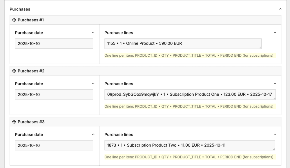
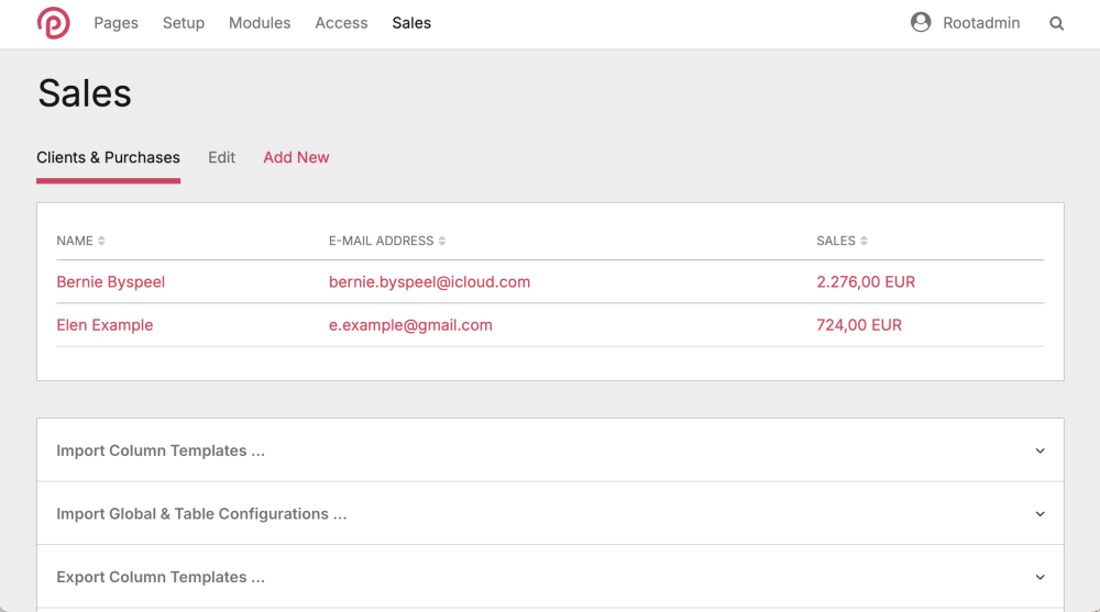
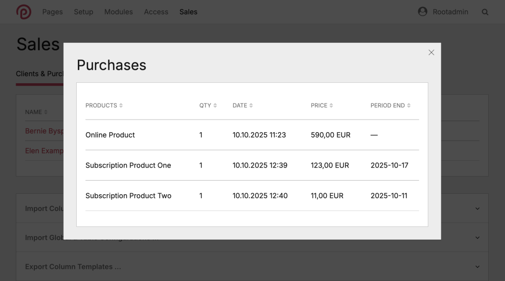
Hey folks! We’ve had a bunch of questions about how purchases show up in the backend, so here are the details: By default, every purchase gets its own repeater item on the user’s profile, and every product bought is pulled straight from the checkout session and listed as a line item. The PRODUCT_ID is the mapped page id, and in case the product does not have a product page it shows the Stripe product id prefixed with "0#": The full session always sits in the purchases.meta object. That means you can totally use the ProcessDataTables module to show whatever data you want in a nice table. For example, you could have an customer table with a column that totals up all purchases and pops up a full list of purchases in a table when you click on it: If you're looking to do just that, here’s the column template to make it happen: sales.column.php -
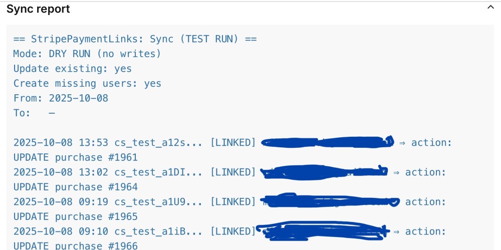
Hi, Pete, I managed to post it without the Code example, so the version in question got deleted afterwards. To reproduce it try to post something like this sync report as code: That caused the described behavior. Cheers, Mike
-

module StripePaymentLinks – Simple Checkout Integration for ProcessWire
Mikel replied to Mikel's topic in Modules/Plugins
🎉 Now with Subscriptions & Webhooks! (v 1.0.8) In the past months, several frameless clients asked for an easy way to sell their content as subscriptions — without manually managing access. Think of a coach publishing daily audio files and offering a weekly subscription for them. That’s exactly what this update makes possible. 💡 🆕 What’s new in 1.0.8 Stripe Webhook support The module now listens at /stripepaymentlinks/api/stripe-webhook and reacts in real-time to subscription events — cancel, pause, resume, renew, or failed payment. → Access updates instantly. No cron jobs, no manual actions. Subscription handling Each purchase now stores a period_end_map, so the module knows exactly when access should expire. Pause or cancel a subscription → access is blocked immediately. Resume or renew → access restored automatically. Smarter access logic hasActiveAccess() now distinguishes between: recurring products (time-limited access) one-time purchases (lifetime access) Config update Added a field for the Webhook Signing Secret in module settings. ⚙️ Setup (2 min) In Stripe → Developers → Webhooks → Add endpoint https://yourdomain.com/stripepaymentlinks/api/stripe-webhook Choose either “All events” or only the relevant ones: customer.subscription.updated customer.subscription.deleted customer.subscription.paused customer.subscription.resumed invoice.payment_succeeded invoice.payment_failed Copy your Signing Secret into the module config. Done ✅ — test by pausing, resuming or cancelling a subscription and watch access update live. Short, clean, and 100 % ProcessWire-native. Perfect for creators, coaches, and anyone who wants to sell recurring access without maintaining users manually. Cheers, Mike -

module StripePaymentLinks – Simple Checkout Integration for ProcessWire
Mikel replied to Mikel's topic in Modules/Plugins
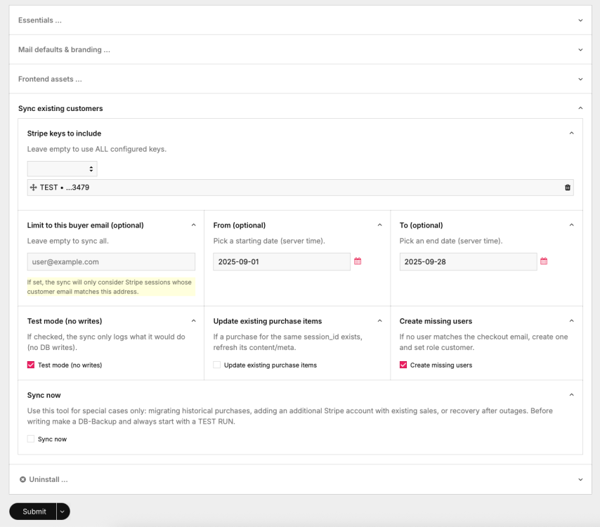
New feature in StripePaymentLinks (v 1.0.7) 🎉 Hi, everyone! We’ve just added a sync helper to the modules config screen that can pull past Stripe Checkout Sessions into ProcessWire. Super handy if you want to… backfill older purchases migrate existing users or just double-check what’s in Stripe vs. what’s in PW How it works: Scans Stripe sessions (with date range + email filter if you like) Matches them to PW users by email Creates missing users (optional) Creates/updates purchase repeater items exactly like live checkouts Has a test-run mode so you can preview before writing You get a nice report right on the config screen (below "Sync now") with totals and per-session actions (SKIP, LINKED, UPDATE, CREATE) plus the line items. Makes it a lot easier to keep things in sync — especially if you had sales before installing the module. Note: since each run fetches sessions and line items directly from Stripe’s API, the total duration depends on network + Stripe’s response times. In our tests with ~120 sessions the sync took about 15 seconds. Grab the latest version and give it a spin. We already tested this version on some live projects and everything works fine, but always backup before you mess with data 😉 Feedback welcome! 🙌 Cheers, Mike


