Search the Community
Showing results for tags 'neuwire'.
-
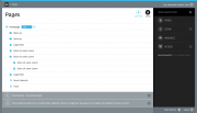
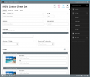
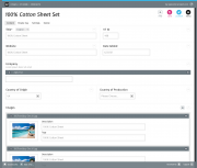
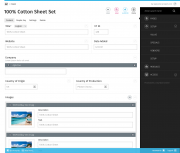
Hi Everyone, the last days i read a lot about the ongoing process of "modernizing" the admin theme, adding some features and getting some marketing buzz from people who aren't currently aware of processwires awesomeness due to the fact they didn't like the current admin theme. I must admit that at first was one of those "design oriented" guys and didn't dig deeper into the system because i didn't liked it's look & feel (or at least i thought it doesn't look "professional" enough to present it to our customers). Fortunately a colleague of mine finally managed to convice me giving pw a second try. After digging deeper i started to really like the concepts behind it. I tried different admin themes and git stuck with "ergo" which we currently are using on several pw instances. Although i weren't completely happy with it's look and feel on several details (but that's just me: i never heard one of our customers complaining ). The Idea of doing a theme by myself started to grow in my mind. After doing several layouts that "just beautified processwire to my taste" (i can post a "design evolution summary" if anyone is interested) i took a step back and started doing some more conceptual work and research. Specifically i thought about which "personas" are using processwire and for what reasons they are using it. Also i tried or looked at screenshots of some more "hyped" systems (ghost, anchor, craft...), asked out some (dev) co-workers and others who are content editors (which are the two main "groups" of personas imo) what parts of processwire could be done better or used in a more efficient way. The good (but not surprising) news is: There were almost no complaints about the current features. Long story short: With the "benchmark" in mind and some feedback i again started layouting. I rearranged some buttons, menus and tried to give processwire a more modern, clean and "up to date" look. But before i'm going to code all of this i wanted feedback from a broader audience so i can propably fix or correct things that you as everyday users aren't happy with. Here we go: I used the "w" of the processwire logo as a "picture mark" as it is pretty unique and can easily be recognized and remembered (You could also use this as a favicon). I kept using "processwire colors" for brand/product recognition (i know ryan stated people are complaing about them) but also tried to use them in a very minimalistic way so there is nothing that distracts editors from the content. I chose the menu to be positioned right for two reasons:1) Content first! The most part of work in processwire is editing and creating content. So why shouldn't content "rule" and be the first and most important thing (at least for LTR Readers)? 2) With the buttons and the menu both at the right side there is a "cluster of functionality" which makes it more efficient: Shorter ways for eye- and mouse movement, less things to "overlook" when actually editing content. The pages options within the tree are hidden (again: reduce visual complexity) into a dropdown with only the most commonly used one (edit) beeing shown (this should be configurable). The Font is the beautiful Fira from Mozilla <3 The messages are displayed "growl style" and can easily be closed by the user (or close themselves after a certain amount of time) I chose to use the content of ryans "new theme" example screenshots to make it easier comparing them in terms of visual hierachy. As you scroll, the buttons on the top will pin and scroll with you. This way it's always possible to save or view the page at any scroll position (the save/publish buttons are part of a module that's currently in devlopment here). The bar at the bottom will contain some shortcuts as well as less frequently used / system related stuff (i.e: user profile and logout). "Zen Mode" with closed menu. Just you and your content For those who like it bright: An example of an alternate version which is even more minimalistic.From my point of view there are some things still missing. I thought a lot about including a possibility to open the page tree from everywhere (as in Nico Knolls Dark Business and the ongoing Discussion in the Two column admin theme concept). I think this might be more effective to just test it from a ux perspective when actually coding the theme. My Idea is to build a static clickdummy and put it on github before actually releasing a "real" theme (with all the logic / js work to be done) to do some usability testing. Thanks for reading and i hope there will be some feedback! Best regards, Felix
- 33 replies
-
- 27
-


