6 October 2017 by Ryan Cramer
ProcessWire 3.0.78
ProcessWire version 3.0.78 is another small incremental upgrade that contains mostly changes geared towards supporting customization of core modules from admin themes. If you are testing out the latest version of the AdminThemeUikit module, I strongly recommend you grab this version. But if you aren't testing it, then there's no need to upgrade from 3.0.77 to 3.0.78.
Progress continues on the Uikit-based admin theme
Like last week, this week progress continued on the new admin theme. I'm getting down into some of the smaller details, and looking for cases where things might not work quite right, and fixing them. For example, the admin theme wasn't working with the SystemNotifications module, so that's been fixed.
Thanks to all of you for your testing and feedback. There's still more ground to cover, but it's now quite stable and should work fine in many production environments at this point. Because I'm mostly into the detailing work right now, I don't have a lot to write about, so consider this post as a brief continuation of last week's post.
Relative to last week's version, there's a lot of little tweaks, fixes and optimizations. Visually the biggest difference is probably in the Page List, where there's some experimentation going on. I'm not sure if it'll remain, but going to work with it for a bit and see how it goes.
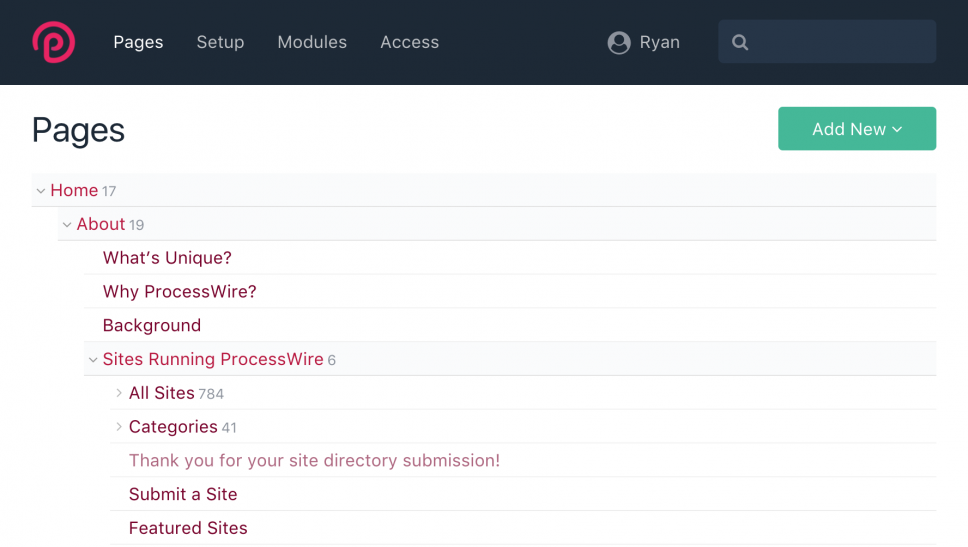
When the page list is used in the sidebar (using the left or right sidebar layout), a more minimal version of the Page List is used. In addition, it now only shows "Edit" and "View" links, moving the "New" and "Move" links into the extra actions, revealed by clicking the ">". This helps reduce the horizontal space requirements when the Page List appears in a sidebar (for less word wrapping).
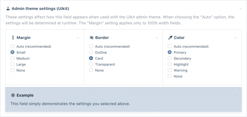
Another nice update this week was this addition in the field editor. You can configure the admin theme settings for Margin, Border and Colors, for any field. You'll see it when editing a field, under the "Input" tab, in the "Admin theme settings (Uikit)" field. It appears right below the "Visibility" field. It also includes a live-updated Example field, so that you can see what your customizations look like, as you make them. Also worth noting is that these customizations can also be configured in field/template context, enabling you to use different settings for the same field, depending on the template it appears in.
When the new admin theme is fully ready, chances are we'll be adding it to the core and it'll take on the "default" admin theme name, while the current default admin theme will remain, but become the "legacy" admin theme. The Reno theme will of course remain as well.
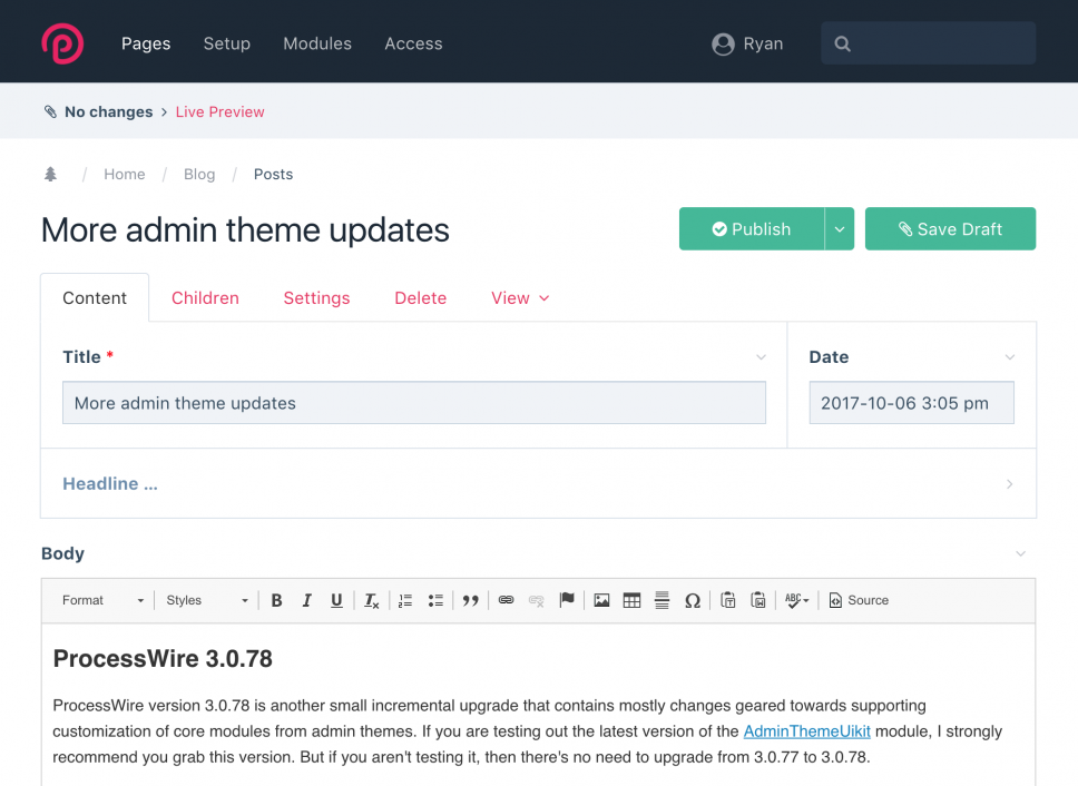
Just for fun, here's a screenshot of editing this post. Note though that the status bar which appears right under the masthead is from ProDrafts, and doesn't appear there unless ProDrafts is active.
Live demo
If you'd like to try out this admin theme without installing it, I've just installed a fresh copy to our Regular demo site. Login with user "bloguser" and password "processwire3".
This post is just a quick update, but for more on this admin theme, be sure to see last week's post. Have a great weekend, and enjoy reading the ProcessWire Weekly.
Comments


Paul Carnevale
- 8 years ago
- 40
★★★★★This feels so client-friendly... exceptionally clean and easy to digest.
Reply
Tom
Looking good! One thing I would recommend is everything looks very tight on the Page Tree. There isn't much breathing space. The class .PageListItem I would set a padding top and bottom of 6px and not 3px.
I also feel there is a lot of the pink colour, it's meshing everything together. The page titles are pink, the icons are pink and the buttons are pink. I would change the icons to a light grey, so they are there to hint but not distract and maybe set the page links to the header blue when active and a grey when not. Maybe #444.
That's my old feedback, look great otherwise!
Reply
Mike Rockett
- 8 years ago
- 40
★★★★★Loving the colour updates - those are super cool. I've been implementing a 'highlight' color manually for MarkupSitemap, and the same will be happening for other modules. I think that as this theme is the only one to support it, I'll stick to the manual method. That said, great update. :)
Regarding Tom's comment, I think he's quite right. I've been wondering if this admin theme should be resolution aware. If running on a standard 1366x768 resolution, the padding should be reduced. If on a higher resolution, then it can be increased, and the page tree top/bottom item padding could change as well.
Reply
Joe Regan
- 8 years ago
- 00
★★★★★So far so good!
Reply
Richard Jedli?ka
Looks really good.
Reply
Tobi C.
- 8 years ago
- 10
★★★★★Nice & Clean. Thanx for your hard work!
Would be nice to save the open/close state of the content in the left menu that pops out on logo click.
Reply