24 February 2017 by Ryan Cramer
Thanks for all of the enthusiasm from the last two weeks of blog posts. We've had lots of comments and feedback from you, which is always appreciated. This week we've got a demo setup of the admin theme framework that's been written about in the last two weeks of posts. It took me a little longer today to get it setup than planned, so I've got to keep this post really short. But that's okay, because it's always better to go and use something than it is to just read about it.
This is being developed as an admin theme framework that uses Uikit 3. While this is a fully functional admin theme, this is not intended as an admin theme design. Skilled designers like Tom Reno and others in our community will lead that effort.
You can login to it here. Login with username bloguser and password processwire3. The site is in demo mode, so it won't let you save anything, but will let you browse around and test things out. Note: Apologies if you get an error trying to access this demo. We're having an intermittent server issue and hope to have it resolved shortly. If you get an error message when accessing the demo, please try again.
Last week we discussed the various presentation options available for page editor fields (Inputfields), and showed you a lot of screenshots. If you navigate to Setup > Fields > [any-field] > Visibility > Theme settings, you'll see how individual fields can be configured. You can also access this through field/template context, for when you want to configure the look for a field when it only appears in a specific template.
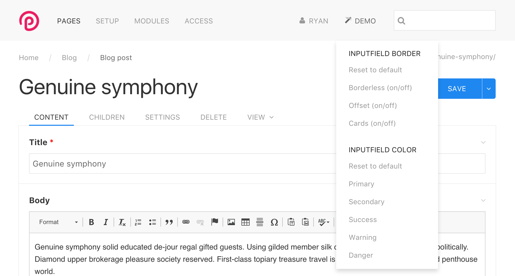
Because this is a demo and you can't actually save the field settings, I've added a "Demo" menu to the top navigation that lets you adjust some of these settings. Though note that it adjusts them for ALL fields in the page editor, which is probably not what you'd do in real life, but does get the point across for our demonstration purposes.

Note that these "demo" settings just affect the page editor fields. Also, some of the "Inputfield border" options can be combined if you'd like (such as Card + Offset).
By next week, I'm hoping to have this theme up in a GitHub repo that we can start collaborating from.
ProcessWire 3.0.53 core
This week's dev core version is ProcessWire 3.0.53. While it contains a whole lot of code changes and additions, almost all of them are specific to supporting customizations by admin theme modules (like this one in development). As a result, if you are already running core 3.0.52, there's not much reason to download this core version just yet. But if we can get a beta version of this AdminThemeUikit module out by next week, and you want to work with it, then you'll want to upgrade your core at that time.
Thanks for reading and hope that you all have a great weekend. Enjoy reading the ProcessWire Weekly tomorrow too.
Comments

Can
- 9 years ago
- 10
★★★★★nice work ryan!
only thing i'm missing is the breadcrumb prepend which opens the page tree in panel mode
Reply
Ryan
This will be coming back, I just didn't consider it an important enough detail at this stage. I haven't found myself using this feature much at all, and wasn't sure if others were, so it's good to hear you've found it useful.
Reply
Can
- 9 years ago
- 40
★★★★★interesting..i'm using it quite often, actually most of the time =)
Reply
nurkka
Would it be possible to make the page tree visible in a sidebar on the left all the time? I am thinking of a two column layout, where the left column always shows the page tree. That would give editors an easier access to the pages, when editing across a whole website, and a better idea of where the current page is located in the page hierarchy.
Reply
szabesz
- 9 years ago
- 00
★★★★★Requesting Page tree in the sidebar comes up very often, eg:
https://processwire.com/talk/topic/4398-two-column-admin-theme-concept/
and in recent discussions as well:
https://processwire.com/talk/topic/15532-new-blog-post-working-towards-a-new-admin-theme/?do=findComment&comment=138990
It should probably be configurable, to please all use cases...
Reply
Ryan
Thanks for taking a close look at the demo. The biggest part of theming is probably the Inputfield classes, and the class names there are all the same as before. So the way you style them will be no different. Though the actual code required to style them is a whole lot simpler, probably about 1/4th of what it was before. Likewise, the javascript to manage them is a whole lot simpler. The biggest difference is that we're using Uikit's grid to handle the column widths, which maps the existing column width percent definitions to Uikit uk-width-* classes. Those classes are added on (via the AdminThemeUIkit module) to Inputfield elements when/where appropriate, automatically at render time. Because the code is now quite a bit simpler, I think the front-end performance is nicer too. You don't see layout adjustments occurring a second after you open a fieldset or resize a window, etc. It's quite a bit cleaner than before. Admittedly it's taken awhile to re-do all of this stuff though, and I've still got a few minor layout glitches to work on still, but it's getting there.
Reply
Renobird
Of course when I say "causing" around I mean "cruising". :) Apparently autocorrect had other ideas. That's nice that the Inputfield class names are still the same as before. I didn't explore it more than a quick glance at the code. I'm hustling through a few projects to clear some space to really dive into this when it's ready.
Reply
ukyo
muted background white header could be much better for looking. Theme is too white.
Reply
Nik
Do you even read the text?
Reply
Simon
I had some same thoughts about the usability of the pagetree. At the moment the pages with subpages are not marked.
On a click, the accordion opens. If the page has no subpages, on a click, you mark the page for whatever reason.
As a new user of processwire, I often want to edit the page by clicking on its name. But this is only possible over the "edit" popup.
To edit a page now, you always go via the popup, it's consistent. But is it better to edit the page by just clicking on its name, except for the accordion? That would be inconsistent, but faster. Because most of the time you just want to edit the page, not use the other functions in the popup.
Reply
szabesz
"As a new user of processwire, I often want to edit the page by clicking on its name."
Me too! Even after more that one year... and my clients too. It would be nice to rethink this!
Reply
Renobird
- 9 years ago
- 50
★★★★★I spent about 20 minutes causing around the demo. I didn't notice anything that wasn't working as expected.
Getting used to the UIKit class names vs. the current PW names will take a bit, but they seem intuitively named. It's easy to cross reference the UIKit docs and pick things up.
Thanks for all the work on this Ryan.
Reply
Mikael Siirilä
Very promising. This combined with design finesse will be perfect.
Reply
Tom
Looks good,
I've been using UIKit for about 3-4 years so this is a great addition for me.
Some things I would suggest in the code is:
- In pw-content-head change uk-width-1-2@m to uk-width-auto and add uk-visible@m to this.
- You can click view leaving an underline, this doesn't disappear.
- Clicking a title in the page tree highlights it even if it doesn't have children
I'll have a closer look soon, looking great so far! Can't wait to get stuck into this.
Reply
Nils
Yep, looks great!
Two things that came into my mind:
1. Page Edit View: Would it be possible to show it more clearly, when a field or fieldset can be opened (probably with a plus sign before the closed field as seen in many accordions?). Now there are only three dots behind the field and some of my clients don't notice that a field can be opened.
2. I heavily use descriptions and notes on fields to provide additional instructions to backend users; however when doing so, the page edit view gets more cluttered. Would it be possible to add a tooltip option for descriptions (similar to AdminOnStereoids)?
Reply
Matze
- 9 years ago
- 40
★★★★★Really very very nice, looking forward to use it live!
A question: Will there be a possibility to reduce the overall width of 100% maybe to 1200px or something?. On a 27" it really looks very stretched and items belonging together are separated by a blank distance. For example left and right aligned items like in an images field.
Reply
Vicki
The gray text is a bit challenging to read. Would be nice if it were darkened. Otherwise it looks great. :)
Reply