17 February 2017 by Ryan Cramer
Last week we looked at progress on a new admin theme framework for ProcessWire. This week we’ll do the same, as development continues to move forward and we have a lot more screenshots to share.
Progress and features (design not literal)
Like last week, I wanted to mention that this is not meant to demonstrate design, but rather, progress and features. What you see here is essentially the stock Uikit framework theme. As some of you mentioned last week, it may be too minimal for your tastes. I agree. And it's pretty monotone too. But this minimalism is helpful for us at this stage in the development, so please don’t take any design aspects to literally, as the admin theme(s) that eventually result from this will likely look quite different. We are in kind of a blueprint stage right now.
Speaking of minimalism, I noticed that the light borders around fields are very obvious on one of my computers (Macbook Pro), and nearly invisible on another (older Mac desktop). So I’m not positive that you’ll be seeing these screenshots as intended, as it seems to depend on the screen. If some of the features are too light to see on your screen, I apologize. We’ll try to increase contrast from the default styles before the next post that includes screenshots.
Oops
Before you continue, note I've got an extra “user” icon present in the masthead top navigation of all these screenshots and didn't realize it until now. It's that one next to the Access link. That's not supposed to be there, so please ignore that. :)
Click the screenshots to view them at full resolution.
Standard/border style
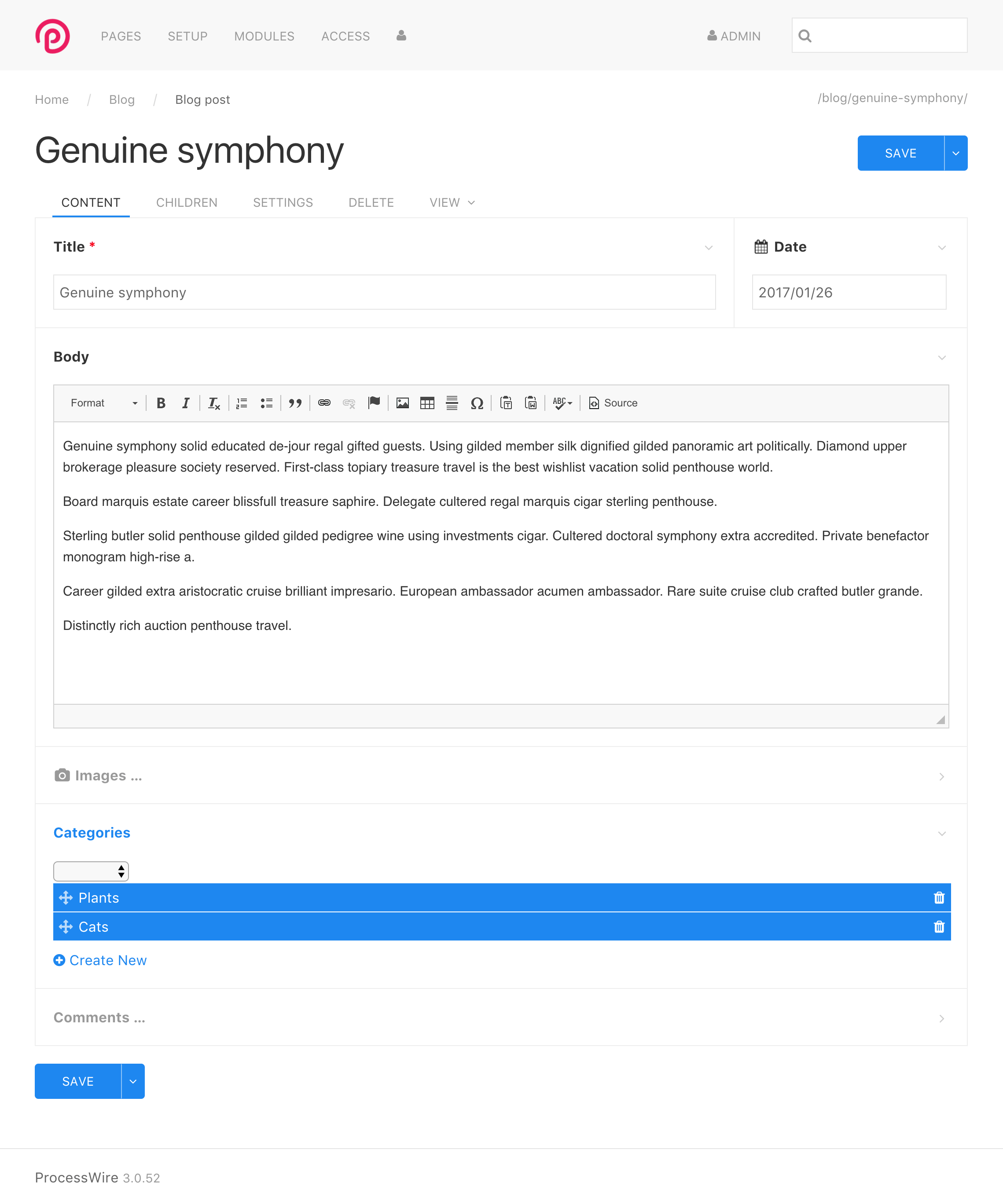
In this first screenshot, we have the default Inputfield style which uses borders around each Inputfield, just like the current Default and Reno admin themes. (Depending on your screen, you may not be able to see those borders very easily). Also note the addition of CKEditor 4.6, which includes a new skin that many prefer (and certainly works better with our admin theme updates). You’ll find CKEditor 4.6 on the core dev branch now.
Standard/border style with vertical offset option
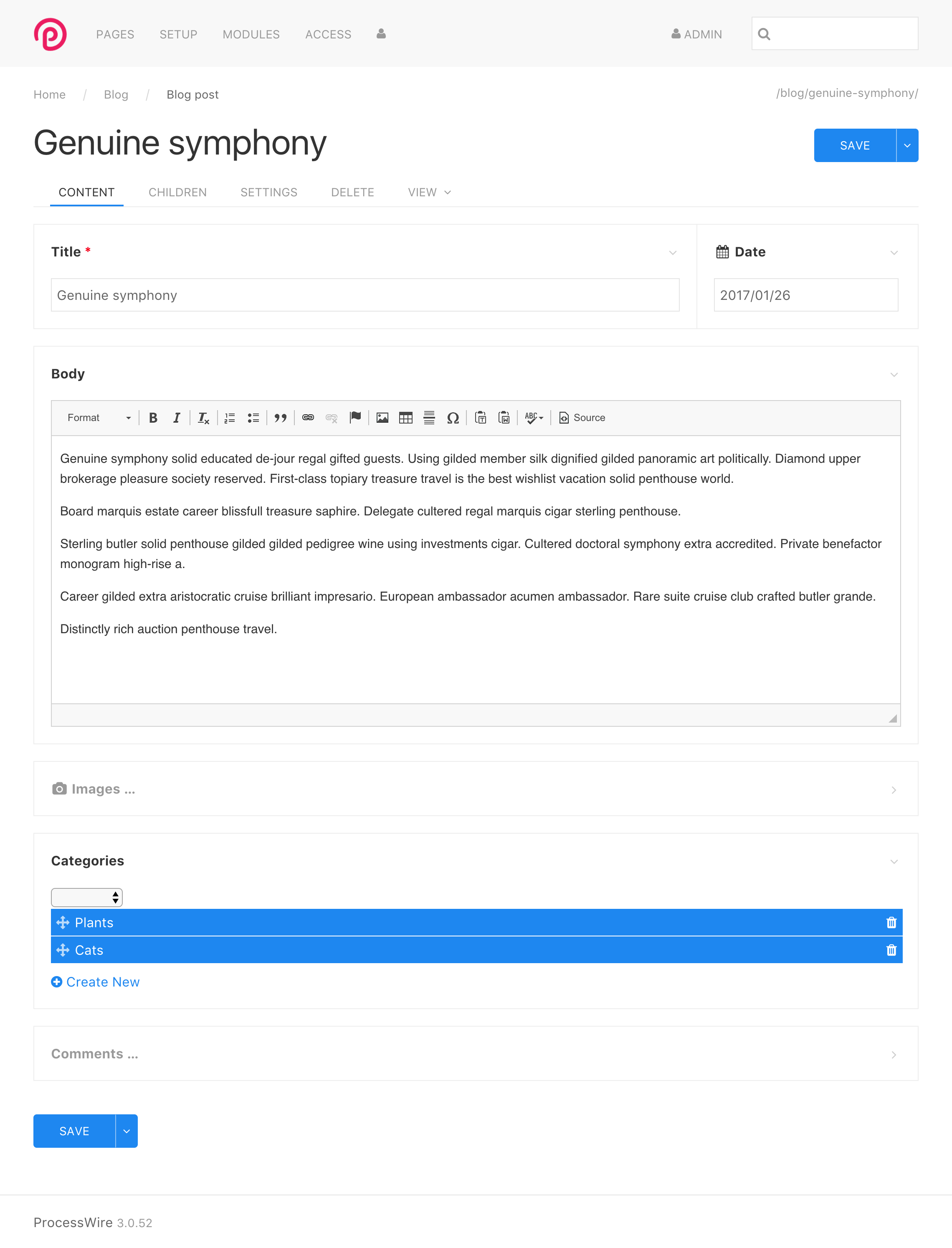
This next screenshot is the same thing, except with a vertical offset enabled. This provides a vertical whitespace between the borders of each Inputfield. This is something that can be enabled with a $config setting in ProcessWire (for all Inputfields) or individually for any given Inputfield.
Uikit “card” style
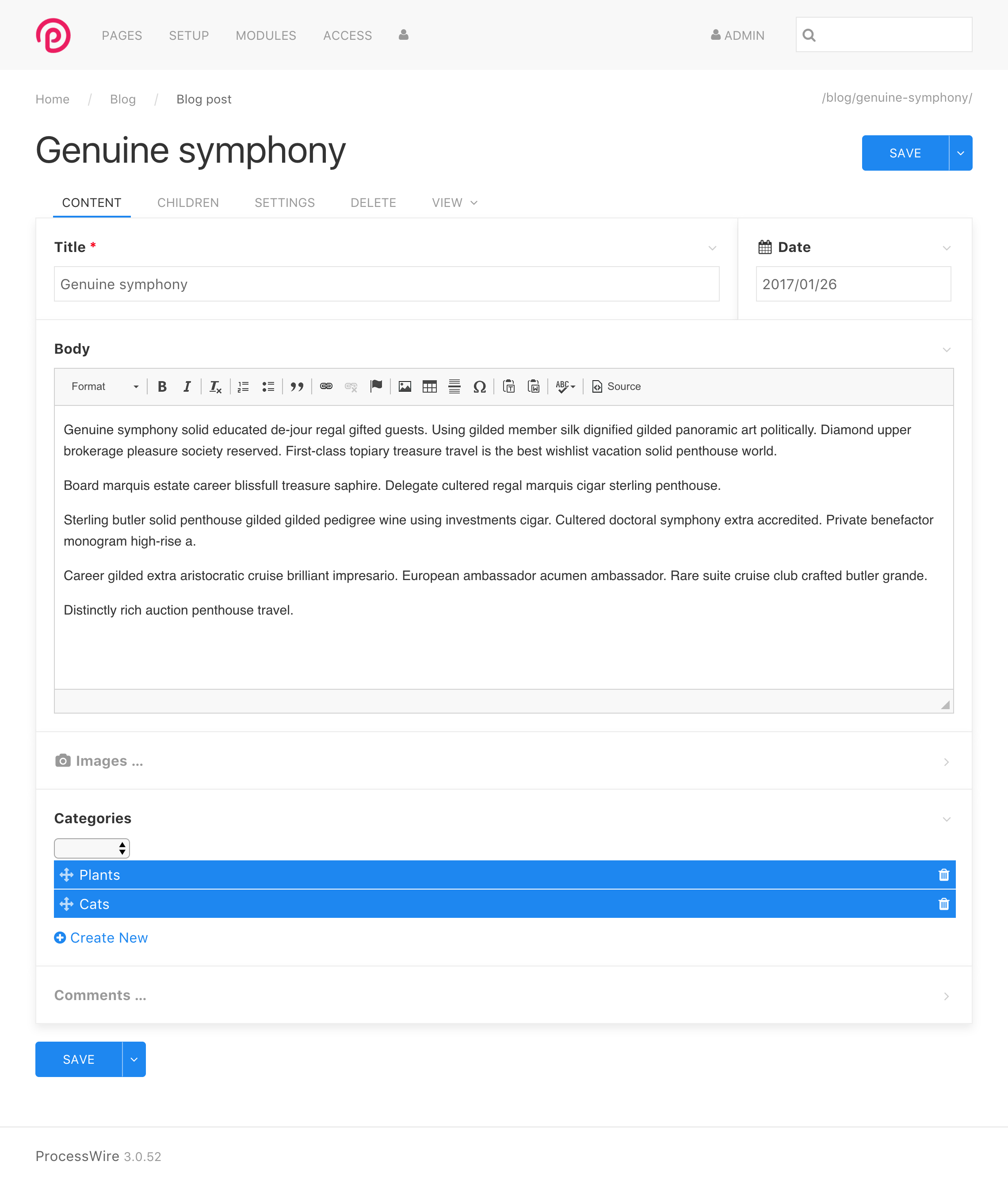
Next we’ve got the same view as screenshot #1, except that this uses the Uikit “card” style for Inputfields. It softens up the borders and gives fields some depth in many cases. I find this card view to be pretty nice, especially when getting into fieldsets and other kinds of nested Inputfields. For the purposes of this blog post, the card style seems to be a little easier to see, given how light the borders are. So I'll stick to using this card style for the remaining screenshots.
Card style with vertical offset option
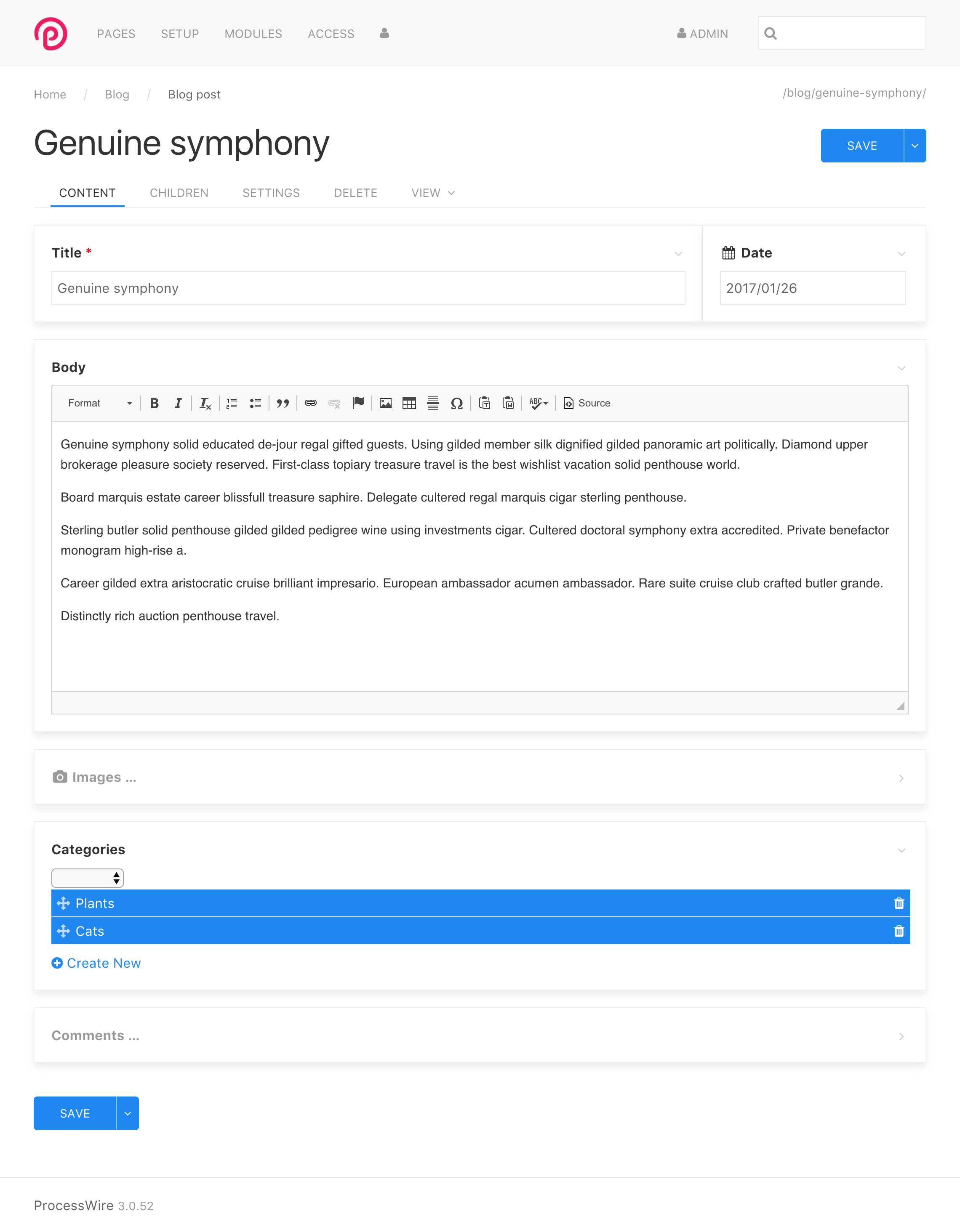
Here is the card view again, but with the vertical offset option enabled again, like in screenshot #2.
Turn off borders per field
A feature that we demonstrated in last week’s screenshots was the ability to turn off borders completely. You’ll now have a field setting where you can specify that you want any particular field to have no border, as you’ll see with the “Body” field below. This field is an obvious example of one that doesn’t really benefit from a border because it already has the border provided by CKEditor.

In this next screenshot, we’ve gone a little further with turning off borders and also turned them off for the Title and Date fields as well.
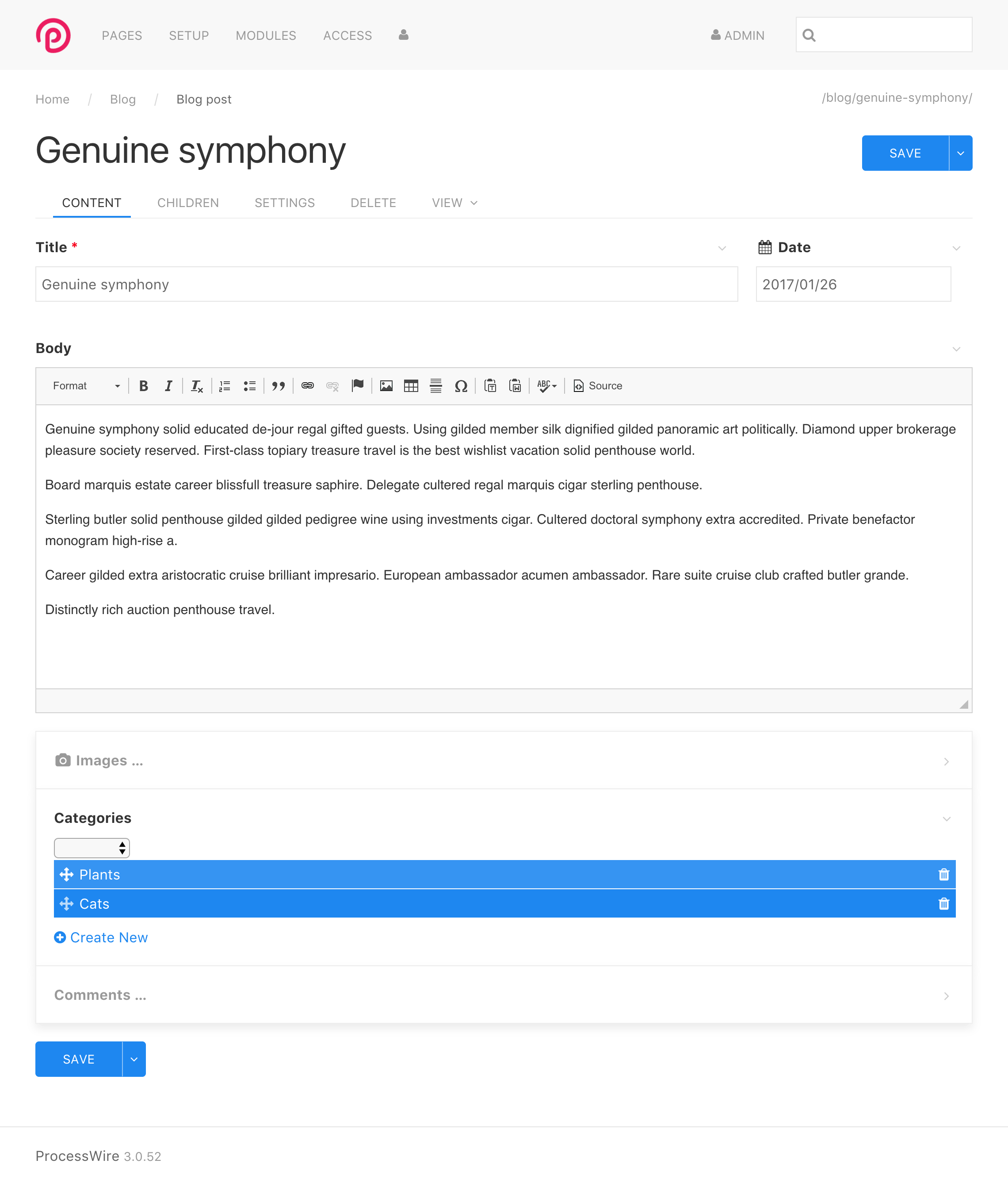
Uikit color options
When using ProcessWire with this Uikit-based admin theme framework, you can also differentiate fields with color. A field can be specified as Primary, Secondary, Success, Warning or Danger (which are Uikit color names). In the example below, these are the assignments present:
- Date: Secondary
- Body: Warning
- Images: Danger
- Categories: Primary
These colors are defined by the Uikit theme, so what color they actually represent depends on the Uikit theme that is in use. The screenshot demonstrates the default colors.
You’ll also see the open comments field, which is already using these color assignments by itself in order to differentiate pending (blue) comments from approved (green) and spam (not shown) comments. We imagine that most of the time you won't need to use these color options, but they will definitely be handy for certain cases where you need to call attention to a particular field. For instance, we'll be using the Danger color to highlight Inputfields that have an error that needs resolution.
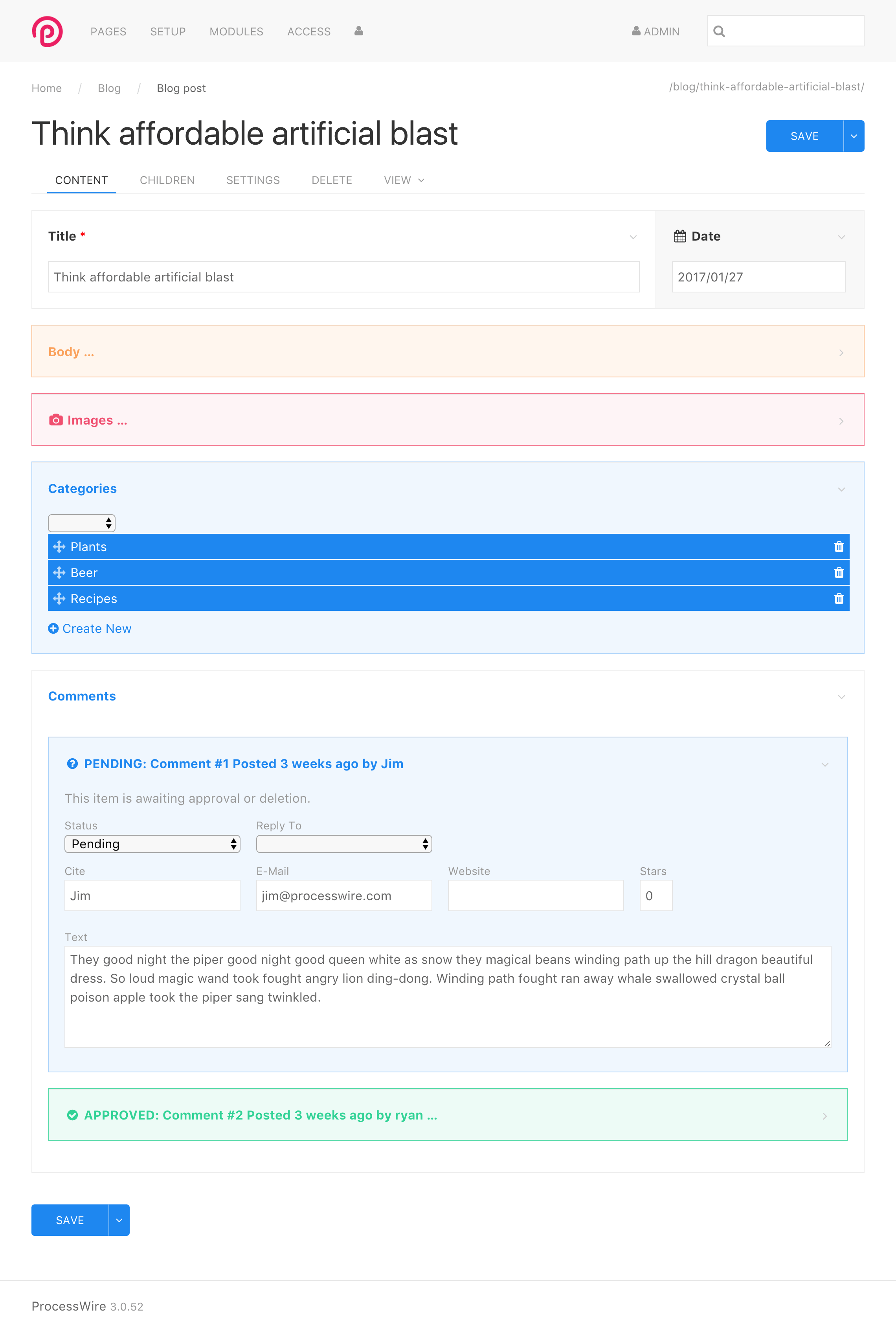
Language tabs
Here's a look at text fields with multi-language tabs.
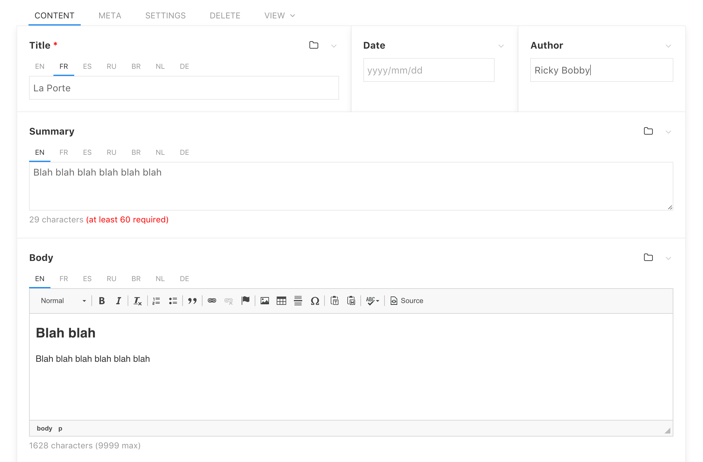
Modules
Here is a screen from the Modules section of the admin.
Fields editor
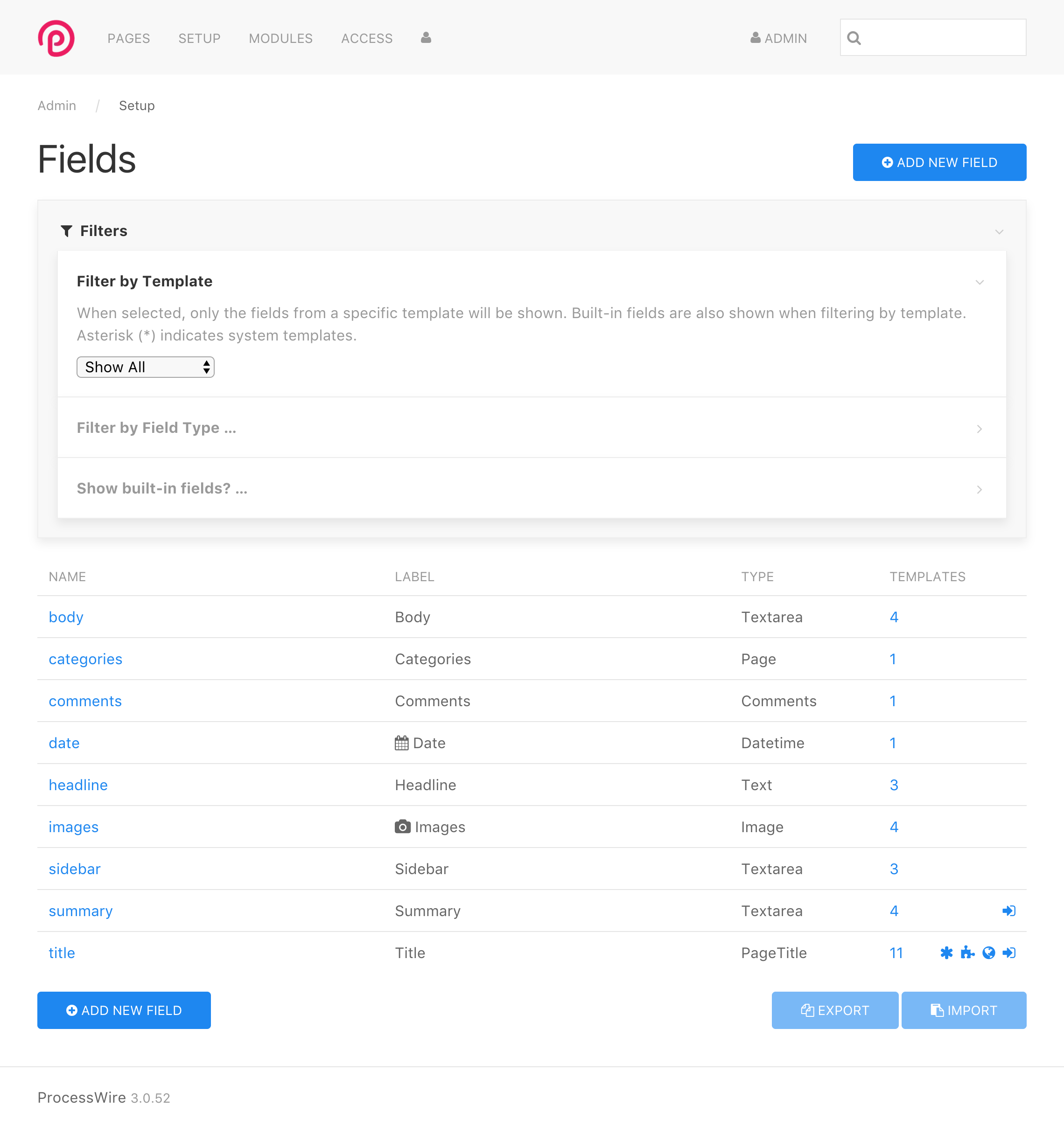
Here’s the Setup > Fields list screen.
Lastly, here’s a really large screenshot that shows the Input tab of the Field editor when editing a CKEditor field.

Comments


Brent
- 9 years ago
- 61
★★★★★Nice work Ryan!
Reply
Alex
I really like that mockup
Reply
Renobird
That is great! We build a ton of admin based modules, and a lot of times there are UI/UX requirements that results in all kinds of module specific CSS tweaks to accomplish the things you mentioned above. Super good stuff.
Reply
Joe Regan
So far I think it looks best with vertical offset enabled and no card style drop shadow added to anything! Less borders = less cluttered to me! And everything is going clean and flat and on the same plane. ie. Let the top be just as important or more important than making the middle pop out.
Great work! Excited to get to use this! I am counting down the days before I can start playing with it!
Reply
Ryan
All the settings are configurable as global defaults, or individually per field. They will be in the "visibility" fieldset of a field configuration, meaning they'll be in the field/template overrides as well. They can also be configured by Inputfield type, enabling a module to specify what presentation options it should use as its defaults.
The settings include:
1. Offset – whether the field is vertically offset from others with a margin.
2. Border – whether the field has a surrounding border or not.
3. Border style – Card style on/off (and perhaps other style options we add).
4. Color – None, primary, secondary, success, warning or danger.
I also have a setting to turn on the Uikit grid on/off, since PW already supports it's own width definitions. But currently using the Uikit grid exclusively, translating PW's width definitions to Uikit grid classes.
Reply
tpr
Looks great - except the drop shadows. A very light gray background (eg #f8f8f8) to the whole content area would separate the white fields wrappers just enough. Here's a quick mockup:
http://rolandtoth.hu/pic/pw/pw-admin-uikit.png
Reply
Joe Regan
I do think it would be nice to collapse messages requiring a click to see full details.
Reply
Lenz
Awesome Work. I also vote for no border shadows, it's more to the point and clearer imho.
Reply
Jonas
This looks really great! Can't wait to use it :)
Reply
Ben
Looks ace, well done!
Reply
Renobird
- 9 years ago
- 41
★★★★★Wow! I love (what appears to be easy) flexibility here. I've spend some time with UIKit the past week, and it's really quite nice. The field specific flexibility with the border type/styling is very useful.
A few quick thoughts there:
• Could the border style/offset be configurable as a global theme setting? I can see uses for each of those depending on the type of site. (i.e. simple or complex templates)
• Is it possible to have the per-field setting for borders to have a template level override? That way you could have a card border for a field in some templates, and no border in others. That would help keep fields reusable in multiple contexts.
Just want to reiterate the point about not getting too hung up on the design specifics at this point. Ryan can correct me if I'm wrong, but one of the reasons for moving to UIKit is so that the admin that is more flexible and configurable. I'm seeing a lot of that in these mockups. Very cool!
Reply
HMCB
- 9 years ago
- 31
★★★★★This can't come soon enough!
Reply
Ivan
It can't be "too minimal". It's way better then old default theme that was driving away new users. Please don't bloat it, minimal is perfect, and way easyer to customize later on. And +1 to no border and no shadow.
Reply
Ryan
Thanks for the feedback guys. Regarding the card view, which Uikit shows box-shadows for (https://getuikit.com/docs/card). Like the first headline says – "design not literal". This is about implementing features in an admin theme framework, not design at this stage. This is the default Uikit theme here, and the purpose of all this is to make something that's theme-able. So that card view is a feature open to design interpretation by the skilled designers in our community.
Personally, I find the current card view helpful in clarifying visual hierarchy when you get into nested fields. Meaning, depth. And one of the things that PW supports is nearly unlimited depth in forms (think fieldsets, repeaters, etc). Having everything flat and/or borderless is great for really simple cases, but becomes a real visual problem when you get into the scope and complexity of forms that PW supports. I imagine other themes will interpret this with border thickness or color usage, rather than a box shadow (maybe like what we've done in the existing admin themes). But I don't want to get into that. At this stage, I think it's better to avoid adding subjective design trends and interpretations to it, and instead leaving that for the actual designers and actual design phase of themes. I stuck to the card view in most of my screenshots above because the default/flat view was just a little too hard to see and follow on these reduced size screenshots when it gets to the more complex forms.
Reply
Simon
Thanks for the work, it's coming together nicely.
I agree with the comments about the vertical offset and also don't like the card design. I think it should be flat. You can use contrast and offsets to create depth. I would also like a dark backend, but we're talking design here already.
Are there any changes for the view panel (panel, overlay, etc.)? I find those a little clunky, but have no better solution. Maybe like in the neos backend.
I also think the save button for page changes should be sticky. On pages with lot of content, I find myself scrolling up or down to save.
For those who would like to have a look at neos:
http://neos123.demo.lelesys.de/neos
Username = admin
Password = demo123
Reply
Simon
Another thing, that just came to my mind is the display of the success/error messages after saving a page.
Maybe some agree with displaying every message with its own bar, pushing the whole page down, for you see all messages at once. But for me the essential thing about the messages is to see if it worked or not.
Would it be better to put out a single bar for all success messages where you can click on a dropdown to show everything?
I just encountered another not so nice thing: If I open a closed repeater field, to page will jump to the top.
Reply
Leeroy
This is looking really nice, clean and uncluttered. Great work!
Reply
Mustafa
- 9 years ago
- 21
★★★★★Woooow so nice and clean .. i wish you add "RTL" mode to Admin theme, Bcoz UiKit Supports it be default.
Reply