PrevProcessWire 2.7.2 master and 3.0.2 devns
This week we don't have any major new features to introduce to you, but we do have two new ProcessWire versions! Plus we have a look at what's coming in the weeks ahead. More
This week we have a guest post from Tom Reno (@renobird) showing us some excellent redesign work he is doing for our images field in ProcessWire. We hope to bring this to you soon in ProcessWire 3 and perhaps on the 2.x dev branch as well! –Ryan
Hello all, Tom Reno (Renobird) here. We wanted to give a preview of some ideas I'm working on to enhance the images field in ProcessWire — specifically in grid view. We will start by looking at the benefits and drawbacks of the current image field admin interface, and then take a look at some screenshots showing upgrades to it.
This view shows the image/thumbnail, as well as the description and tags fields. If you are using any modules that add fields or cropping options (such as Image Extra or Croppable Image) it displays items added by those modules as well. List view is great, but it has some drawbacks when dealing with a large number of images. Let’s suppose you have a field with 10, 20, 30 images or more. Each image consumes the entire width of the field. If you have custom fields and/or buttons for each image; each entry consumes a lot of vertical space. This makes things like sorting and spotting duplicates a bit time consuming, and with a lot of images, downright tedious.
Grid view addresses some of the issues mentioned above by displaying 100px thumbnails of the images. It also supports drag/drop sorting, and provides access to the new image editor when you hover the thumbnail. The drawback to grid view is that you can’t edit any of the image data, mark an image for deletion, or access any options added by other modules without switching back to list view.
Below are some preliminary mockups I’ve been working on for improving the grid view. These are all just static images without any working code.
One of the first things is to increase the thumbnail size from 100px to 130px. That is really just an arbitrary increase. It could end up being a little more or less, but this size worked well for my mockups.
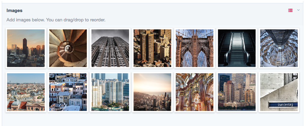
Grid view with larger thumbnails
When hovering the thumbnail, there are several key things that appear.
Quick look
The quick look is a tooltip that shows some basic image information. In the mockup you can see there are checkboxes next to description/tags. Those indicate that the fields are not empty. This is just a way to take look at some of the basic information without having to open the editor.
Delete
Mark an image for deletion by clicking the trash can icon in the top left corner.
Edit
Clicking the thumbnail opens the information overlay. More on that below.
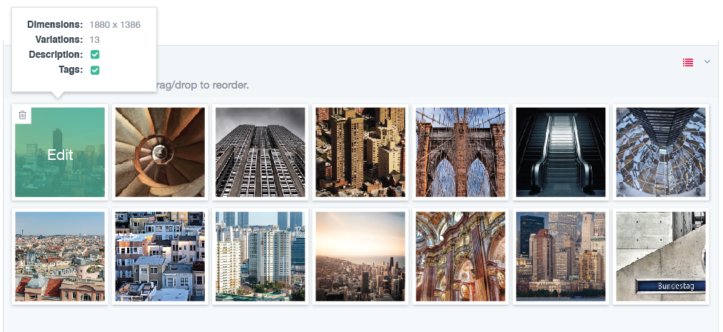
Thumbnail hover state
When a thumbnail is clicked, an overlay appears with a preview of the full image, image details, and any fields or buttons associated with the image. Ideally the overlay will work more like a dropdown menu that overlays any images below. Optionally, it could work more like Google image search, where the editor appears in between the rows. Since these are all just mockups; the actual implementation is still open for discussion.

Image editor overlay
As mentioned above, when hovering a thumbnail, the trash can icon appears in the top left. When checked the image will be marked for deletion. At that point, the border becomes another color (in this case dark red) and the trash can icon is becomes always visible.
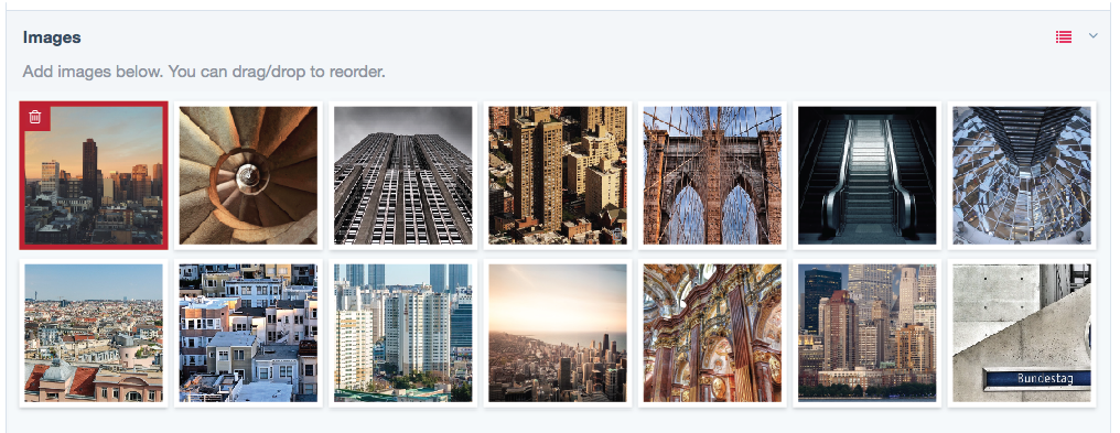
Image marked for deletion
I hope you’ve enjoyed this preview. I want to take a moment to acknowledge the excellent ideas and mockups Peter Knight posted. His mockups were a great reference point and inspiration for these changes to the grid view. I’m looking forward to exploring some of his ideas for overall improvements to working with images.
This week we don't have any major new features to introduce to you, but we do have two new ProcessWire versions! Plus we have a look at what's coming in the weeks ahead. More
Today we've got some nice upgrades to the comments manager, two new ProcessWire versions (3.0.3 and 2.7.3), plus a great tutorial from LostKobrakai. More
Tom
- 11 years ago
- 40
★★★★★Hey Tom,
I'm really liking the update, one thing I could consider is I find the "drop zones" quite small and often it's hard to judge where the image is going to be placed when letting go.
I would be nice to see something like this: http://i.imgur.com/M7gIoKj.jpg
Reply
Helder Cervantes
- 11 years ago
- 101
★★★★★Someone buy Reno a beer. First the awesome theme, now this. Great work!
If you ever come by Portugal, drinks are on me.
Reply
Peter
Wonderful work. Love the tool tips. What a great Xmas treat :)
Reply
Mike Rockett
Awesome idea - and visually appealing, too.
Reply
Nico Knoll
Looks awesome!
Reply
Tom Reno
Thanks all. Continued feedback is welcomed.
@Tom. I agree. I think Peter Knight has some nice ideas in his mockups. I'll be looking to incorporate some of those ideas for the overall implementation. Including masked file inputs.
Reply
Tom Reno
@Tom, I see what you meant now. Perhaps even just leaving more space between the images will help.
Reply
Szabesz
Hi Tom,
Thank you for all the efforts! I think the "Google image search" idea is not really user friendly solution, generally I do not like it since it pushes the GUI elements apart which slows me down. I like the built in iframe modals. Simple and effective, no need to reinvent the wheel :) The modal could incorporate next/previous buttons so we do not have to close it just to skim through the "records".
Reply
k07n
- 10 years ago
- 11
★★★★★Nice! Keep going!
Reply
Jugibur
- 10 years ago
- 11
★★★★★Look well-wrought and pleasing!
My wish is only a select field for the editor of a page, so the developer can present i.e. different classes for aligning or theming or whatever to choose.
Reply
Pwired
Just noticed about this in a forum post. Didn't know about Reno being such a contributor. Thanks for all these goodies mate.
Reply
kolewu
Wow, that looks great!
Please consider the mobile world and the difference with hover handling on iOS and Android.
Reply
gmclelland
I like the Google images like edit mode for the images. Looks like it might be possible with just html and css. See http://codepen.io/ciprianionescu/pen/JYPwwL and click on the calendar days for an example.
Reply