PrevProcessWire 3.0.119 and new site updates (part 3)
This week we take a look at what's new in ProcessWire 3.0.119 and then we finish up by taking a look at a few screenshots from the new ProcessWire development website. More
This week ProcessWire 3.0.120 is on the dev branch. This post takes a look at updates for this version and talks about our work towards the next master version. In addition, we take a look at some more updates and screenshots for the new ProcessWire.com website.
Relative to version 3.0.119 this update focuses primarily on resolving issue reports from GitHub as well as various other small improvements and optimizations.
Last week in a forum post I mentioned that we’re now working towards our next master version. I tend to wait too long between master versions and end up with dev versions that are often more stable than the master. That’s because the dev versions have months worth of resolved issues and such. So my focus right now is on identifying and fixing any issues that are new to the dev branch (that aren’t on the current master). After spending a couple days in the issue reports this week, I feel like we may already be there.
I’m going to be working through issue reports next week and focusing especially on those that might be new to the dev branch. Following that, 3.0.121 will be the first release candidate for the next master. After we get the next master version out, I’m going to go back and resolve any remaining issue reports that aren’t necessarily specific to the dev version.
Progress continues on the new ProcessWire.com website. At this point, the main site is nearly fully built out. Just about everything but the homepage is there, though a lot of detail work remains to be done throughout. I’ve been trying to get the largest parts of the development work in place so that I can get it to the point where it’s useful for staging and collaboration.
Let’s take a look at a few screenshots of where it’s at right now. These are in addition to the previous screenshots posted earlier. Some of your suggestions in that post are already present in these screenshots. By the way, I'm cropping out the footer in most of these screenshots since it takes quite a bit of vertical space and you've already seen it in the previous round.
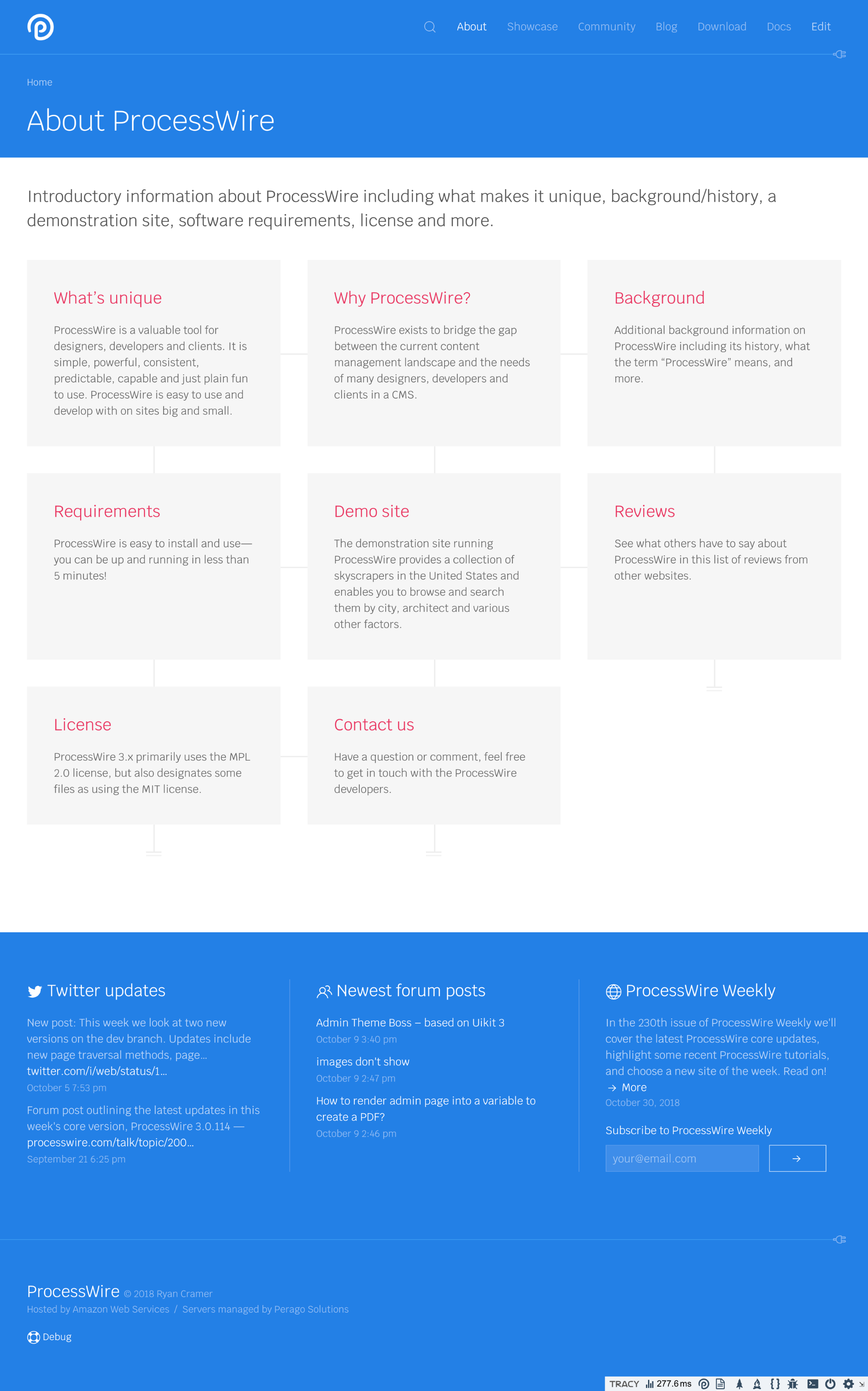
This first screenshot shows the About page, which is kind of typical of many index pages in the site. Since the site uses drop-down navigation, it’s likely many will never see these index pages, so I’m just keeping them relatively simple.
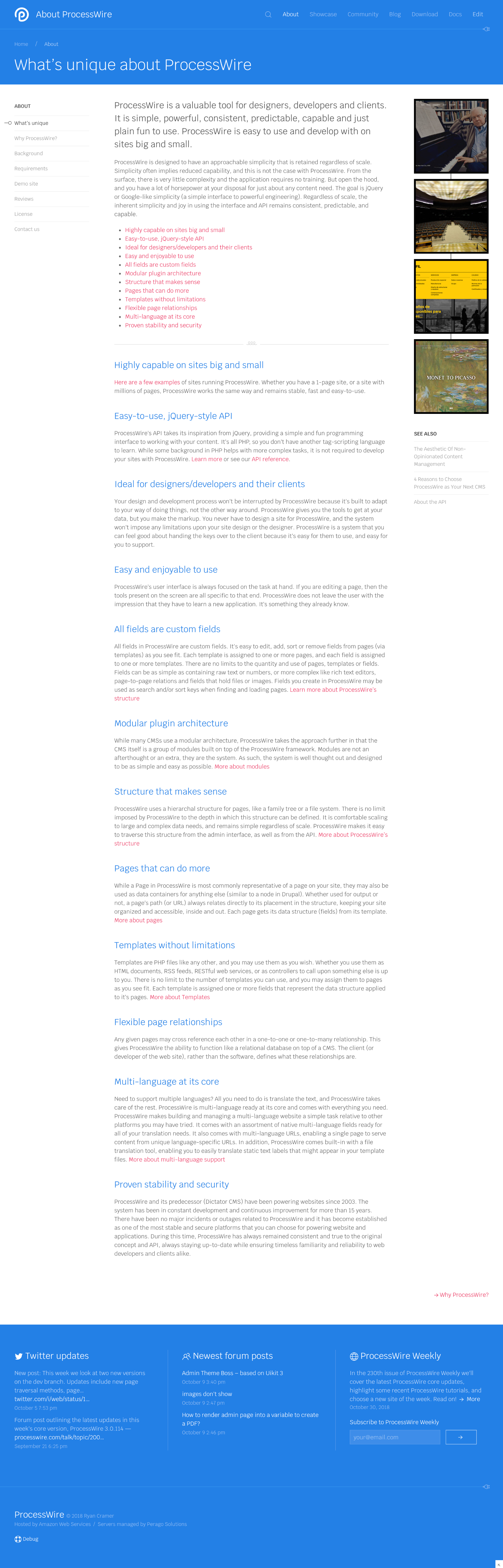
Next is an example of a general content page in the About section. The right sidebar of most pages in this section randomly feature selections from the Showcase. This page is actually about twice as long as what's shown, but I've cropped it half way just to avoid a massive screenshot.
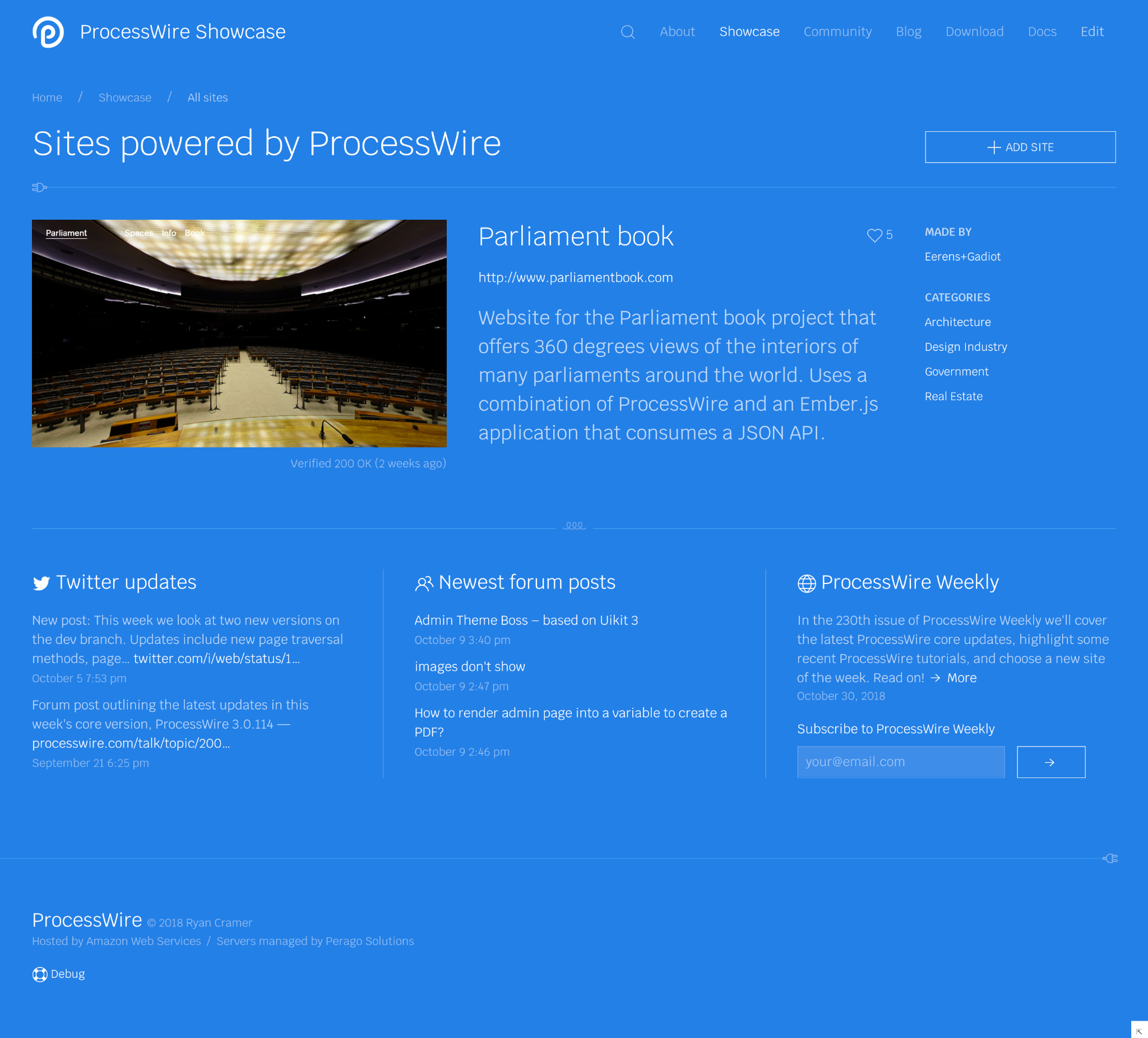
Since we are showing a selection of showcase sites on various pages, clicking any of them leads to a details page for the showcase site that you clicked on. The next screenshot shows an example of that.
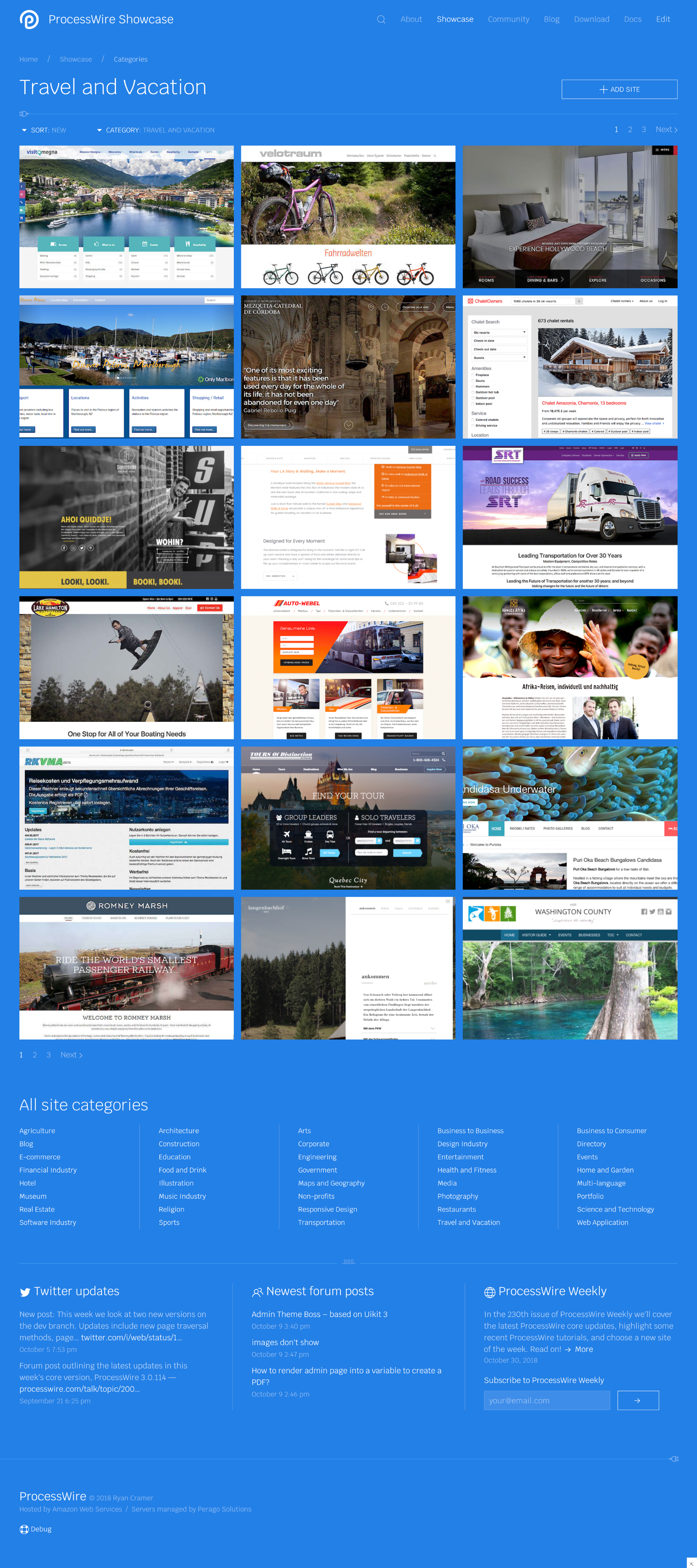
Here’s an example of a Showcase category page:
Here’s the downloads index page. This is shown with the dropdown selected as well.
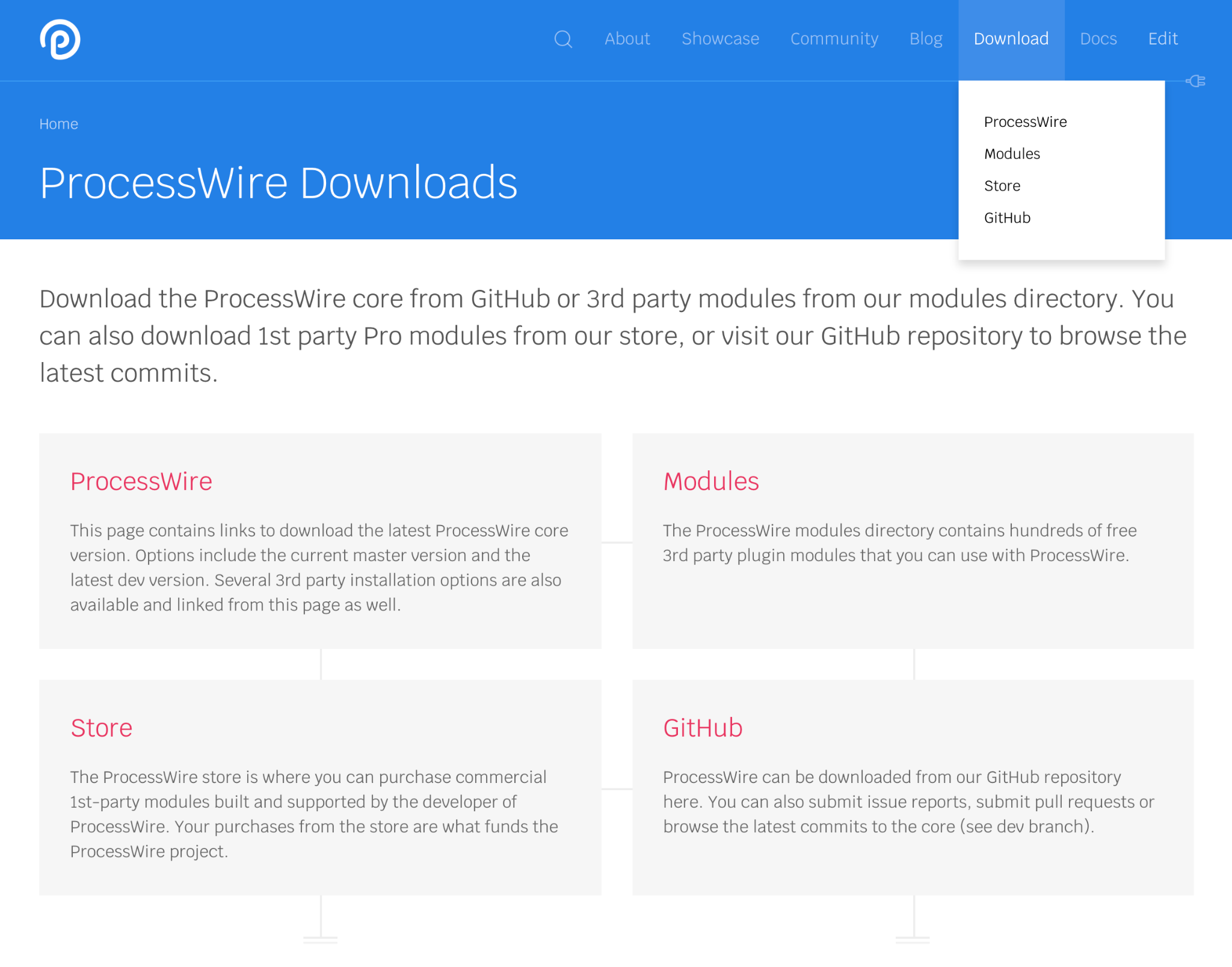
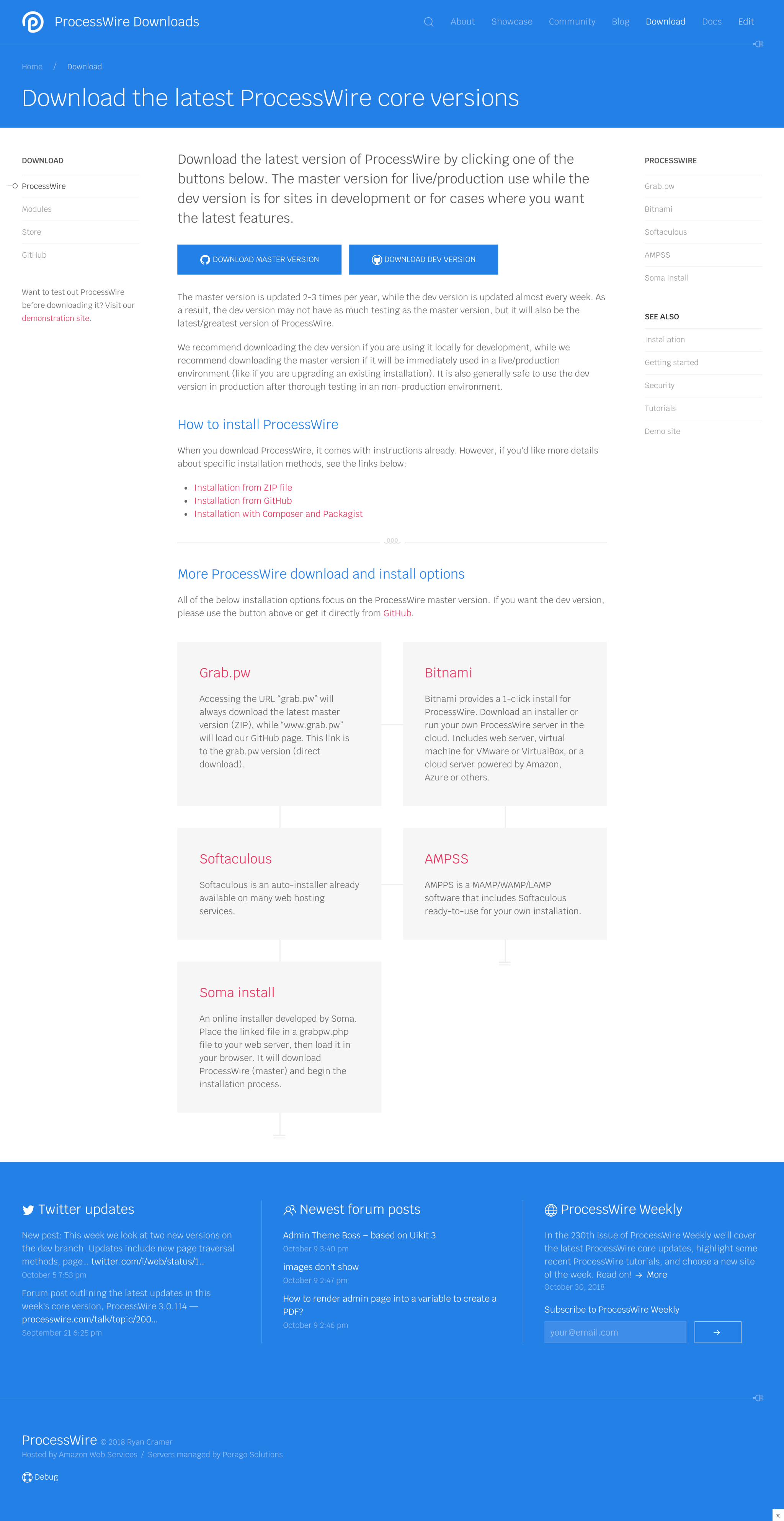
If you click the ProcessWire link on the page above, you get to the core download page:
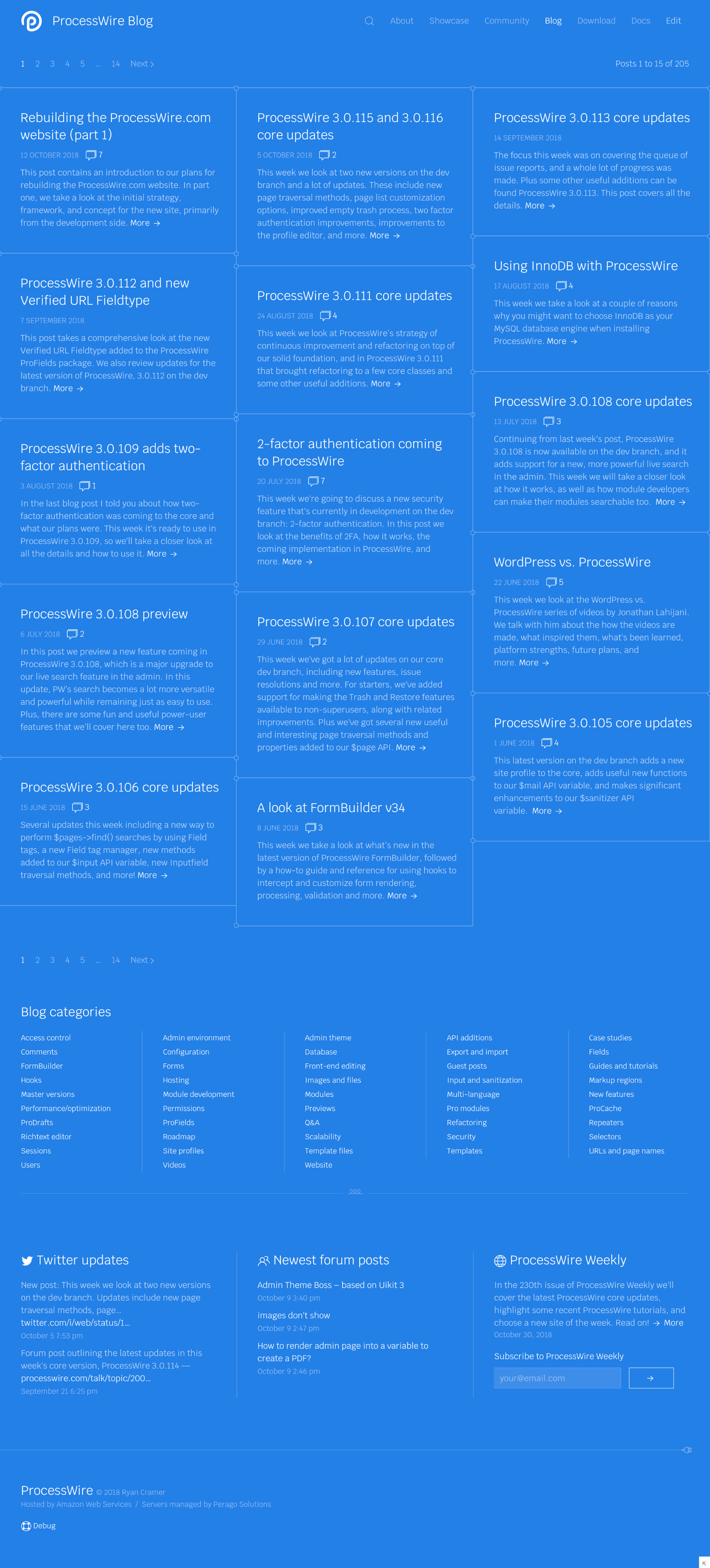
Next up is the blog index page. This continues the “everything wired together” theme used throughout the site, though in this case it’s also part of the masonry grid layout being used here:
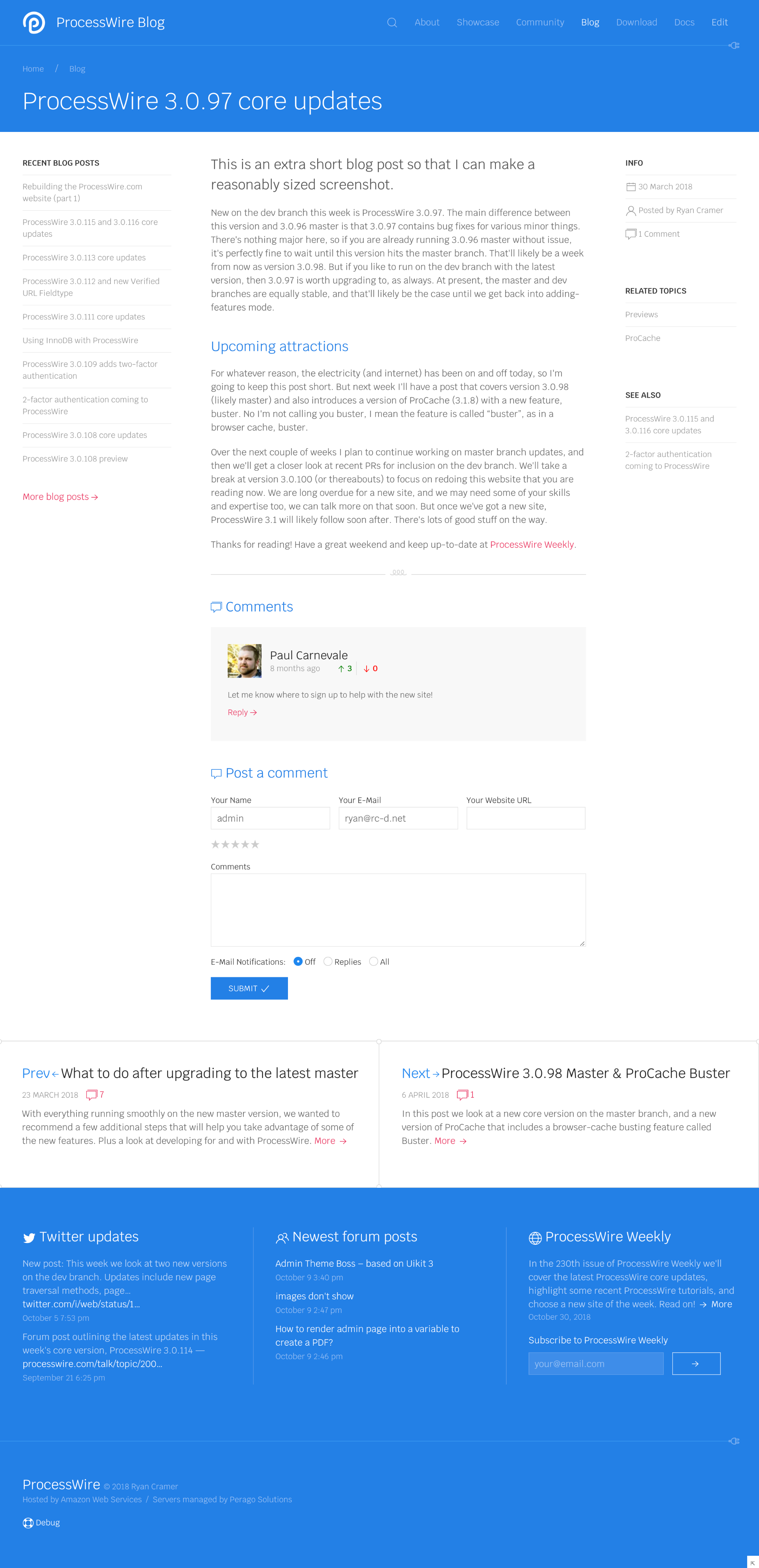
Here’s a look at a blog post. This is probably the shortest blog post ever, ideal for a screenshot:
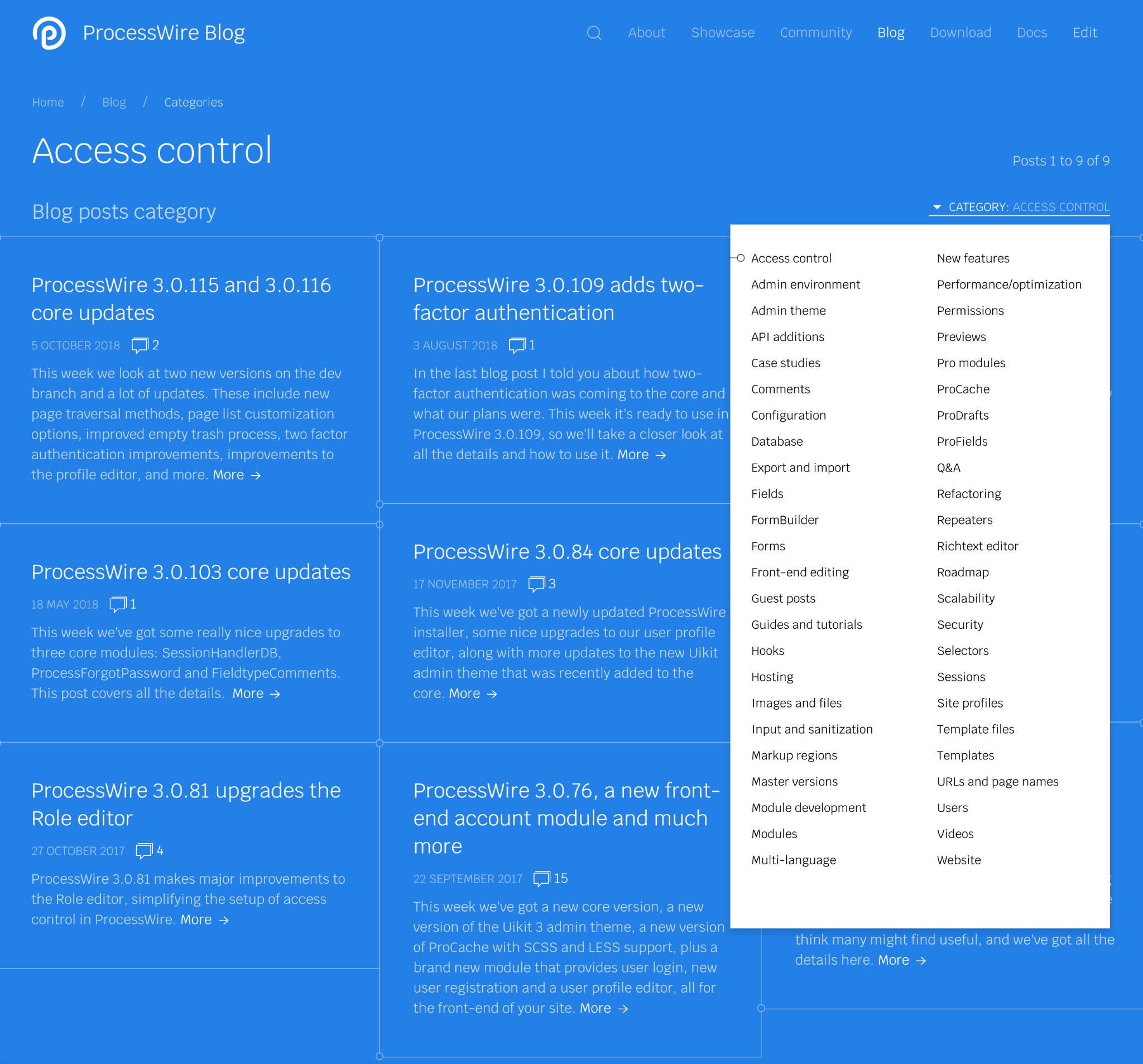
Here’s an example of a Blog Category page, something that we don’t have on the current site. In this case, the category dropdown is also hovered:
One thing that I gathered from your comments is that you’d like to see a better search engine on the site, that integrates everything. That’s what I’ve spent most of my time working on this week. I now think we’ve got a great search engine. The following screenshots preview some of the capabilities.
First off, the search engine is a live search, so the results appear as you are typing. Secondly, the results are categorized by section of the site. And as you can see, it searches the modules directory too, unlike the existing site search.
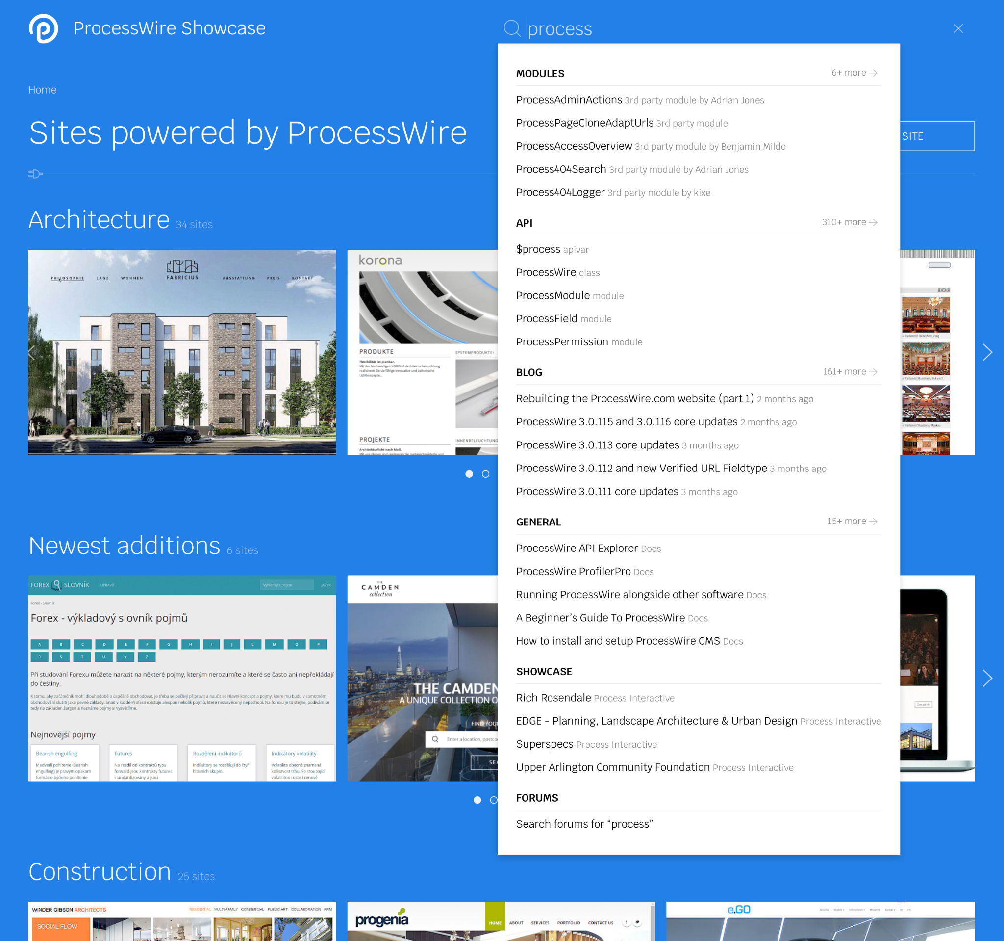
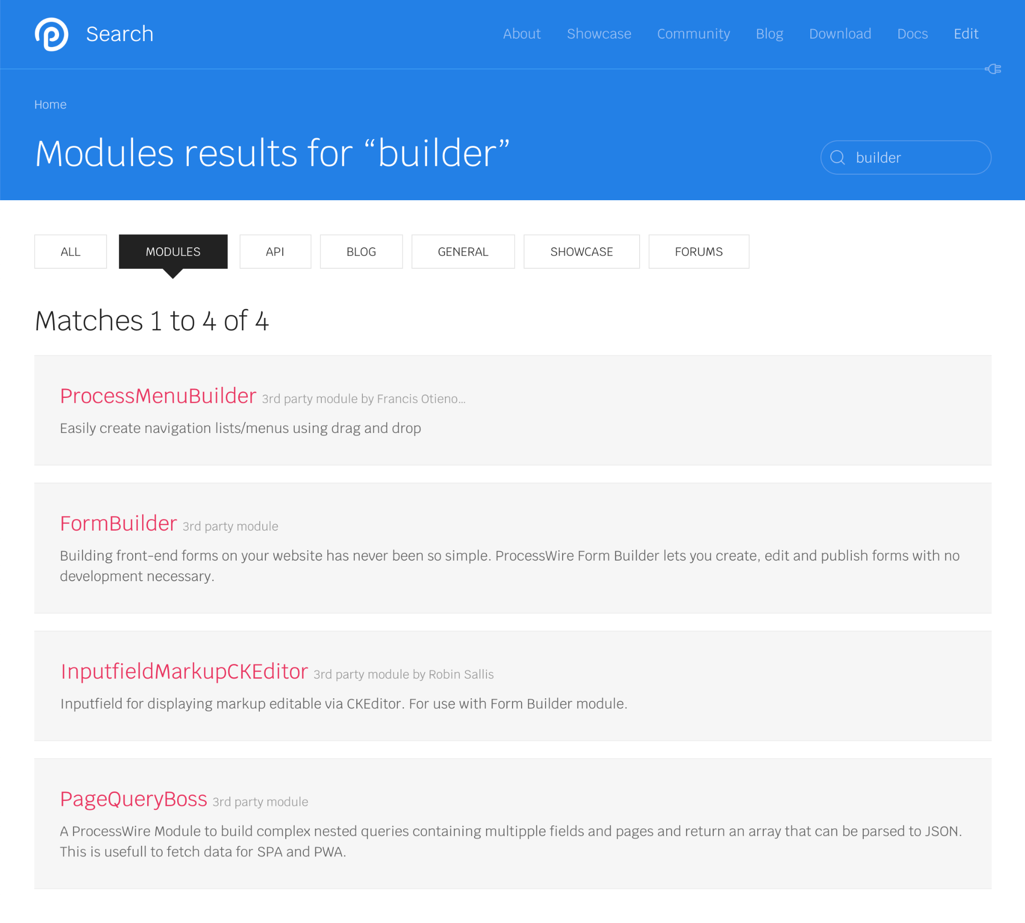
You can click on any category in the search to view more results and get more details about those results:
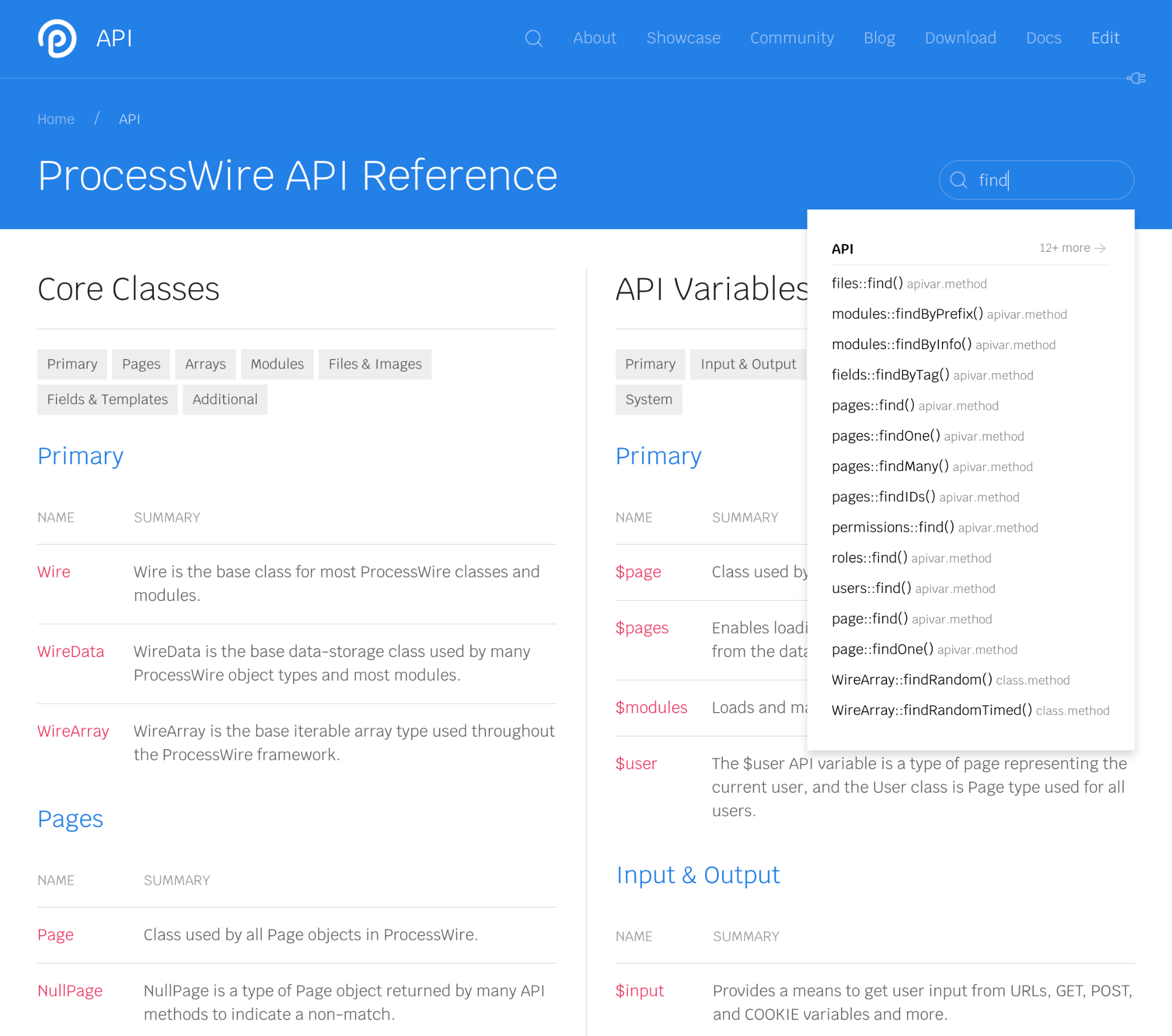
Some parts of the site also get their own focused search engine. For instance, even though the main site search engine also searches the API, the ProcessWire API section of the site also gets its own API-focused engine as well:
That’s all for this week. Thanks for reading and have a great weekend. Check in at the ProcessWire Weekly this weekend for the latest ProcessWire news and updates.
This week we take a look at what's new in ProcessWire 3.0.119 and then we finish up by taking a look at a few screenshots from the new ProcessWire development website. More
The RC1 version for our next master release is here. This post covers all the details and information about how you can help. We also look at a a new PageAction module added to ListerPro, and a couple of other new modules currently in development. More
“I just love the easy and intuitive ProcessWire API. ProcessWire rocks!” —Jens Martsch, Web developer
Nicolas
- 5 years ago
- 30
★★★★★Great post Ryan. This looks great. One minor issue maybe is that the blog index page might be difficult to scan as on the screenshot the chronological order doesn't stand out.
The categorized search results is a huge win.
Reply
3fingers
Totally agree with Noel :) I like the way the new website is going towards but to me, right now, it's very uikit default style. Even thought is very clear it's lacking of unique personality. Same as above, not a criticism per se, but I'd love (IMHO) to look at processwire more as a brand rather than a (magnificent!) CMS.
Reply
HMCB
- 5 years ago
- 30
★★★★★Love it Ryan. I’d love to have a powerful search like that on the front-end. Is that forthcoming or already possible?
Reply
MrSnoozles
Agree, the all blue pages look like the header is not properly closed. I don't see why those pages should have a different style from the rest either. Otherwise great update, really looking forward to the new page.
Reply
Jonathan
Great update! Looks professional, clean, I love it. But I agree with Nicolas on the blog. From a UX perspective it's not that great. Hard to scan and not chronological. But keep up the good work!
Reply
Pete
Looking great. I'd prefer if all pages had blue header then white content then blue footer as the all-blue pages almost look like a coding error at first glance to me but maybe I'm just being picky? ????
Reply
Noel
- 5 years ago
- 40
★★★★★Great work Ryan! Especially love the new search!!! I also like the results view of the search alot, clean and with the smart ability to filter by kind. Thanks for listenibg to our feedback about the Skyscraper ornaments.
What stands out to me is that the screenshots all together (with the exemption of the sites pages) look very uniform – mostly text, headings, lists. Very clean and organised, I like that, but visually there is not much to distinguish.
Now I get that you are focusing on the content and structure of the site - so it might just be to early for feedback on this topic: I think that especially on the marketing focused pages, focusing on presenting ProcessWire for new users, stakeholders and designers & marketing departments, more images and specially crafted pages would make sense. But I would even argue that for more developer oriented pages, some images would be helpful. I'm a visual person and nice images for blogs, even modules would go a long way in making the experience on processwire.com a pleasing and joyful experience.
Now I totally understand that you probably need support from a few UX and UI gurus but I guess, there are a lot of us from the community who would be more than happy to stepp in and offer support. A few examples from pages a stumbled across the last couple of days:
Well crafted homepage with gimmicks (feature-slider): https://ora.pm/home
or https://craftcms.com
Nice visual blog posts: https://ora.pm/blog
Visually appealing modules directory (with a nice touch for developers, the ability to sell your own modules): https://statamic.com/marketplace/addons
Presenting many features visually (nice menu on the left): https://craftcms.com/features/all
Blog, module and tutorials directory: The new Laracast website probably has a good middle-ground with nice graphical touches while still not to heavily reliant on custom visuals: https://laracasts.com/series
One last thought, maybe "features" would be a better title for the "about" page because it's less about an organisation and more about a product.
This is by no means negativ criticism, I really like the current progress of our new beloved CMSs home and would only like to offer some inspiration and my thoughts in hope that it helps boost PW.
Reply